02.02 - Font Families - The Foundations of Typography
Chapter 02 - Classifying Type
Lesson 02 - Font Families
Even once you've chosen the right typeface(s) for your project (we will cover more on that later in this series), there are still so many potential options within the typeface for your font selection.
Fonts vs Typefaces
Fonts and typefaces are sometimes incorrectly used interchangeably. You can think of a typeface as a group (or family) of fonts. For example: Garamond is a typeface, and I am using the “ITC Garamond Condensed Italic” font.
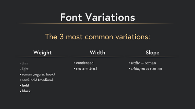
3 most common variations are weights, widths, and slope:
Weights
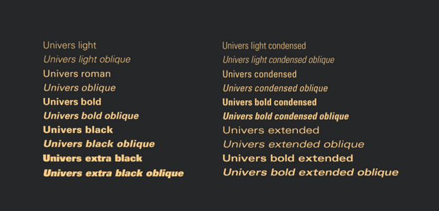
Which can generally include light, roman (sometimes regular, or book), semi-bold, bold, and black each with their own version of italic.
Widths
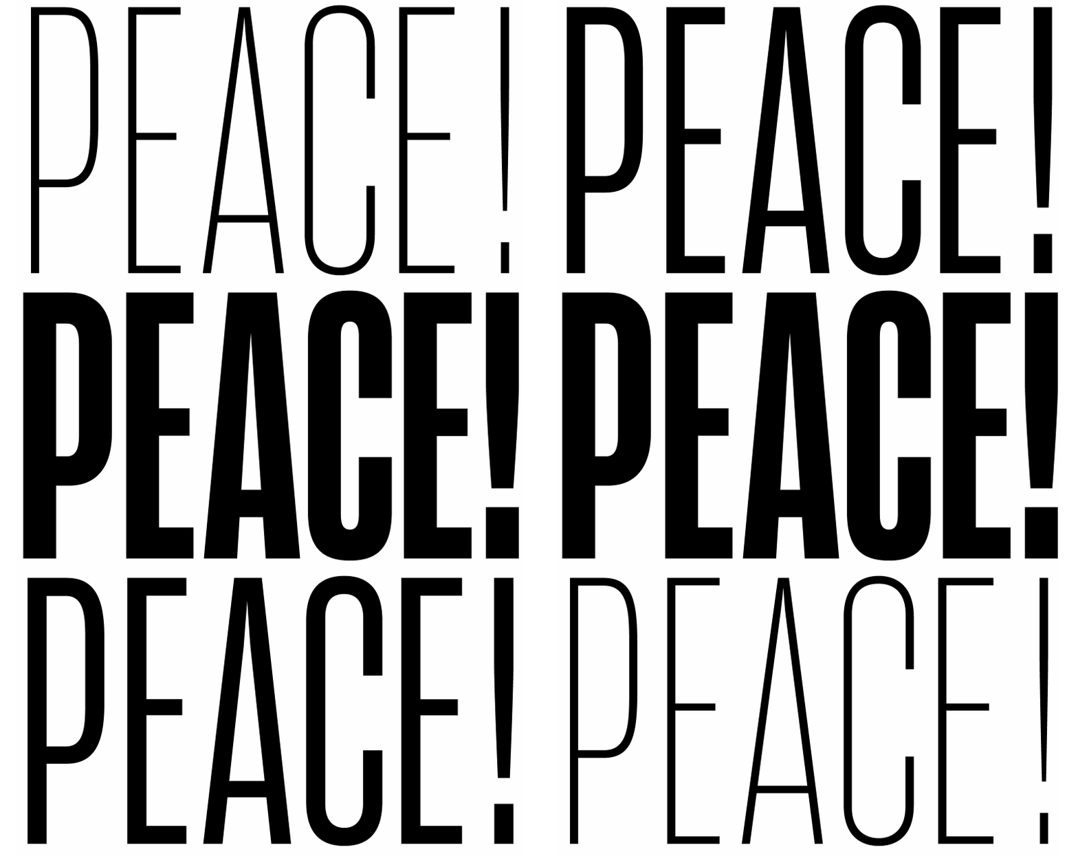
Many type families include a condensed and extended version that provide additional flexibility.
Slope
The slope can be referred to as an italic or an oblique. They are both similar, but an oblique is only a slanted version of the font, while an italic is specifically drawn to a more calligraphic style while drawing around an angled axis.
Superfamilies
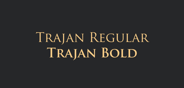
Typefaces can vary in size. Some typefaces, like Trojan, are very small. It was designed to replicate the traditional roman typefaces that had no minuscules at the time. There is only a regular and a bold version of this typeface.
On the other hand, some typefaces are very large, like Univers. Univers has several different widths and weights, as well as corresponding obliques.
Variable Fonts
Variable fonts are a new font format offering unprecedented flexibility. In October 2016, version 1.8 of OpenType was released, and with it an extensive new technology: OpenType Font Variations. The technology enables a single font file to behave like multiple fonts. In essence, the font's weight and width can be adjusted continually between minimum and maximum weights and widths to allow for the perfect tone.
Common font family mistakes
Finally, here are some helpful things to consider when considering a new font. The following are common font family mistakes made among beginner designers and non-designers.
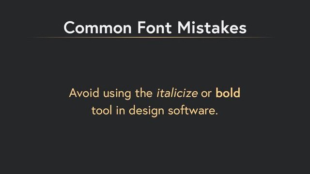
Avoid using the “italicize”, or “bold" tool in software to italicize or bold a font. Type designers have spent countless hours designing specific bold and italic version fonts, and they have created them proportionally to each letterform. By using these software tools, you are only distorting the regular versions of the letters, creating skewed italics, and bloated bolds that look unnatural.
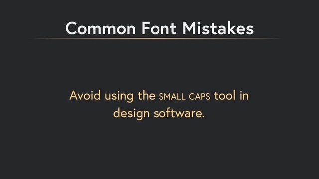
If you need to create small caps, use the properly designed small cap fonts included in the family. These are also designed to keep the flow and rhythm in text. The pseudo small caps appear thin and fragile.
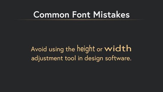
Do not ever resize your type using the width or height scaling. This stretches the type's proportions. Instead, look for a typeface which contains a varied width selection.
I hope these tips have been useful! Now that we've covered some ground, have you been noticing typography (good and bad) around you more carefully? If you're looking for inspiration, I recommend checking out a wine shop! The wine bottles offer tons of variation and beautiful type.
