02.01 - Serif and Sans Serif - The Foundations of Typography
Chapter 02 - Classifying Type
Lesson 01 - Serif and Sans Serif
The two most basic kinds of letterforms are serifs and sans serifs. We’re examining the type very closely here, but all of these details significantly change the look and feel of the typeface when it is set in a smaller, text size. Let’s begin with the serif typefaces.
Serifs
Serifs are the letterforms with serifs (or feet) on the end, evident in the capital letters and the lowercase letters. These serifs help readability, as they often give a horizontal flow to the text. Serifs can vary quite dramatically between each typeface in, shape, weight angle, and balance. I won’t dive too deep into it in this course, but you can actually sort serifs into a number of different categories as shown below.
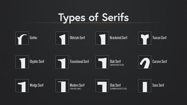
However, they are most broadly classified into one of four subgroups: The first roman serif typefaces are called old style (or humanist).
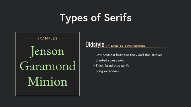
These serifs dating back to the 15th and 16th centuries emulated classical calligraphy. They can be described as low contrast between thick and thin strokes, slanted “stress” (or an invisible axis line that runs through the thinnest points of the letter) of the letterform, thick bracketed serifs, and usually they have longer extenders. Some common examples of old style typefaces that you may recognize are: Jenson, Garamond and Minion.
The next category of serif type, the transitional (or baroque) typefaces made their first appearance in the mid 18th century mostly due to advances in printing technology. This allowed them to have sharper, flatter serifs and a higher contrast between thick and thin. Some examples of transitional typefaces are Baskerville, Georgia, and the very common Times New Roman.
Modern serifs came about in the late 18th century. These typefaces took the contrast of the transitional letterforms and exaggerated them even further to give an extreme contrast between thick and thin strokes. In contrast to the old style, you get more of a horizontal emphasis of the letters. Didot and Bodoni are examples of the modern serif. Finally, Slab (or egyptian) serif emerged also in the 18th century. Slab serifs can have a range of looks and feels (such as the bracketed or unbracketed versions), but the one thing that will always consistently define a slab serif is the identical thickness of their stroke and the serif.
Sans Serifs
Sans serifs came about in the late 18th century for use in advertising. There are 3 main categories of sans serif typefaces.
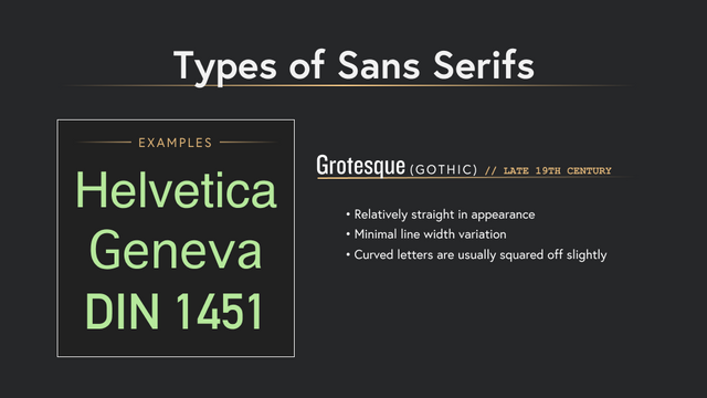
The first is what we call Grotesque (and sometimes referred to as Gothic). These typefaces have slight variation of thick and thin strokes, and the curved letters are usually squared off slightly.
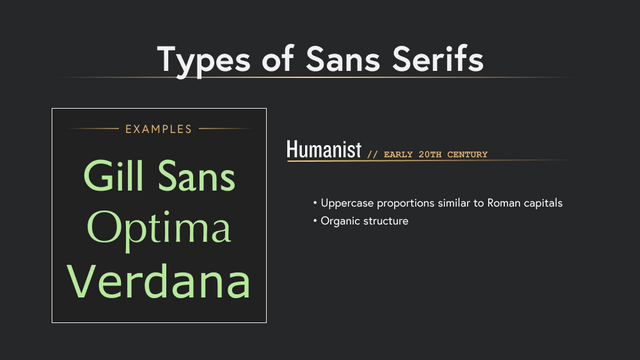
Next, we have Humanist typefaces. These sans serif typefaces have an overall more organic structure and similar proportion to the monumental Roman capitals.
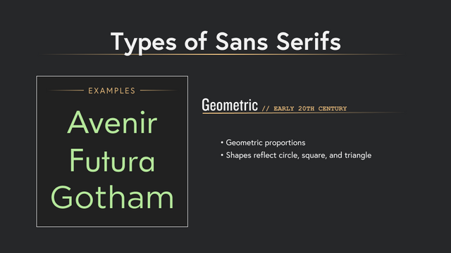
The last category of sans serif typefaces are called Geometric sans serifs. These typefaces reflect the modernist movement of the early 20th century. They are easily identifiable due to their geometric proportions reflecting the circle, square and triangle.
The Quiz
Now, it’s time to test your knowledge of serifs and sans serifs!
Grab your notebook and write numbers 1-6 down the page.
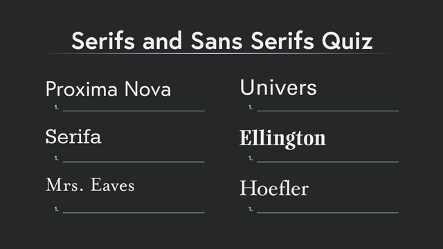
Now, fill in your answer to each corresponding number what type of serif or sans serif each typeface could be categorized as…If you don’t have a notepad handy, at least go through each and take a guess.
...Got it? Ok, here are the answers. How did you do?
Some of the subtleties can be hard to distinguish, but the more you consider these differences, the more you it will help you hone your typographic eye.
Let us know how you did on the quiz in a comment below!
