⚡"Jesus Apollo" ⚡Character Design - Trial By Comics Entry #1
⚡Jesus Apollo's Evolution ⚡
I've been working on a graphic novel (super early stages) since before 2016. It wasn't until a few months ago, two plus years later, that the project finally came to light. Putting this post together has helped me realize what a monstrous process it's been; one I hadn't been able to really appreciate until studying it in retrospect.
So... let's rewind.
Jesus Apollo started with a tiny little doodle I did way back. I hadn't drawn in ages so "rusty doodle" is an understatement (brace yourself):
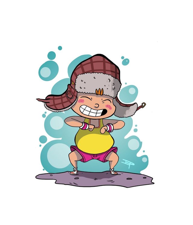
He had a glum face (one which I simply couldn't get out of my head)... and a signature dance pose, because how could I not? (Hint: he wants to be a dancer).
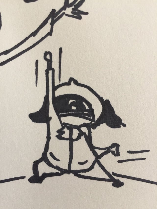
I felt that, no matter how rough and crappy my doodles, I'd somehow been able to capture the essence of Jesus Apollo.
As I explored his story in a notebook, those two doodles eventually became...
...which is a closer version to what he looks like today -- but not quite.
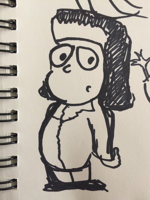
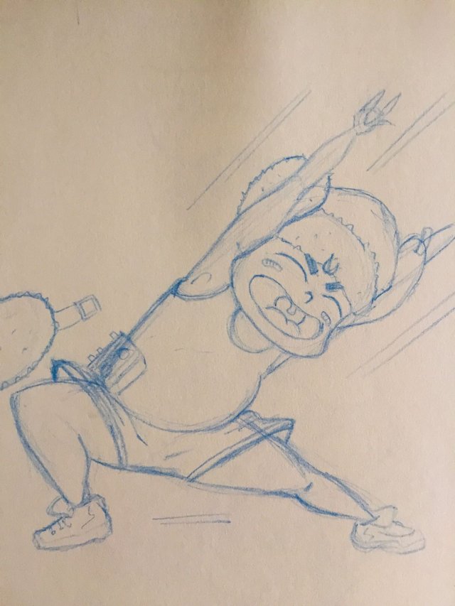
From then on his body and proportions changed over and over... and over... and over.
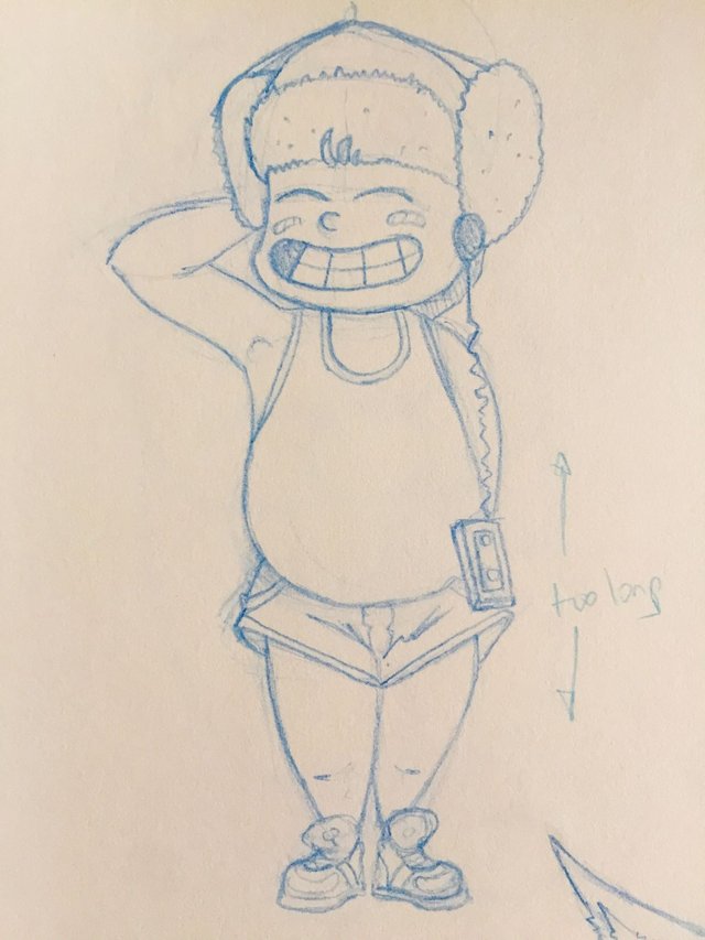
I found myself struggling between making him look like a real boy vs a more chibi cutesy look.

I ended up trying both but neither felt right. Either the body was too big, or the head was too big (compared to the body). So playing around, I landed somewhere in-between...
But as the proportions started to feel right, I came upon another problem... his "thickness".
Since the very beginning I wanted Jesus Apollo to be chunky, like a marzipan ornament atop a wedding cake. And for the most part I was achieving this look, except for his limbs, which most times just felt too much like stick figures.
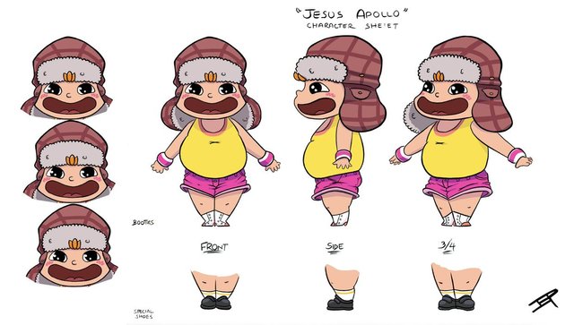
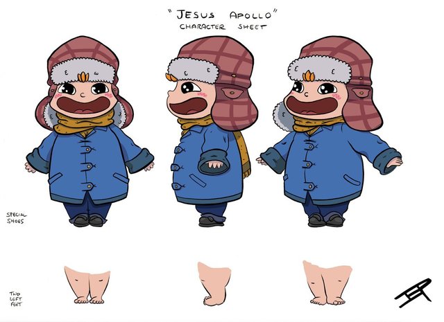
I concluded I had to thicken his arms/legs. So I put together a character sheet that I would use as my guide; that way Jesus Apollo would always look the same -- or well, kind of the same.
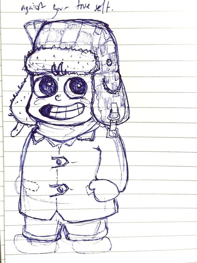
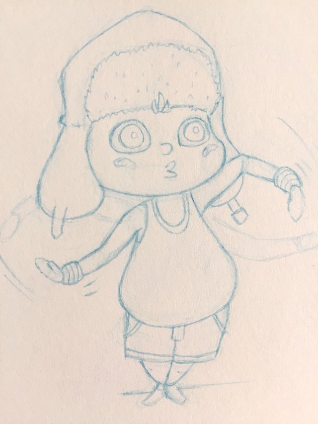
This helped a lot but his design continued to evolve and with it came the decision to change his hair... in most of the initial designs (and in the unpublished "first pages") his hair was orange:
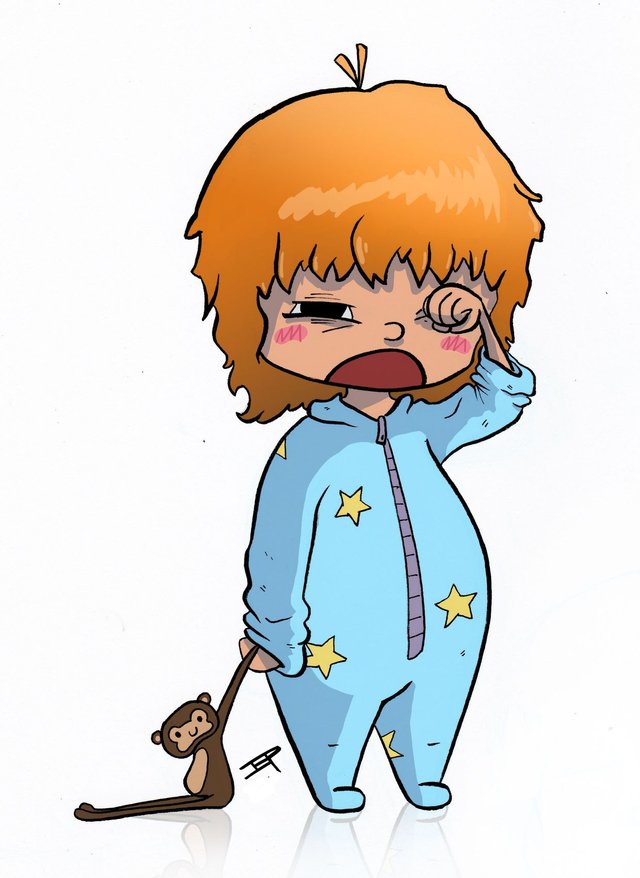
...and it was shaped differently. After working on some of the other characters, in particular on Jesus Apollo's mom, I felt the need to go back, and change it up a bit...
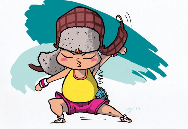
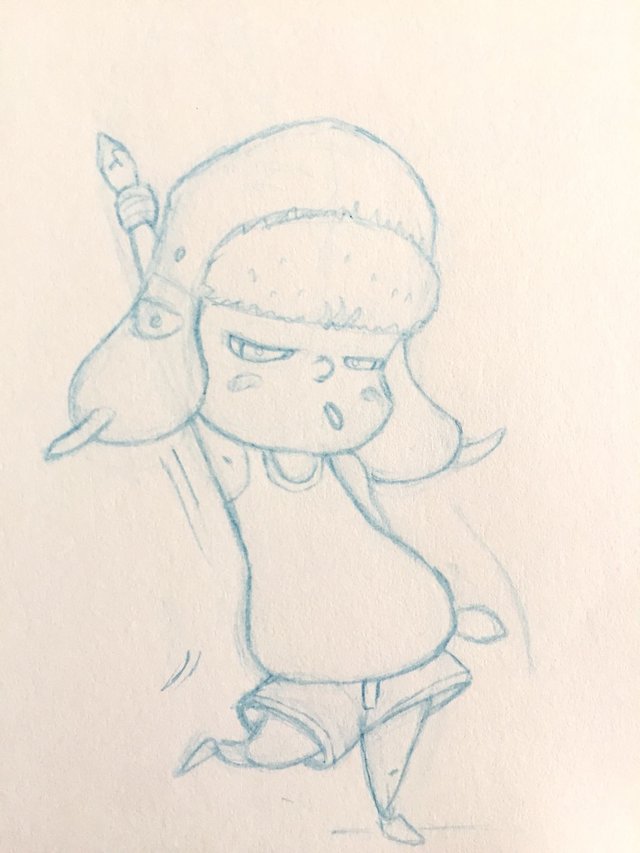
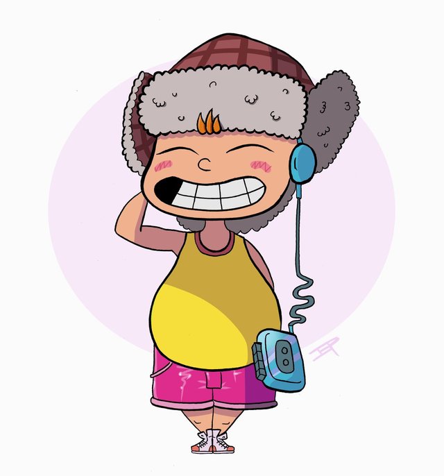
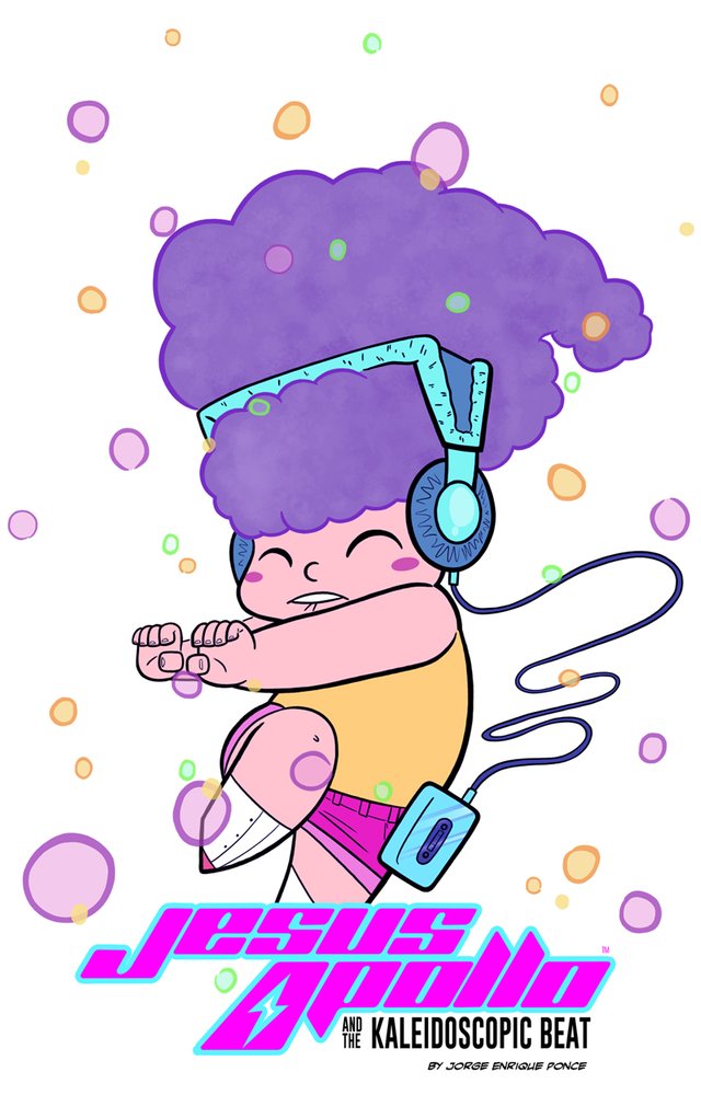
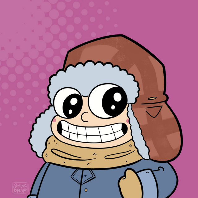
And I'm so glad I did. The untamed, unruly wild purple hair symbolizes what he was to become -- yet it's what he continues to hide under a hat.
All of this happened over a span of two years' work. Work which eventually brought me closer to his final look:
And even after all those changes, I went an extra mile and removed the squiggly lines on his cheeks halfway through making issue 1 (before posting it online). That was probably the last (and final) change to his design. I love how he turned out, and, honestly, the process was crazy fun.
If you're curious and would like to check out the graphic novel (currently in webcomic form), you can visit the Webtoon page.
Thanks @kommienezuspadt , once again, for creating this awesome opportunity for creators, and thank YOU, Steemit community, for taking the time to read.
Much love ♥
Hello @eyedrip, thank you for sharing this creative work! We just stopped by to say that you've been upvoted by the @creativecrypto magazine. The Creative Crypto is all about art on the blockchain and learning from creatives like you. Looking forward to crossing paths again soon. Steem on!
Thank you!