8 New Graphic Design Trends That Will Take Over 2017
So we’re already into the middle of 2017, in case you haven’t noticed. That means you probably have already broken one of your New Year’s resolutions. Don’t worry, my resolution to get better sleep has already been dashed. But one of my resolutions that I will not be breaking is to become a better graphic designer in 2017. And this is great news for you, because I will help you also become a better designer in the process. If you have read any of my other articles, you’ll know that I am not a traditionally trained graphic designer. I am, instead, a writer who enjoys design enough to immerse myself in it and learn all that I can, using simple graphic design tool to help me along the way. And that quest continues into this new year.
A great place to start is to see what the graphic design world will look like this year, and what trends will take it by storm. And we think that 2017 will reject some of the past graphic design trends completely. It is going to be an interesting year, to say the least. This guide will prepare you for those changes.
Graphic Design Trends You Should Know for 2017:
1. Louder and Brighter Colors
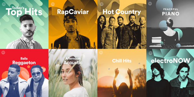
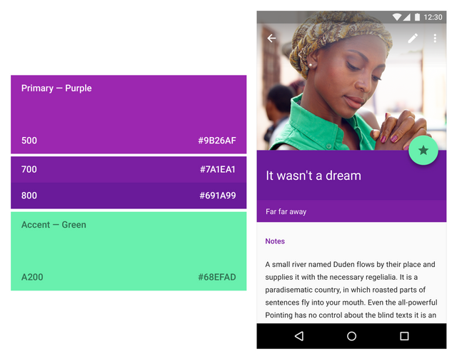
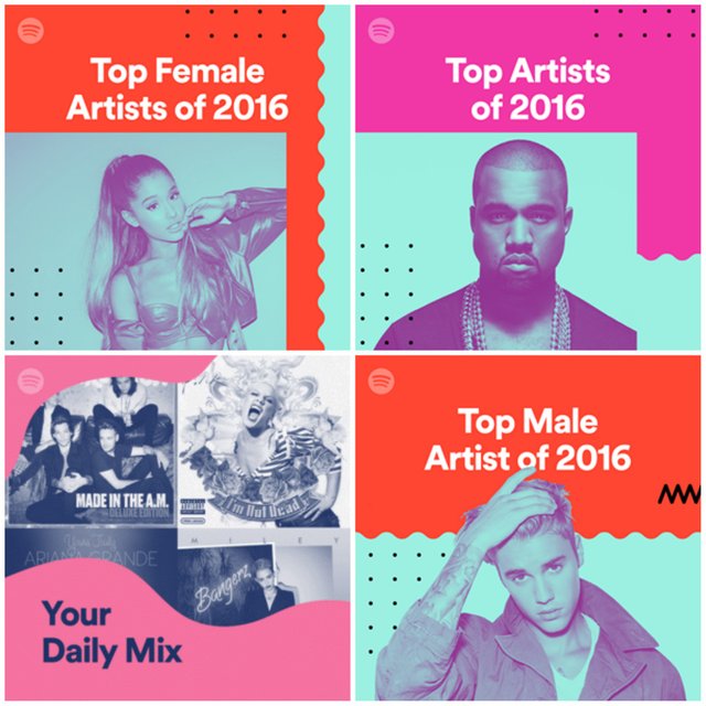
Over the past few years, many tech leaders used muted, safe and easy to digest colors. This was in an attempt to create a very clean and controlled design scheme. It was almost an attempt to show people that the sleek, functional future they have seen in science fiction movies was already here. But now that everyone and their mom have seen this design style work for Apple, the copycats have killed the power it once held. Now, in 2017, there will be a shift away from neutral colors like whites, grays and black, to bolder and brighter colors. Some companies are already doing it and have been for a while, like the music wizards over at Spotify. In fact, they are already leading the pack, using bold colors mixed with professionally edited photos to create in-your-face designs. This kind of color usage has become part of their brand, which means that their images are instantly recognizable. And when you are fighting for real estate on social feeds, powerful branding like this will help you win 2017. Just because many companies will be ditching their boring color schemes in 2017 doesn’t mean there needs to be a color revolution in your company. Some companies will be adding just a bit of color, and it will make all the difference. Using bold color accents will also help many brands cling to their minimalist roots. By infusing bright colors with traditional neutral backgrounds, companies can give their branding a fresh new look without straying too far from what made them great. For example, we already saw this type of redesign from Instagram a few months ago.
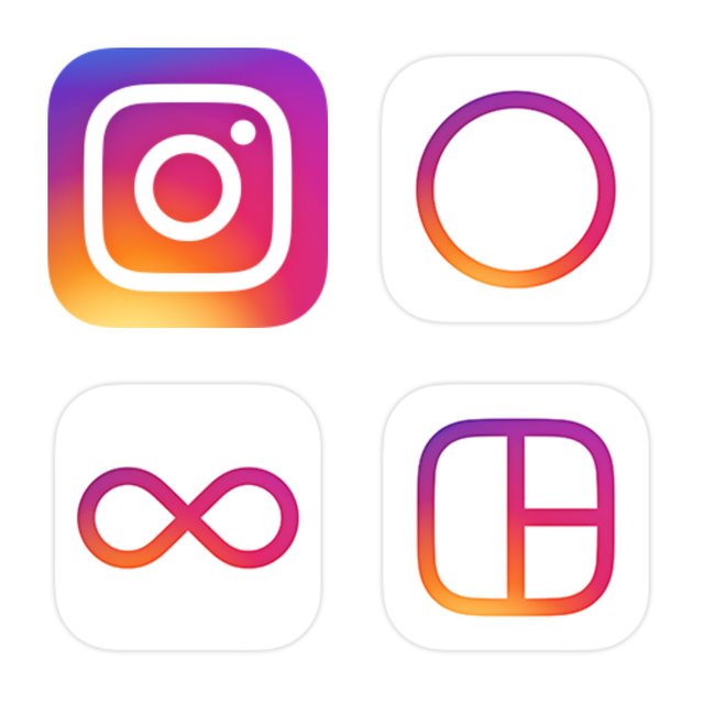
This simple redesign helped bring them into a whole new era and unified all of the different apps under one color. And just like with Spotify, this type of bold color usage is recognizable across the web. A large driving force behind the trend of bold and bright color usage in design comes from Google’s Material Design. Their design language focuses on flat, organized, and intuitive design. They use “unexpected and vibrant” colors, as well as fonts and images that are as functional as they are pleasing to the eye.
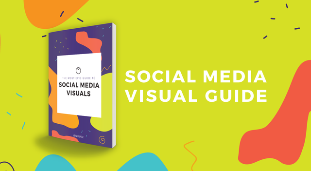
Actually, a lot of the things that will be trending in 2017 are influenced by the adoption of the Material Design principles. We took their advice when designing this graphic to promote a new ebook. It has been an insanely popular featured image!
If you need some great examples of color palettes that fit this bold scheme, check out this article that helps you choose the best colors for your designs. Don’t be afraid to use colors that contrast starkly against one another.
2. Bold Typography
In 2017, bold typography will also fight against the ever-dwindling attention spans of readers, and the saturation of content. Big and daring fonts will be used to grab the eye.
One of my favorite examples of this would have to be Wired. They use a mix of fonts to emphasize individual titles and establish a hierarchy of information on the page. Just take a look at some of the examples from their homepage below:
A great example of using in-your-face fonts to grab the reader’s attention on social media comes from HubSpot. They make sure the text is front and center, with the graphic used as support:
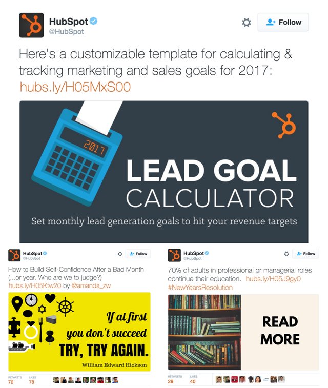
HubSpot know that the time we allocate to digest a tweet is nearing zero each year. They combine concise, punchy copy with bold fonts to capture your attention. Additionally, the shift to mobile and extremely high definition screens will also increase the need for bold fonts. Obviously, more and more people will be using their phones to get content, and the way that content is presented will need to keep up.
Want to take your infographic design to the next level? Download our interactive guide on The Dos and Don’ts of Infographic design!
Buffer uses strong headers in the body of their articles, not just at the beginning, to give them a backbone and make it easier to read across different devices. I would recommend using this approach to help people navigate long reads, no matter the screen size. We also took a similar approach, when creating this infographic template. Mixing bold font choices with interesting colors to create an eye-catching graphic:
3. Google Fonts
I have been using Google Fonts for a while now because they are so versatile. If I need to design one thing online and then add it to my slide deck, I am confident the fonts will work together. And they play nice with about every blog or site you could build. Oh, and did I mention most of these 810 different fonts are free to use? Yeah, people like free. And they like things that are insanely easy to use. Like this example that uses a mix of a few popular Google Fonts:
Some of our most popular fonts on Venngage are bold Google Fonts, like Roboto from above or Open Sans.
4. Authentic Photos
As the amount of content created each year continues to increase, the need for quality images has increased as well. And to maximize the shelf life of some of these images, the creators have had to make them as generic as possible. The only problem is that the best generic images get overused by everyone. If you have been active in tech or marketing scene lately I am guessing you have seen the following image:

It has been used in landing pages on, blog headers, and even some Instagram posts. To be fair, I even used it for one of the sites I was building a few years ago. But because of the popularity of this image and other stock images like it, the authenticity has plummeted. The need for clean and perfect images in everything has only exasperated the problem as well. As reader seeing this image for the hundredth time, I would think that the writer or creator does not care about making their work original. So why should I read it? That is why you need to start using authentic, original images that represent your brand. Stop using the most popular images and start making some of your own. I am guessing everyone on your team has a camera phone in their pocket. Why aren’t you using them? Snap a few photos of your office or some fun pictures of your logo and use those instead. Or if someone on your team is a budding photographer, give them a day or two to shoot some images that you can use for a year! For example, we took a picture of some of our employees for our new website and could not be happier.
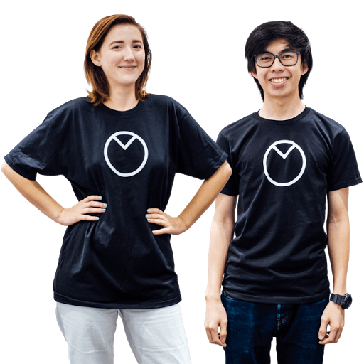
By doing this, we added the human element back to our images, that so many of these stock photos are missing.
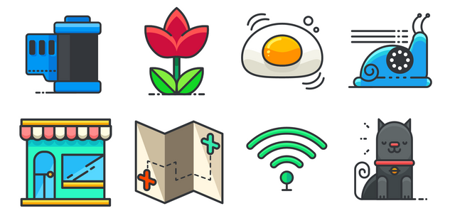
5. Hand-Drawn Graphics and Icons
The need for more authentic images will also influence icons and graphics. Recently we have seen brands embrace this wholeheartedly as they look to differentiate themselves from the pack. This will also add a personal or fun element back into your design or content work. And this can’t be done with off-the-shelf icons or graphics. Many may see this trend as childish or unprofessional, but it will definitely help you stand out online. Like many of the trends in 2017, this is a push back on the clean and almost clinical nature of design in recent years.
For example, Dropbox has adopted the use of hand-drawn illustrations in everything they do. It has become part of their brand now and is easily recognizable.
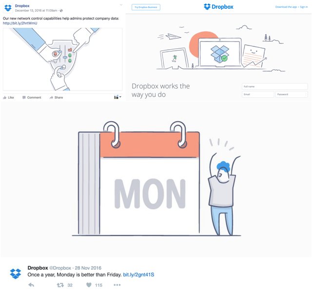
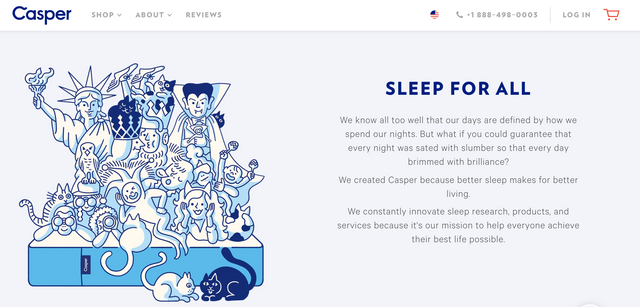
Plus, it puts the user at ease, appeals to the child in all of us, and makes the product seem more accessible. This is especially helpful if you are a large tech company like Dropbox. Another great example of hand-drawn icon comes from Casper, a mattress company. They use illustrations on almost all of their landing pages Like this interesting one below:
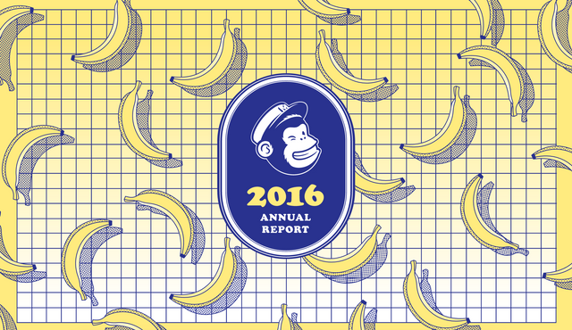
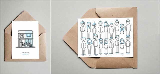
MailChimp also got into the spirit and used hand-drawn illustrations in their 2016 annual report!
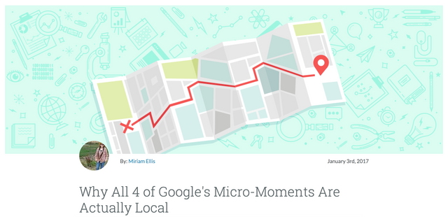
And finally, for one more GREAT example, we look to Moz. They use illustrations in their blog headers, like this one:
We also have introduced more hand-drawn illustrations in Venngage as well. I am particularly a fan of some of the ones below:
And our love for hand-drawn icons sometimes makes its way into other projects as well:
6. Minimalism Will Get Back To Its Roots
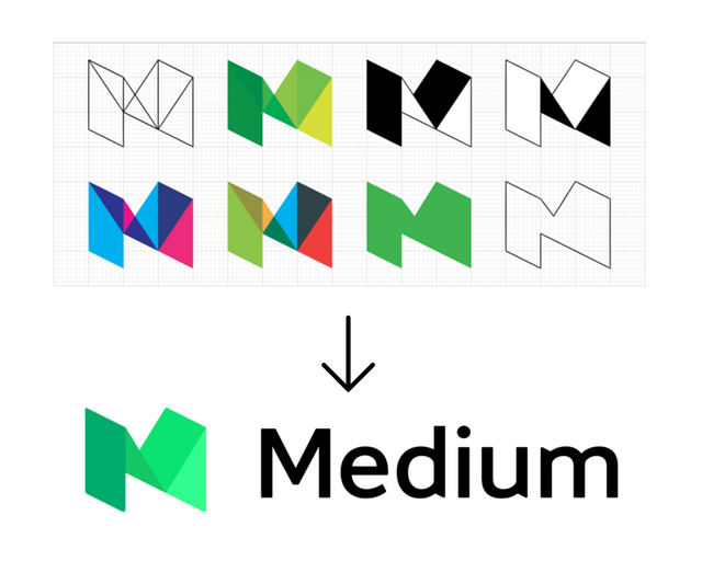
If you were to describe what minimalism was to a stranger, you would probably talk about a lack adornment in design, with a focus on functionality. You would probably also think of a neutral color palette of blacks, grays, and whites. It seems that the true spirit of minimalism–pared down, functional design elements–has been lost and, instead, replaced with boring black and white color schemes. I suspect this was done to make up for the lack of processing power and screen size on mobile devices. In 2017, that will all change. This is the year that minimalism, hopefully, gets its groove back. And that involves using a lot more color. Mobile devices are now just as powerful as computers and some even have better screens. One of my favorite minimalist-influenced designs would have to be Medium’s logo. They were able to include a bunch of different colors but still create a very minimalist logo.
Another logo redesign that influenced minimalism with color happened a few years ago with Google, who happens to be a catalyst for many of these new trends. They shaved a little bit off their typeface but also debuted a whole new “G” logo, which I am still a fan of.
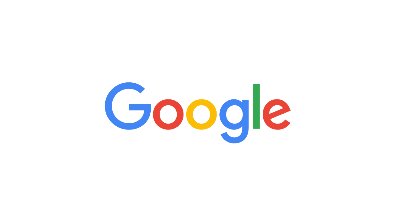
Everything about that screamed minimalist but there was not one mention of it in the press because true minimalism has been lost to the general public. Because it did not look like it was created before color was invented and only used one shape, it was not a minimalist logo. Instead, it was more colorful and popped off the page–but it was still a minimalist logo. And following that redesign, like so many things before, people followed Google’s lead. We have even started emulating a more minimalist style with our featured images for blogs.
The simple design clearly communicates the message of the graphic.
7. Useful GIFs
Everyone (well, almost everyone) loves GIFs. They are the perfect little conversation helper that expresses emotion when text won’t do the trick. Plus, they do not require any special software to run, usually have a small file size, and can be embedded just about anywhere. So they are better than videos and images, in most cases when loading time or data usage needs to be minimized. And I think that versatility is what will make them even better and more useful in 2017. One of my favorite ways to use GIFs is as featured images for your blog posts or article. Instead of using boring stock images, invest a few minutes of your time in creating a GIF
It does not have to be a work of art, but it definitely will draw attention to your post when shared on social media. One of the best examples of using a GIF as a blog header is this post on The Next Web
8. Duotones
Duotones are simply the combining of two colors on an image, usually using very bright or contrasting colors. They require a bit of design work but it is most definitely worth it.
Only a skilled designer can really create an amazing duotone. It is honestly past my skill level but that does not mean you should not include it in your 2017 design plans!
Spotify was one of the first to really push this type of design into all parts of their branding, and many other brands have followed their lead since. Like below:
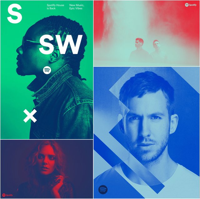
They have been able to use this approach to color to stand out in not only the streaming space but music in general. And you can use it in the same way for your industry! This bold use of contrasting color will also bring some originality into your design. And hopefully make it pop on the white backgrounds of the many social media sites.
Conclusion
The driving force of design this year is the rebellion of designers against the overly clean, white everything and almost too perfect aesthetic that the titans in the tech industry have pushed for the past few years. Now we will see design take a whole new approach to things they have been doing for so long. And it will be intense, innovative and beautiful. But I think that just like with other design trends in the past, most of the innovating will be done by the top tech companies like Spotify, Google and Apple. They are the ones that have the bandwidth, money and talent to test a bunch of ideas to see what works best. And that is great for us, because we can only use the winning ideas. I hope this article will guide you in taking on some new design challenges and getting ahead of your competitors.
By Ryan McCready.