How to read trading charts for crypto

If you’ve looked into trading cryptocurrency, you’ve probably seen lots and lots of charts. While it may not seem so glamorous to look at squiggly lines all day, learning to properly interpret the data displayed by cryptocurrency charts is critical to your success.
Many see charts as simply a way to relay cryptocurrency prices, but there is so much more to it. You need to know what you’re looking at before you can act based on them.
People who have experience in the stock market or forex trading will see lots of similarities in these charts, and many of the techniques and trends are the same. But many who are joining a crypto trading platform these days do not have previous experience in other markets.
For this reason, we thought we would break down some of the basics and some of the key differences when reading trading charts for crypto.
Types of charts

Most importantly, you’re going to want to know exactly what type of chart you are looking at. Each one gives a different type of view and exposes different information and trends.
Line chart
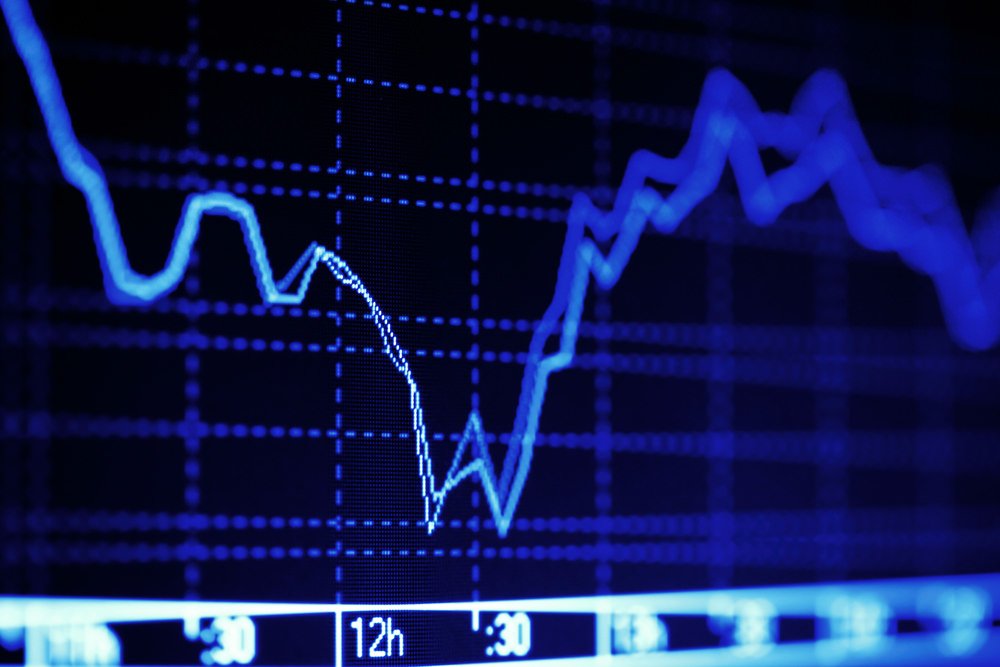
The simplest form of a trading chart is the line chart. This is a simple plot of the price (or market cap) over time. Zooming becomes critical here, because you can often tweak the zoom in or out to support a certain conclusion. Zooming is your friend here because it can help you properly identify trendlines.
Trendlines have to do with the overall slope of a given chart line. While there may be daily or weekly volatility (many peaks and valleys,) the overall trend line shows the longer term direction that a price is heading.
But zooming in and out can change the trendline drastically, and give you a false sense of things. For instance, a week view might show a sharp downward trend, but zooming out to a year might show a steady upward trend. Make sure you using zooming properly when using a line chart, as it’s critical to successfully reading this type of chart.
Learn to visualize trendlines, and make sure that you are always checking those trendlines against current events and news about the market. There might be a long-term upward trend, but a newsworthy event triggers a long-term slide. Neither the chart alone nor the news alone gives you enough information.
Candlestick chart

This type of chart takes things a step further, and instead of simply plotting the price versus the timeline, it looks at the performance over a given set period of time. The most popular is the daily candlestick chart.
Instead of a simple line, each day is given a bar where the thick part of the bar represents the opening and closing price, and the thin lines above and below it represent the daily high/low. This goes for whatever other time periods the candlestick chart uses (hour, minute, week, etc.).
Each segment of the graph is color-coded, green if the price went up on a given day and red if it dropped. For green bars, the top of the bar is the closing price and the bottom is the opening price. For red bars, it’s vice-versa.
While trendlines can still be gleaned from this type of chart, more often a support or resistance line or band is used to predict future behavior. The difficult part of trading successfully is often learning how to predict this support/resistance level.
The support level is a price where you believe it’s low enough that it will cause entry into the marketplace or for people to buy it. There might be a round number that you see as a mental barrier, or some known value correlation. On the resistance side, it’s a high price where you believe the benefit of selling outweighs the benefit of holding.
Drawing a support and resistance line across a candlestick chart can help you predict where things might go next, although doing this successfully is very difficult and not a beginner skill. Even the most successful and experienced traders don’t always get it right.
Chart signals to look for

There are many different patterns to look for, and many of these follow the same patterns as more traditional stock market charts. For example, there are several key candlestick patterns that will predict either a short-term rise or fall with a high degree of accuracy.
One example is the ‘three (red) strike’ pattern. This carves out three significant downward trending lines within a longer downtrend. This can predict a subsequent rise in price with an 84% accuracy rate.
For line trends, there are different patterns to look for. By learning these patterns, you can predict future trends with better accuracy. It is important to remember, however, that no pattern is a guarantee - it simply gives you a statistical probability of something happening.
There are many complex line chart patterns to become familiar with, but one to highlight how they work is the ‘triple bottom.’ This is where a long downward trend gives way to three distinct rises and falls back to the bottom of the market. This usually predicts a breakout rise from after the third bottom.
Trading volume and market cap
Many charts will overlay trading volume or market cap with the price or candlestick chart, and this is helpful additional information to see how people are interacting with the asset.
Large volumes are often associated with big losses or gains, or periods of great volatility. But as a rule, watching volume helps you see how important the trends are which create the patterns in the chart. The more volume, the more important the patterns become.
Cryptocurrency differences

While typical financial charts are based on fiat currency/asset pairings, pairings in cryptocurrency charts can vary widely. You might be looking at the bitcoin exchange rate versus a fiat currency like USD, or you might look at it paired with Ethereum instead. In this way, reading bitcoin price charts is more like forex trading, where you compare currencies that might have separate forces pushing them up or down.
The volatility and novelty of cryptocurrency markets means that they are less likely than more established assets to follow established patterns. This means you should take extra caution before you enter the market, and don’t blindly trust patterns.
As always, before you exchange bitcoin you should make sure you aren’t investing more than you can afford to lose to help take emotion out of it.
Ultimately, the data contained in charts and the information in the news are all you need to make informed trading decisions. Just know that you’ll win some and lose some, and just keep working on learning how to better read crypto trading charts.