Are Candlestick Charts Useless?
I've heard many traders state that time-based candlestick charts are useless. 'Why does a 30min chart have more significance than a 45min chart', for example. 'You should use tick-base charts to filter the noise', and so on.
On standard, time-based candlestick charts it's true that you're slicing the market into neat, yet arbitrary intervals.
Many order-flow and price ladder enthusiasts will often say that candlestick charts are pointless, full-stop. These are traders who only operate off of a price ladder and perhaps only using a market profile to make trading decision.
The problem with people painting in these broad strokes, is that that fail to take trading style into account. Not everyone trades in the same way nor use the same tools.
What's Wrong With Candlesticks?
To be clear, I'm talking about traditional, time-based candlesticks. An example being a 1 hour chart, where each candle represents 1 hour of trade.
There may be a delay from your broker
This is a fairly obvious drawback of candlesticks. If you use the open and close prices of them, a 30 second delay could mean that the candles look different.
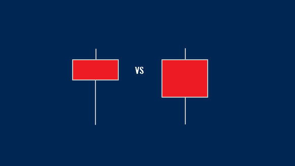
If you are a 'traditional' price action trader using basic candlestick patterns, the close price can be integral in your execution. Let's look at the pinbar pattern as an example:
For trader A, the candle on the left may be interpreted as a bullish pinbar, with price action traders preparing to get long the market. Trader B however, is seeing the candle on the right, his broker's hourly candle closed just fractionally before trader A's.
This, in turn, can effect the open price of the next candle and end up being a vicious cycle.
Trading price action patterns in a fast market can have this occupational hazard. Perhaps this is why the traditional price action traders will often advise trading higher timeframes.
What if you use trendlines?
Good question. Let's start with an example.
Click to enlarge
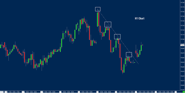
In the picture above, we see an hourly chart with with a trendline drawn. To nearly everyone's eye, the trendline is undeniable. It probably fits most traders' rules for them (if they have rules for them).
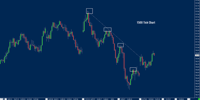
The trouble arises when traders use alternative charts. A 1500 tick chart of the same market is roughly equivalent to the hourly timeframe. What if you try to draw the same trendline on there?
Click to enlarge
As we can see, the exact same highs in price simply do not connect in the same way. Are trendlines useless? Are the charts useless?
Neither. They simply aren't the same.
I believe trendlines to be an analysis technique which works simply because people notice it. Ie. They are created as a purely visual pattern, rather than as an element of the supply and demand of markets like horizontal support and resistance.
They're arbitrary
Price is the only thing that matters right? So why don't you just track price movement, instead of putting it into time-based chunks? Use range charts instead.
You can definitely do this if it suits you.
What Are The Alternatives?
There are a few commonly used alternatives to your classic, time-based candlestick chart. Here are a few of them:
Point and Figure
A charting style which can be traced back to 1898, spoken about by an anonymous author who wrote 'The Game in Wall Street and How to Successfully Play It'. This method is a quasi mix of volatility and reversal.
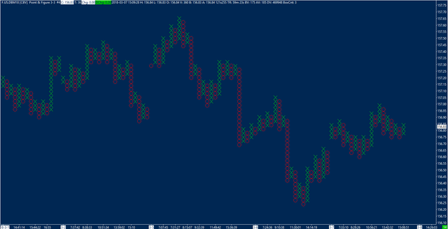
The X's and O's represent upwards or downwards movement and each shows 3 ticks of price (in this example).
Click image to enlarge
If we have just formed a column of X's (as shown on the hard right of the chart), in order to now create a column of X's we must move down by 9 ticks. To form another X on top of this column, we only need to move up 3 ticks.
This is what as known as a 3-3 Point and Figure Chart. Each 'box' is 3 ticks and we need 3 boxes to reverse the letter (note that no column has less than 3 letters).
There are many tradeable patterns on these charts, similar to candlesticks, such as breakouts and retests, fakeouts, trendlines etc.
Renko and Kagi charts are very similar to the traditional Point and Figure.
Tick charts
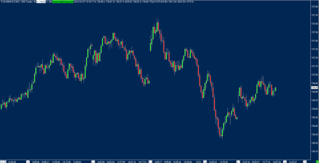
While these appear to be candlesticks to the naked eye, they are in fact based off of ticks. Another name for a tick in this instance is a trade. The following example shows a 1200 tick chart. 1 tick is 1 transaction. Once a candle has reached 1200 trades, a new candle is formed.
Click to enlarge
These have the advantage of compressing the candles when the market isn't moving. Usually, in the market shown, the last couple of hours per day have tiny ranges. Due to the lack of real orders going through, this doesn't effect the tick chart.
Volume charts are a very similar style of charting.
Range Chart
This chart format is based purely off of price movement. Each candle represents an 8 tick range. No new candles will form unless either the range high or low is broken. Because of this, these candles always close at either their low or high.
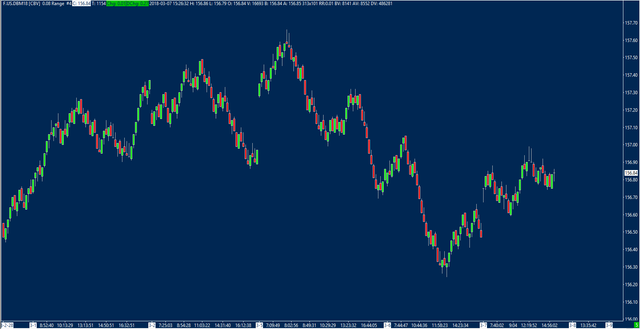
Click to enlarge
Similarly to tick charts, they have the advantage of compressing 'noise' data during quieter periods. When price isn't moving much, time charts can show tiny candlesticks, range charts make sure every candle is the same size.
What Are The Drawbacks Of Nonlinear Charts?
The main crux of these charts is the lack of standardisation.
Time is a standard between everyone (save for possibly 4 hour charts). The hour ends at the same time everywhere. There is consensus on the New York close of the Daily candlestick.
With ranges and ticks and volume, everyone makes up their own amount. It varies heavily between person and per market.
There is no comparison between a Bund 1-range chart and a Crude Oil 1-range chart. Crude Oil would be printing bars at a much much quicker rate than Bund.
Volatility changes
2 ticks in today's market isn't necessarily the same as 2 ticks in next months market.
The average range of markets changes over time. Therefore, you need to change the amount of ticks or the size of the range and X's and O's. Keeping it the same over big swings in volatility is akin to changing timeframe, either higher when markets move less, or lower when markets move more.
So Why Use Time-Based Candlesticks?
Speed kills
Time-based Candlesticks show price velocity. That's important. Sometimes price movement alone isn't too important if we don't know the speed in which it made the move.
If you trade retests of breakout areas, the velocity of the breakout matters. On an hourly chart you can see that the breakout happened, in full, within an hour. On a nonlinear chart you don't have that luxury.
You could get to the charts and see a breakout, but you don't know that it took 4 hours to do so. Any weak hands who are trapped may have gotten out by then.
Low volatility markets can be deceiving
We've all heard of the drift of death.
Guess what? This drift can't be spotted on charts which aren't time-based.
On the other hand, a high volatility market can spray out a great quantity of candles on a range or tick chart. When the markets kick into gear, you suddenly find that candles are appearing non-stop. This can have negative effects on your decision making, and cause your trading to lack the standardisation that time-based charts afford you.
At the end of the day, candlesticks of any type, shape or inner working are merely tools to use in your overall edge. As long as you understand what they are and what they can tell you, any will be fine.
My preference is for time-based but I have seen success in the past, with a similar style, using range charts. They all will convey the same information as long as you understand how to interpret it.
Thanks for reading, don't forget to subscribe below if you haven't already!
Posted from my blog with SteemPress : https://www.tradingprobability.com/are-candlestick-charts-useless/
Good quality written article.
Question: Wouldn't current crypto market considered too volatile to be considering using these tool?
As more often than not there are actually "whales" that are manipulating the markets, and definitely they're not really following the candlestick etc.
Thank you for reading and commenting!
I firmly believe that you can analyse all markets. However, you're right in that crypto is easier to manipulate (due to the distribution of wealth in the crypto space). Another thing worth noting is that crypto has only jsut become a two-way market (with most individuals still net-long), which may distort the market mechanism somewhat.