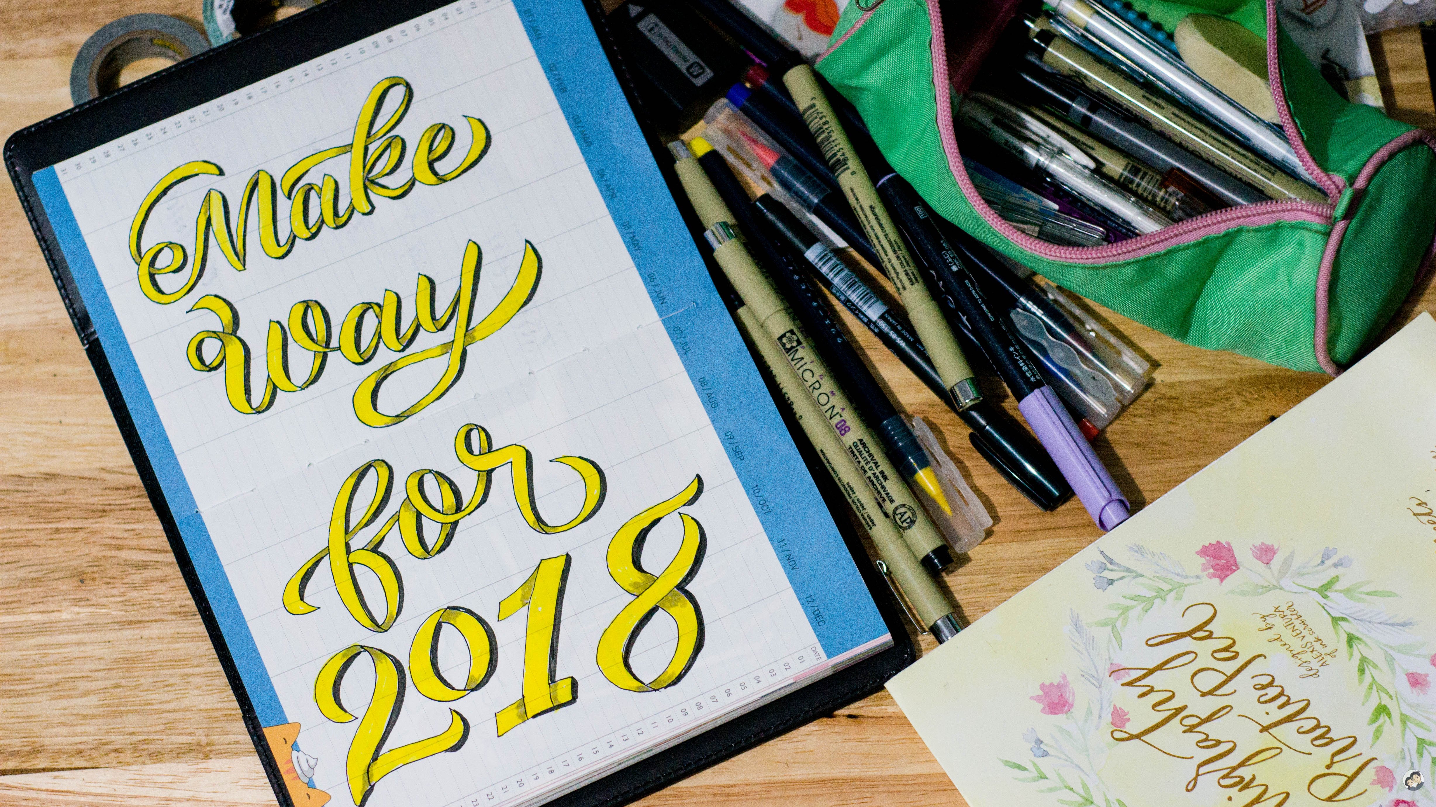
Faux Calligraphy/Typography Series | Make Way for 2018
Disclaimer: I changed this series name into Faux Calligraphy/Typography because there are entries which are more of a typography type than calligraphy.
Make Way for 2018
I know it's a late one, about a week now but I would still want to share this here in steemit. This blog will show how I usually make these type of typography, step by step from scratch. Before that, let me list down the items I used to create this piece:
- Tom n Toms 2018 Planner (gift from a friend)
- Econ 0.7 Faber Castell refillable pencil
- Sakura Pigma Micron 0.4mm line
- Tokyo Finds Pro Blend yellow water brush pen
- Kuretake brush pen in purple
- Eraser

I usually start with sketching the letters, making sure that the width of each letter may it be in upper or lower case are consistent but I am also not afraid of having mistakes, the inconsistency sometimes makes the piece interesting.
Here I used the Faber Castell refillable pencil which is very light and can be easily erased. In certain pieces, I make a sketch but ended up not following the lines so it would just depend on my mood!
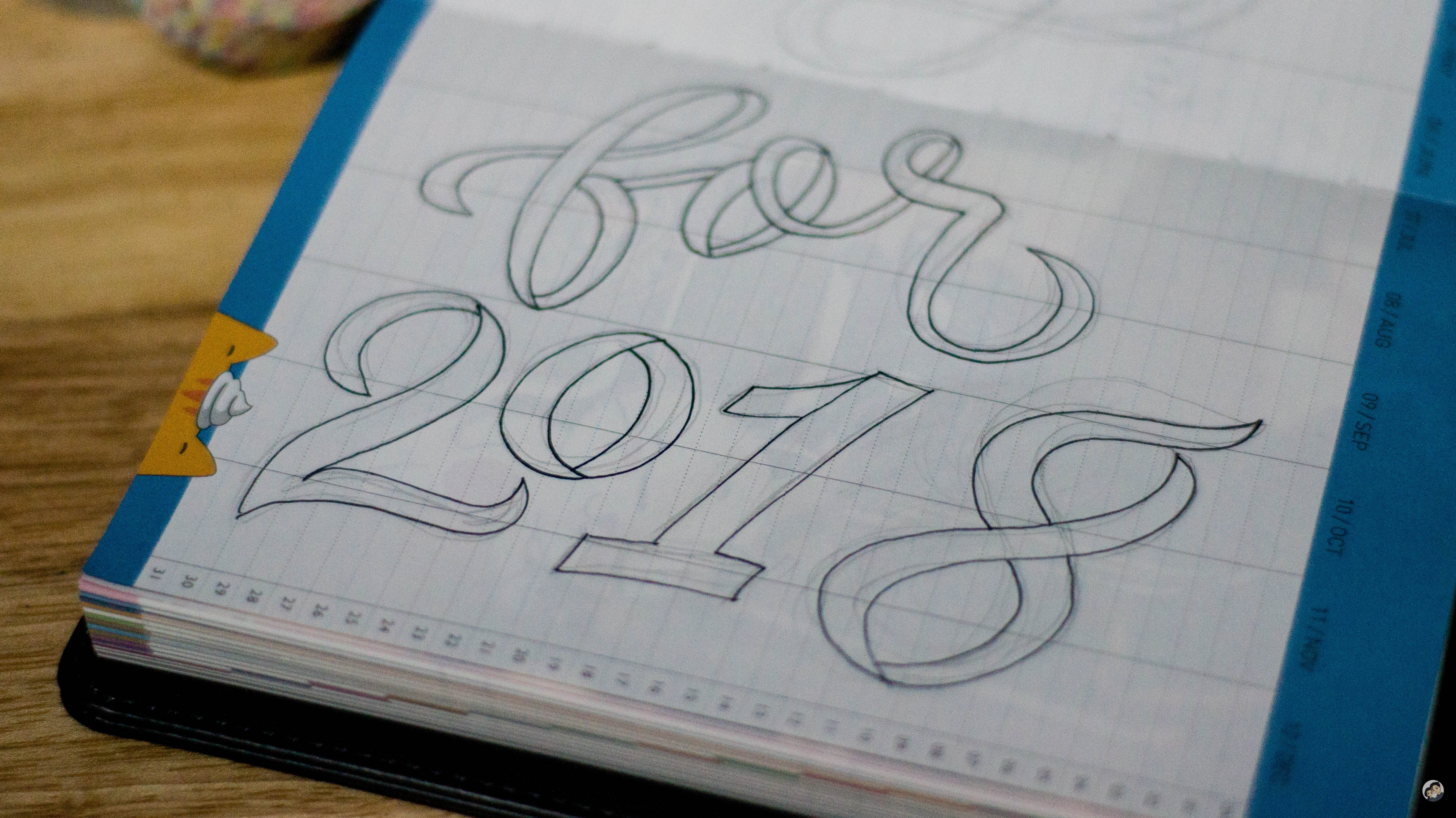
Then I trace it with a Sakura Pigma Micron 0.04mm pen which is the same pen I used for the shadow although I think I used a bigger point for that case, I can't remember though, the important thing is that I have used pigma for tracing. It won't create any blotch so it is safe for tracing.
It takes awhile to fill everything but I am already a bit used to this so I could do it in less than ten minutes.

Now, filling up the color of each letter. I used the yellow Tokyo Finds water brush pen. This needs water if I wanted a lighter yellow shade but I just ditched the water idea and continued with using its own ink. I had this for quite awhile and it still has a lot of ink in it! I bought it in FullyBooked Ayala Cebu branch.

Depending on the design I wanted, I add anything which I think would help with the font style. However, most of the time, I would make mistakes and in this one, I had made a lot but I truly believe you won't notice it, let me know if you can spot the mistakes.
This is actually the beauty of Typography or even Calligraphy itself, let me borrow sir @surpassinggoogle's line:
FLAWS ACCEPTED!
Here, I used the Kuretake brush pen, although it has a purple shade, it turned into something gray-ish when I applied it in the yellow canvas.

And now, my favorite part - shadows!
I enjoy adding them in my pieces because it emphasizes the texts and even hides all the flaws. Again, there are still flaws in the shadows too but its negligible, at least for me. I hope!
I used the Sakura Pigma Micron again in this part. I consider that set as a favorite ever since I got my hands on it. It includes a brush pen too which has no more ink. I used it up way before the rest.
And the final result....

I was really glad that the planner's paper page was able to hold the ink from the water brush to the shadow pens.
Let me greet each one again a Happy New Year! Welcome 2018!

| Please support @surpassinggoogle as a witness by voting him at https://steemit.com/~witnesses and type in "steemgigs" at the first search box. |
| If you want to give him witness voting decisions on your behalf, visit https://steemit.com/~witnesses again and type in "surpassinggoogle" in the second box as a proxy. |
Waaaaah talented ka talaga Mam 😭🙌🏻
Ang galing mo talaga, sis Jean <3
thanks sis
Wow nice ate!!!
matsalams dai!
So nice @junebride! As always, your works are astonishing! ♥
thanks cheli!
Always nice! Mapa travel, photography and arts. Good job @junebride proud brother here.
slamat kuya!