The Alliance : Logo Launch
Sometime on Monday I remembered there was an Alliance meeting so I hustled to check and sure enough it was still going. After being recently accepted back into the fold, after my moment of madness, not that I ever really left. I felt I needed to show my love and appreciation to the group with a grand gesture.
For me that was in the form of establishing The Alliance brand.
Branding
I don't know if other people think about branding, but I do. It is something I am keenly aware of everywhere I look. For me a company's logo sets the tone or gives a glimpse of what the company or organisation is about.
But first, what does The Alliance mean to me.
@TheAlliance is a group of people who are fiercely supportive. I have been the beneficiary of said support numerous times and continuously since I became a member.
They're the ninja invasion on my posts giving me love and support.
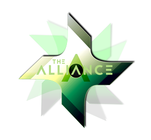
With that in mind I drafted this logo. The top represented the T for "The" and the arrows represented the A for "Alliance". It also looks like an upvote with fangs.. someone said claws.. it just looks like a mean upvote and that was the feel I was going for.
I also didn't want to go with my usual round logo and I wanted something unique and utilise the new day and night modes.

But upon further discussions with @enginewitty and considering the running theme..
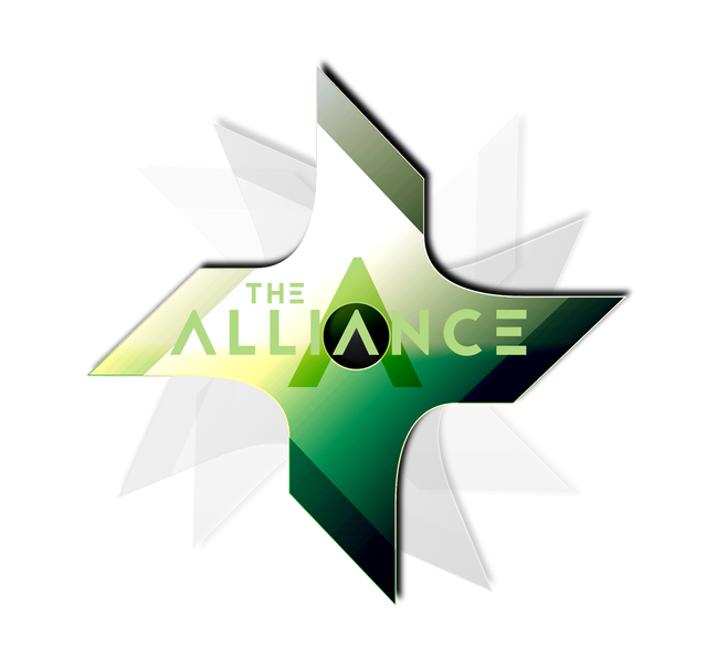
I came up with a new logo, something that fits the group better than my killer upvote idea.
This is the process or birth of the logo.
Step 01. Search for 'Ninja Star' on PixaBay.
I like this one. It was simple and I like the shiny effect to it like its metal.

Step 02. Duplicate twice so there are 3 copies of the Ninja Star.
Step 03. Take one Ninja Star and edit Hue & Saturation so instead of a silver star I have a golden star.
Step 04. Create a circle shape to cover the hole in the star and place that layer underneath the top star layer.
Step 05. Rotate the two duplicate stars and this is what we have.

Step 06. Add gradient to the golden star. I like green.

Step 07. Select a font for the writing. I like 'Jaapokki Subtract'
Step 08. Add a big A for Alliance and position it over the circle.
Step 09. Add the account name and BOOM!
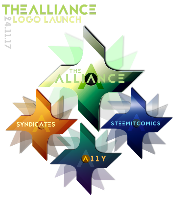
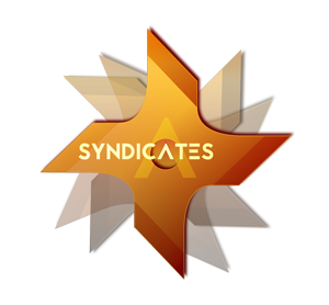
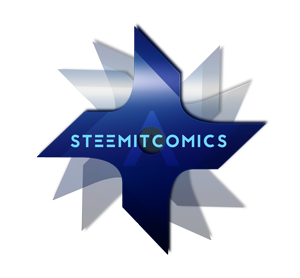
I wanted people to recognise The Alliance logo when they see it and know this project/account is an Alliance initiative so...
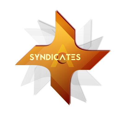
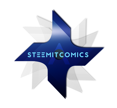
I duplicate the finished logo (I keep all my layers in folders to make this process easy) and repeat Steps 6 to 9 and came up with these for the other accounts so we have a unified and instantly recognisable logo. The account identities are defined by colours.
I'm stuck on the @a11y colour at the moment. Maybe you guys can weigh in and let me know your thoughts? I'm sort of leaning towards the last one with the blue, green and gold. It feels like its a combination of @thealliance, @syndicates and @steemitcomic.


These logos are also transparent and looks awesome on both day and night mode if I say so myself. Go on, have a look!
And of course I have variations, but I'm not sure if it takes away from the unified look of the ones above.

What do you guys think?
💗Arly

NOM NOM NOMMITYfuknNOM!
Love it doll, already apllied ;)
I see!!! It looks cool! But little. I may need to adjust the size so the icon looks bigger.
This is really amazing dear. Such a great job you have done 😉 creative. You are amazing 🤗 so happy your back in.
hey honey!!! Thank you so much. I'm happy I'm back too lol I thought youd be fast asleep by now <3
Hey you are so welcome 😊 doing such a great job and I love your designs...
Ahh yes it's middle of the night here so yes I should really be in bed now😁😁hahaha
And yet here I am.
I wish you a great Thursday evening or Friday morning... Lol 💕 stay Awsome!
Have a great night beautiful! lol I hope you're in bed now catching ZzzZs
Hey darling, I was in bed zzz zzz... Lol
I hope you are having a fab weekend.
Cheers! 💕
That shiny green ninja star is awesome! Excellent job @bearone!
Cheers bmj!! Digging the green lately.
They look awesome, you have some real skills there and it's great to see how the process comes along.
Thanks heaps @Phelimint 💚 I was surprised at how well they turned out 😊 Next time I'll remember to do the progress shots as I make it. It was kinda a last minute thing lol
I absolutely love these. I know I got a sneak peek but like seriously. It was a great thought and the execution was just amazing. Love them. If I ever need a really cool brand (outside of my current one) I tell you, I am gonna hit you up.
Aww thanks hun!! So glad you like them! I really like them too! Love how its not cookie cutter and stands apart from the rest. 😊 Hit me up!! You know I gots you.
The colored shadows looks really neat too, I like them all :) Well done.
Cheers @enginewitty I'm glad like them! It looks very ninja on @thealliance 😊
Ninjas rule baby!
BEEPBEEPBOOPBEEPBOOP wikkid awesome.
hahah i see you! though, do you think its too dark in night mode?
Looks pretty good on me!
this one looks wayy better than the @a11y one
Really pretty shurikens :D The spinny bit behind them is a nice touch, gives it some dynamic.
That steemitcomics one threw a bit of a spanner into your pattern didn't it :D Is it possible to run one word along each axis and cross them on the I in the centre where your As for the rest of them are or would that upset balance too much?
They look awesome anyway, would use if I was in this scary sounding ninja clan XD
Cheers Ry!! Ohh you saw that eh? It drove me bonkers and I've tried the other variations.. on top of that the blue sheen isnt shiny enough, if you know what I mean. It might get fixed....
hahah were not scary at all :D