How Colors Affect Your Website’s Conversion?
How much thought do you put into your web design? You spend time planning the layout, all the pages and posts. Then comes the difficult task of putting the color in. How do you decide what is best for your industry or niche?
Color has a powerful psychological influence on the human brain. It also has a long history from McDonald’s, “Make you feel Hungry”, red and yellow, to Pepsi’s, “All American you-can-trust-us for a good time”, everybody is making choices every day based on color and perception in marketing design.
Web design is no exception. Studies have shown that not only the site structure but also the colors and combinations of patterns affect consumer behavior. As a website owner, it definitely pays to know how colors impact the visitors of your website.
What is color psychology?
Image Source
Color psychology is the science of how color affects human behavior. Color psychology is a branch of the broader field of behavioral psychology. Some studies are dismissive towards color psychology, due to the difficulty of testing. Nevertheless, we can all agree that proven or not color in one way or another affects user’s perception.
There are essential facts of color theory that are indisputable. Study by Satyendra Singh determined that it takes a mere 90 seconds for a customer to form an opinion about a product. And, 62-90% of that interaction is determined by the color of the product alone.
Color psychology is a must-study field for leaders, office managers, architects, gardeners, chefs, product designers, packaging designers, store owners, and even expectant parents painting the nursery for the new arrival! Colors are crucial and our success depends on how we use them.
Color tips that will improve your conversions
Since color is ubiquitous, we need to understand where you should use these color tips. This blog post discusses the use of color in website design. Specifically, we’re talking about the color scheme of a website, which includes the headline type, borders, backgrounds, buttons, and popups.
When choosing colors for your website’s logo and design, you need to keep in mind the type of business you are conducting as well as your target audience. For example, studies show that women don’t like gray, orange, and brown, they prefer blue, purple, and green.
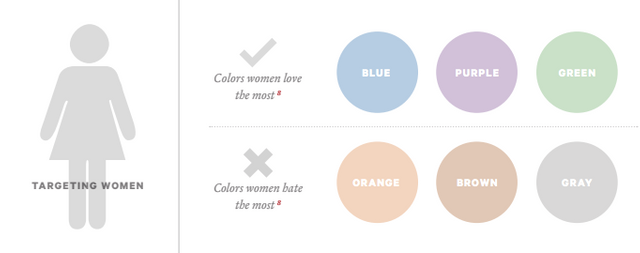
Image Source
Sociological differences between color preferences is a whole branch of study unto. Neil Patel got it right when he cited the colors preferred, and disliked, by the two genders. In a survey on color and gender, women said blue was their favorite color, followed by purple and green. Most women agreed that orange was their least favorite color, followed by brown and gray.
Other studies have corroborated these findings, revealing a female aversion to earthy tones, and a preference for primary colors with tints. Look at how this is played out. Visit nearly any e-commerce site whose target audience is female, and you’ll find these female color preferences affirmed.
Most people think that the universally-loved female color is pink. It’s not. Just a small percentage of women choose pink as their favorite color. Thus, while pink may suggest femininity in color psychology, this doesn’t mean that pink is appealing to all women, or even most women. Use colors other than pink — like blue, purple, and green — and you may improve the appeal of your e-commerce website to female visitors. And that may, in turn, improve conversions.
On the other hand, men don’t like purple, orange, and brown. Men like blue, green, and black.
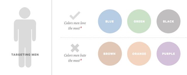
Image Source
These colors — blue, green, and black — are usually associated with maleness. However, it comes as a slight surprise to some that brown isn’t a favorite pick.
Use blue to build user’s trust
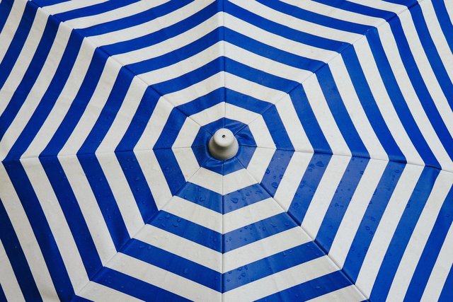
Image Source
Blue is one of the most-used colors, with good reason – both females and males like blue.
There is wide agreement in the research community on the psychological effects of the color blue. Blue is a color of trust, peace, order, and loyalty. You can use this to your advantage on your website and landing pages. The design of world’s biggest social network contains blue too!
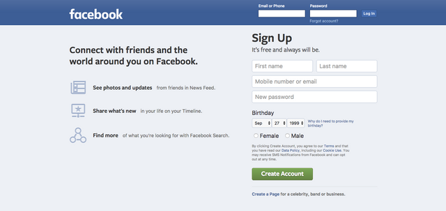
For a company whose core values are transparency and trust, this probably is not an accident.
A company that serves as a conduit for billions of dollars, PayPal, also prefers the color blue.
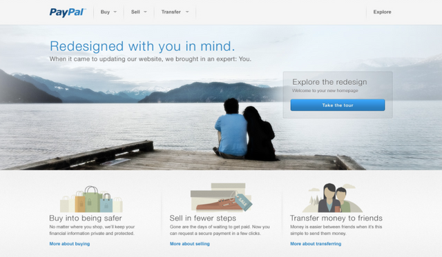
Chances are, this helps to improve their trustworthiness. If they were to try, say, red or orange as the theme color and branding, they probably wouldn’t have the same level of conversion.
Although blue is pretty much an all-round great color, it should never be used for anything related to food. Dietitians have used blue plates to prevent their clients from eating more.
Yellow is for warnings

Image Source
Yellow is a color of warning. Hence, the color yellow is used for warning signs, traffic signals, and wet floor signs.

Image Source
Yellow can also mean and encourage playfulness. Since yellow stimulates the brain’s excitement center, the feeling of playfulness may be a state of heightened emotion and response. Moreover, it is said that the right yellow will lift our spirits and our self-esteem; it is the color of confidence and optimism. Too much of it, or the wrong tone in relation to the other tones in a color scheme, can cause self-esteem to plummet, giving rise to fear and anxiety. Thus, yellow can be used for attracting attention/warning and lifting spirits.
Green is ideal for environmental and outdoor products

Image Source
Perhaps the most intuitive color connection is green — the color of outdoors, eco-friendliness and the environment. Green essentially is a symbol for nature itself. Apart from its fairly obvious outdoorsy suggestiveness, green can improve creativity. Labeled “the green effect”, a study indicated that participants had more bursts of creativity when presented with a flash of green color as opposed to any other color.
The word “green” itself is a buzzword for environmental awareness and appreciation. Using the word and the color itself can lend an environmental aura to your website, improving your reputation among those who are concerned about the environment.
Orange is a fun color that can create a sense of haste or impulse

Image Source
The positive side of orange is that it can be used as the “fun” color. According to some, orange helps to “stimulate physical activity, competition, and confidence”. This may be why orange is heavily used by sports teams and in children’s products.
Amazon.com uses orange in their “limited time offer” banner. The color suggests urgency, which makes the message more noticeable and actionable.
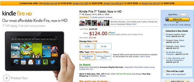
However, orange can be slightly overwhelming. We advise, that orange should be used sparingly to bring your attention to something, but not so much as to overwhelm the actual message of the advert.
Black adds a sense of luxury and value

Image Source
The darker the tone, the more luxurious it is, says our internal color recognition. Black is described as “elegance, sophistication, power,” which is exactly what luxury designers and high-end e-commerce sites want you to feel. Moreover, black can be used as the color of “timeless, classic” which helps further explain the use of black in high-value products.
Louis Vuitton handbags are not cheap. Therefore, colors and designs of whimsy and fun are absent from the website.
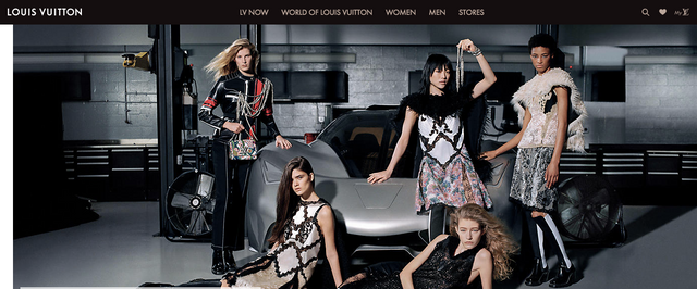
If you are selling high-value luxury consumer items on your website, black probably would be a good choice.
Don’t neglect white
Color white can easily be overlooked, maybe that’s because color theorists can’t agree on whether white is a color or not. In web design that doesn’t really make a difference, the plentiful use of white space is a powerful design feature. Take, for example, the most popular website in the world. It’s basically all white!
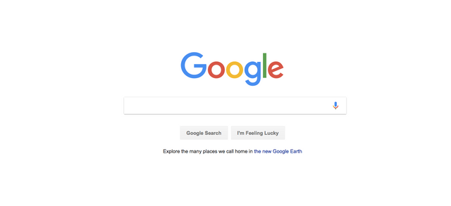
White is often forgotten because its primary use is as a background color. Most well-designed websites today use plenty of white space in order to create a sense of freedom, spaciousness, and breathability.
Conclusion
The Internet is a colorful place, and there is a lot that can be accomplished by using color in the right way, at the right time, with the right audience, and for the right purpose. The highest-converting colors for calls-to-action are bright primary and secondary colors – red, green, orange, yellow. Darker colors like black, dark gray, brown, or purple have very low conversion rates, but they give a strong sense of exclusivity. So, the bottom line is: use the right colors, and you win!
A beautiful and detailed article. So that the color composition also harmonizes, I can only recommend Adobe Color. This allows up to five colours to be identified and the colour values to be easily extracted.