The Story Behind the Logo of Smartphone Companies
a company certainly has a value or philosophy that is held firm. This also used to smartphone company.
Not only written values, such philosophy is also often poured in the form of logos. Therefore, no wonder the logo is often a representation of the company and easily known to many people.
However, many people didn't know the meaning and the story behind the logo of the famous smartphone company. For those of you who are curious, here is the story behind the logo of some of the world's smartphone companies.
1. Samsung
/https%3A%2F%2Fblueprint-api-production.s3.amazonaws.com%2Fuploads%2Fcard%2Fimage%2F198911%2FGettyImages-158208911.jpg)
Samsung, which means 'three star' in Korean actually has several times changed the logo. Before using the latest logo, the company always inserted a three star icon in its logo.
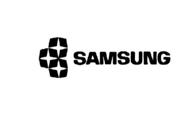
The founder of Samsung / CEO, Lee Byung Chull chose the name on hope that Samsung can grow strong and everlasting like a star in the sky. The third number is chosen because it describes something big and strong.
While the new Samsung logo used after 1992 to now, Samsung look more highlight the name. But from this logo, this company shows ambition to be the center of attention in the universe and not just a star.
2. Apple
Admittedly, the story surrounding the background of the phenomenal Apple logo has many versions. In fact, the bite image on the apple that appears on the logo has a variety of stories behind it.
However, the designer Rob Janoff said, the bitten apple image was deliberately made to make it different from other fruits of similar shape.
"I want to make an apple silhouette, but to make it clear like apples and not other fruits, I do the things other people do, biting them," he says.
3. Xiaomi
This Chinese-origin company just put "Mi" word in the logo. The decision was not in line with the company's plan to penetrate the international market.
Mi logo itself means 'Mobile Internet' and can be interpreted also as another 'Mission Impossible'. The word was chosen because Xiaomi faced many challenges at the beginning of his establishment.
On the other hand, this logo also makes it easier to say by many people. For your information, Xiaomi alone in Mandarin is pronounced as 'Shao-Mi'.
4. Asus
![]()
Asus actually took the name of the Greek mythological characters. "Asus" is abbreviation from "Pegasus", a winged horse that is also a symbol of wisdom and knowledge.
The name was also implemented in the company logo. The Asus logo clearly illustrates the spirit of the company to become stronger, growing, and responsible to consumers.
5. Huawei
![]()
Huawei logo also describes the meaning of the name consisting of two syllables, namely Hua and Wei. Hua means petals or majesty, while Wei means proud achievement.
In other words, the company becomes big as a blossom. The philosophy was also described in the form of flower petals that expands.