How the Malaysian Ministry of Tourism and Culture Handled it's UGLIEST Logo.
You might have seen this logo floating around the internet, seeing how thousands of netizens have commented on how dreadfully ugly the OFFICIAL 'Visit Malaysia 2020' logo looks. For those of you who don't know, recently the Malysian Ministry of Tourism and Culture launched it's official Tourism Malaysia 2020 logo on Friday at the ASEAN Tourism Forum (ATF) 2018 at Chiang Mai, Thailand. It's launch stoked the fires for an outburst of dissatisfaction from netizens online, who criticized the logo as being 'cheap' and 'backwards'. There was even an online petition, signed by almost 12 000 people for them to stop using the logo and re-design it (link given below).
Here it is, the one and only.
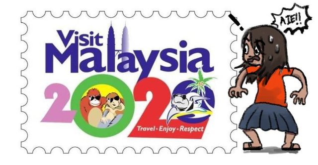
credits to the Malaysian Tourism Board.
As an artist- Actually wait, anyone with eyes can tell that there is something wrong with the design of this. Any normal person who sees this would be able to tell! Because they slowly get more uncomfortable the longer they look at it.
Why is it bad?
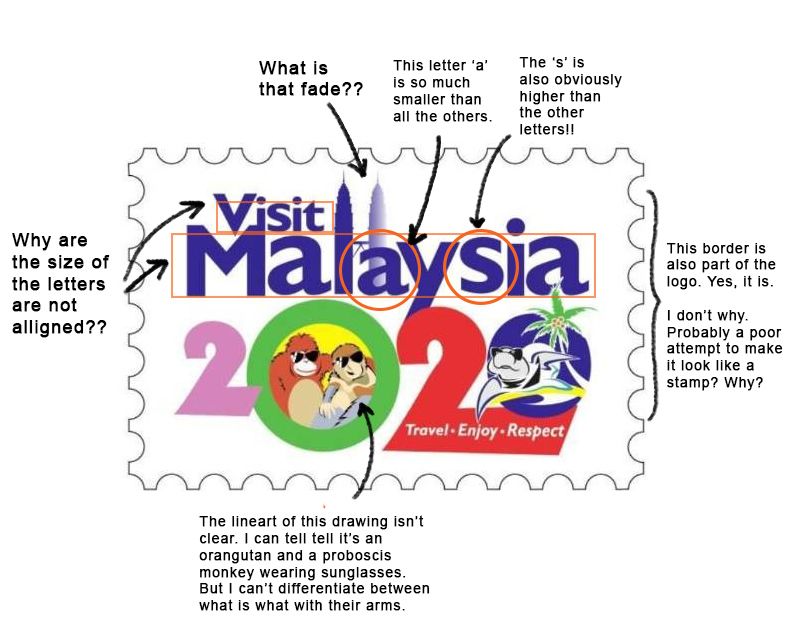
This logo made me wonder... what year did they make this logo? What tool did they use? Why would they approve of this?
Here's another explanation made by Graphic Lab Malaysia. (Sorry it's in Malay!)

Source : http://www.rojakdaily.com/lifestyle/article/4367/what-do-creative-professionals-think-about-the-visit-malaysia-2020-logo-we-ask-them
Tourism Malaysia didn't always have terrible looking logos.
Actually, we had a pretty good long line of beautiful logos throughout the years, as you can see below.
This is our 2015 logo.

Source : https://www.tourism.gov.my/campaigns/view/visit-malaysia-year
This is another logo from 2014, with 'Malaysia Truly Asia', our tagline.
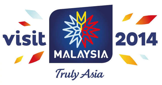
Source : http://www.publicis.com.my/news/details/tourism-malaysia-appoints-advertising-agencies-for-2015-2017/
So they have made good logos before... what happened that changed that? Obviously the designer who made the 2020 logo had a legacy to live up to, so what made them decide to design the 2020 logo like it is?
Malaysia also needs to compete with the other countries.
Another important question is how this effects our image when compared to other countries. Because this logo is going to be advertised everywhere. What is the rest of the world going to expect from Malaysia when the logo looks as what it is? A logo is a brand, an identity. If not represented well, a brand name can easily become ridiculed by the public.
“A logo should have five basic principles: simple, memorable, versatile, appropriate and timeless. I didn't see any of the basic principle in the ‘Visit Malaysia 2020’ logo. If your logo looks amateurish, how will your business be?” said Nadzrin Zariffuddin, Creative Director and Brand Consultant of Graphic LAB Malaysia.
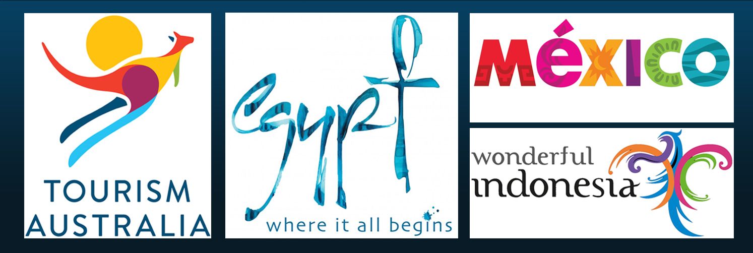
Look at the logos from all over the world! Beautiful, modern, and gracefully represented.
Graphic Designers All Over The Country Came Up With Their Own Version of The Logo!
What a beautiful thing to see. Sure, people all over the country can agree on something, but not only that, they also came up with their own logos. ( All credits goes to the original artists : https://www.facebook.com/aqilosman93/posts/1532425286870955?pnref=story)

by atiraariffyn

by ahmadfazrin

by muhdhiddaytullah.com

by nazhif tarzimi
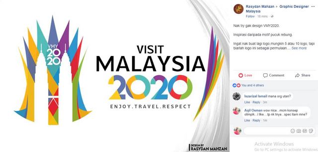
by rasydan mahzan

by ARTez Designs
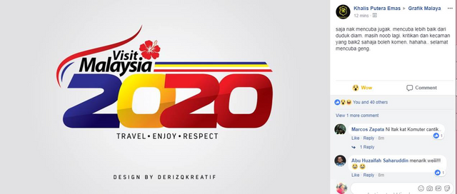
by DERIZQKREATIF

by RAHSIA DESIGN

by Mohd A'am
It was so amazing to see what the local talent pool had in store for us. It speaks so highly of what hidden talent we had among the community. But it was sad to see that the Tourism Minister did not pluck one among the people to design the logo for them. It only says so much of how the art industry is being treated.
Tourism Malaysia defended the 'hideous' logo
'KUALA LUMPUR: Tourism Minister Datuk Seri Nazri Aziz today defended the new Visit Malaysia Year 2020 logo and explained the meaning behind it.
He said, despite criticisms, the logo will not be changed and that he trusted the judgement of the ministry’s in-house design department, which came up with it...'
This line was plucked from New Strait Times. More in the link here -->
https://www1.nst.com.my/news/nation/2018/01/329937/nazri-defends-visit-malaysia-2020-logo
And here's the link to the petition if you need proof --> https://www.change.org/p/malaysian-citizen-stop-tourism-malaysia-from-implementing-the-visit-malaysia-2020-logo?recruiter=83310566&utm_source=share_petition&utm_medium=facebook&utm_campaign=autopublish&utm_term=autopublish&utm_content=nafta_fb_canonical_share_3%3Acontrol
My thoughts?
Creating a bad logo is fine, sure, sometimes mistakes happen. But not owning up to what the professionals have to say about it is just plain strange. So many people had agreed, so many have voiced out their opinions (with reason!) as to why this logo should be changed, but they're still adamant about keeping it. I just don't understand how they see this logo. It has the elements of what Malaysia is, but how it was designed and represented could have been better, as we can see with the designs by the local artists. Were they just being stubborn? Or was there another reason for keeping the logo?
What does the #teammalaysia and #steemcartoon community think about this issue? Do you agree or disagree with changing it?
Would love to hear everyone's thoughts, not just the locals :) Leave your thoughts below and lets have a nice and constructive discussions about this ^.^

(I'd also like to apologize if there was any wrong information in the post. They were all taken from news websites on the internet ^.^ )
Let me try to look like I put some serious thoughts into it...well, the logo is shit. Period. Malaysians are shortchanged and they have always been receiving the short end of the straw. So any excuse even indefensible excuse seems like a legitimate way out. What should be done is to commission a quick one...one to appease the public and if the ministry think beauty is in the eye of the beholder, well their general norm of beauty is definitely twisted.
Constructive critism... U are not simply critisized... u also suggesting some solutions and educate, based on professional opinions from the netizen. I like it.
We don't know what happen behind their design process... but if the output are rejected by many something is not right... Public opinion matters and I believe they must come out with better explanation to justify their decision.
100% agree with @sireh
So many people from the country said they didn't like the design. Did they think that maybe other people from other countries wouldn't like it as well? Public opinion certainly matters in this case.
and it's true, the only way they justified it is by saying what elements lie in the logo. Like, the minister said, “We kept the Twin Towers, the orang utan, proboscis monkey and turtle because these are our symbols and it’s what foreigners want to know about Malaysia when they come here,”
Yes that's true, but the way it was designed was poor. Inserting too many elements can also decrease the strength of a logo itself. There are too many things to look at that it can become weak/confusing.
Days before the logo was officially launched, Nazri, the Minister openly commented on Malaysia Cartoon & Comic House (MCCH)’s logo during his speech when he officiated the “Cartoon & Us Exhibition “ at The National Museum.
He said the Logo was “too serious” and contradicted to the roles of cartoonist (who is supposed to be funny and humorous)
Most people just didn’t understand why he did that.. before the general public and the press...
With due respect, MCCH now is in the process to look for a better logo to replace the present familiar logo.
Anybody have any idea, how to relate this to their UGLY logo?
What... Why would he openly criticize a logo during an opening speech...? The Malaysia Cartoon & Comic House just opened and he decides to comment on the logo 😂
And I don't think the logo looks serious! Already with the two C's in MCCH, it looks like curious eye, or maybe boobs for the more creative side ahahah. Back to seriousness, the style of the font and the borders surrounding the lettering also represents the sense of 'comic' very well. There's balance and unity.
Maybe the only thing that would be missing is some illustration integrated into the logo? :)
Btw, is there a coloured version of the logo or is this the final look, Mr mie?
That’s the REAL logo... only monochrome
aaah I see. Its a good logo, and not childish like the 2020 one ;)
They got one principle right though; memorable. 😂
Agreed ^^^^
I'm with you. The current logo is too busy, and way worse than the ones on Facebook. It should be changed as soon as possible.
They have no intention of changing it though, sadly enough.