Battling the Segira Character Sheet Day 2
I spent a lot of time today fighting the character sheet for Segira: 1985.
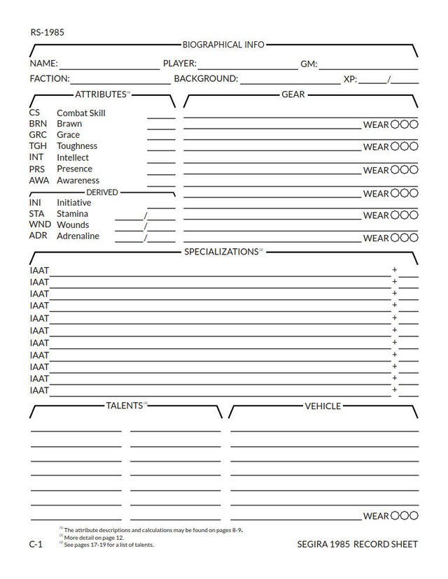
Building Character
A character sheet is really important for a tabletop game. You need people to be able to find stuff instantaneously, but you also want something that has some character and communicates your design concepts. For something like Hammercalled, each part of the character sheet represents a layer of the character.
It's important to have some sense of flow; in this character sheet we have a pretty high amount of verticality; the standard way you calculate a roll is to go from attributes to specizliatiosn to talents.
Gear and vehicles, which are mechanically similar, both occupy the right side of the character sheet, though they're blocked off from each other by specialties.
As I mentioned, I'm really considering two sources here; the visual style of Twilight 2000, which is one of the major typesetting inspirations for Segira, and the military manual I've been stealing elements from imitating (the sincerest form of flattery!).
One of the things that I don't do that I think the Twilight 2000 sheet does really well is using all the space on the sheet, and making everything stick out as a very clear coherent unit. This sheet doesn't quite do that, and I don't feel like it looks like a "complete" sheet by itself.
There are three things I hate about the Twilight 2000 character sheet:
- It sometimes puts highly important information next to unimportant information, and the blanks don't indicate type.
- It has unrealistically small blanks for those of us with execrable handwriting.
- There are no resources/guides for players on the sheet to help them figure out what they should be doing.
I think that I've managed to overcome these issues. Each blank has a length that indicates the type of information that will go in it (no two-inch lines for one or two digit numbers). All the information is organized in the conceptual layers of a Hammercalled character, meaning that whatever is important at the moment can be easily sniffed out.
Likewise, I have blanks that even I can use, so we're pretty safe there. I think this gives us enough room to comfortably add all relevant information as needed, though talents are a little sparse. If you need talent references, you'll need to go on the back or use scratch paper, which is not ideal.
The footnotes are both a nod to the origins of the formatting (they're done in the same style as the military manual), but will provide a tool for players to do important reference. Since there's not necessarily enough space to list the talents, it's handy to have the page numbers on here so that they can be accessed quickly. I don't have calculations for derived attributes on the sheet, but that's a concession to the space limitations.
Looking Over the Sheet
You'll notice that the sheet is pretty sparse on content, but that's the Hammercalled way. The big challenge has been figuring out appropriate levels of white-space to match the contents. I'm thinking the Attributes and Gear headers might get dropped a little (and with them the rest of the character sheet).
The Derived attribute section header was a little difficult. I'm happy with the finished result, but it took a lot of tinkering. The header text is actually smaller than all the other text. I made a separate vector in Inkscape to import for the wings out of the section header; it's about 40% thinner on stroke and has greatly reduced drop-sides (which is pretty obvious), so that the whole thing can sit comfortably within the space allotted to a single line of hand-written text in the character sheet. It will never fully fit, but I think it's about as good as we'll get with this layout.
You'll notice that there's not much on this sheet. I'm trying the experimental approach; Hammercalled is very mechanically crunchy, but we do so in a very hands-off way. Each piece of gear has its own unique description, each vehicle has its own description, and while there are mechanical components we don't necessarily want to make the whole thing about that and I'd like them to be a natural part of the description.
This is probably not the fully finished version of the character sheet, but it looks pretty final, unless it turns out that the "just have people describe it instead of breaking the blanks down into a bunch of pieces" is a bad idea. Playtesting is needed.
I'm not totally sold on the wear checkboxes. I thought a clever octagon design would be visually interesting, but I'm considering going to just "boring" boxes, both to have them be a little smaller and perhaps fit the visual design a little better.
Still, looking at it right now I'm pretty proud of this. It's not perfect, but it's functional, and that's something that you can't say about some of the earlier Segira/Hammercalled character sheets. It wasn't quite as hard as I expected (in the interest of full disclosure, I spent most of the time I should have been working today on reading or listening to books, which isn't exactly a waste of time but also isn't getting work done), but it did take a lot of time and effort and I think it's grown my skills somewhat.
I believe that everything that needs to be recorded for play is available on this sheet, plus probably a little extra (who is going to have twelve talents?), so some refinements in streamlining may happen eventually. I only remembered to add XP on the sheet at the last possible moment.
Because I'm feeling that it's finally in a place where it can be shared, I'm including the links below.
Get it in PDF or grab the original Scribus layout.
Next steps: do some stress-testing, play-testing, and make a form-fillable version. I already pushed the Attributes and Gear section content down a little from their headings, but I'm up to six minor tweaks since I started working on this post and it's time to go to bed.
It looks a lot better than the previous version.
Posted using Partiko Android
Yeah, that's mostly just a consequence of iterations and gut feelings rather than intentional design, but there were a few things I noticed.
It helped to print out a couple copies. I scrawled all over a copy of the previous one that I printed out, going through every little thing.
Some of the better looks are due to the fact that it got exported more nicely, however. I realized after the fact that the previous export looked worse than it was (e.g. irregular line thickness).
It's mostly a good idea to follow your gut feelings.
Printing out stuff and have it in the hand is also great, there you can see how it really looks.
Maybe you can show us an example char in one of your next postings so we can see how that looks?
Posted using Partiko Android
Definitely!
The main things I'm working on are showcasing how to use some of the new features, such as downtime, and other user experience things (in line with your suggestion regarding the examples).
Then we're into final formatting, poking and prodding, and other little things to get the game ready to publish.
If I make great progress, it might be ready today, but I'm probably going to postpone any release until tomorrow at earliest.
Hi loreshapergames,
Visit curiesteem.com or join the Curie Discord community to learn more.
The character sheet has really much information it is good organized so that you see clearly a lot of features of the player. The organization of table in two columns gives a good separation between attributes and gears and it was good to put both talents and vehicle on the bottom.