High PE Stock YTD Performance (AMZN, NFLX, & SQ)
Index - https://steemit.com/tax/@alhofmeister/3ibscz-accounting-and-finance-blog-index
Introduction
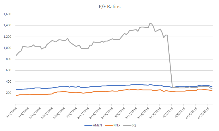
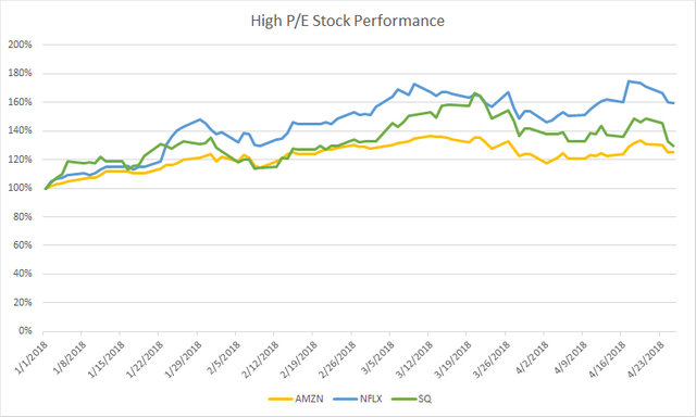
In this post, I wanted to present two graphs. The first graph shows the price to earnings ratio for companies that have high P/E ratios. Note that the earnings is calculated on historical data, so the high P/E ratio for Square (SQ) represents the increase in earnings since the last reported period. The second graph shows the year to date performance of each of the 3 companies (current market cap / market cap as of January 1). As demonstrated by the second graph, each of these stocks have performed very well since the beginning of the year. In a second post, I examine the performance of stocks with a low P/E ratio.
P/E Ratio
YTD Performance
References
https://www.zacks.com/stock/chart/AMZN/fundamental/market-cap
https://www.zacks.com/stock/chart/NFLX/fundamental/market-cap
https://www.zacks.com/stock/chart/SQ/fundamental/market-cap
https://www.zacks.com/stock/chart/AMZN/fundamental/pe-ratio-ttm
https://www.zacks.com/stock/chart/NFLX/fundamental/pe-ratio-ttm
https://www.zacks.com/stock/chart/SQ/fundamental/pe-ratio-ttm
@contentvoter
Your self votes will be countered by @sadkitten for 1 week starting Sunday, April 29th 2018, 6:59 because your account is one of the highest self voters. For more details see this post.
I find it interesting that Amazon is on top in the first graph and on the bottom in the second. Hum, makes you wonder the existing correlations one can derive.
Your self votes will be countered by @sadkitten for 1 week starting Sunday, April 29th 2018, 6:59 because your account is one of the highest self voters. For more details see this post.