Stock Market Analysis 4-16-18....S&P 500 Big Picture Using Just Trend Lines
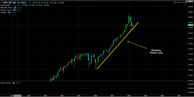
Monthly Chart
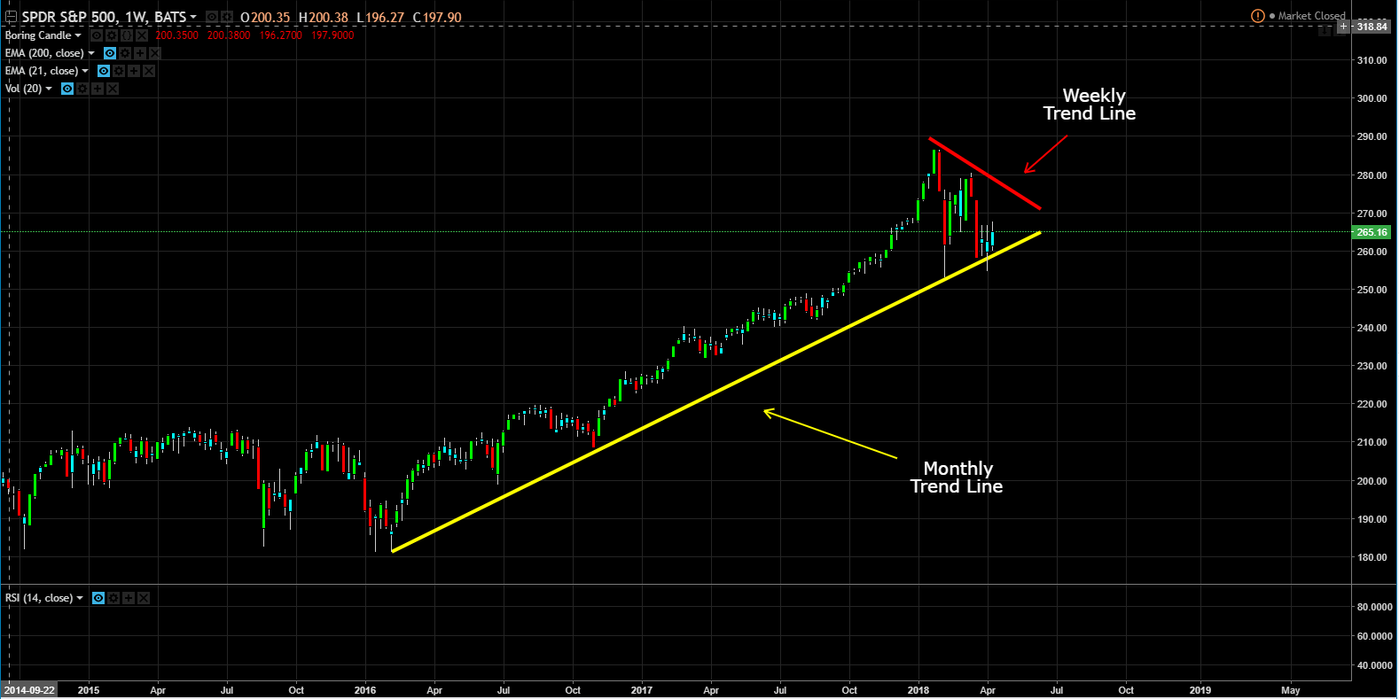
Weekly Chart
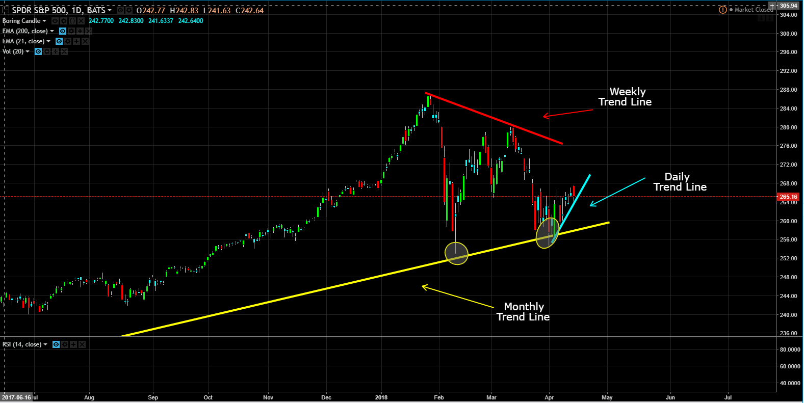
Daily Chart
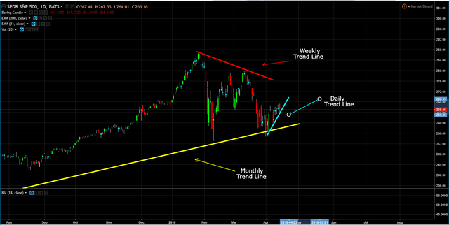
Well, we are still in a long term uptrend (monthly chart), despite the recent volatility the bull market is still intact. However, the intermediate term, we are trending down (weekly chart). However, we are starting to trend higher in the short term (daily chart).
If you are a position trader, you would of bought price when price hit the yellow line. A position trader is someone who holds a position, usually stocks, for the long term; from weeks to months, even years. They are less concerned with short-term fluctuations and the news of the day unless it impacts the big picture behind the stock they are trading.
If you are a swing trader, you would of bought price when price hit the yellow line and sold price when price hit the red line. A swing trader is someone who holds a position, usually stocks short term; from two to six days, but may last as long as two weeks.
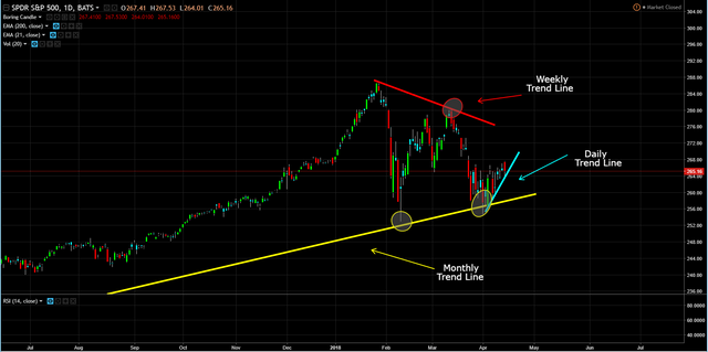
If you are a day trader, you would of bought price when price hit the aqua line. A day trader is someone who holds a position, usually stocks short term; from seconds (scalpers / high frequency), to minutes, to hours, but closing all positions by the end of the trading day.
If you have been following me or have been reading my posts over the last 1-2 months, even with the use of trend lines shows why I feel the Markets are topping and this topping period should last another 12-16 months before the Markets start breaking down to the downside.
This post is my personal opinion. I’m not a financial advisor, this isn't financial advise. Do your own research before making investment decisions.
