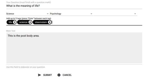
StemQ question form greatly improved!
One of the main issues that has been reported about StemQ was how confusing it was to submit a new question.
It was clear that several visual elements were not intuitive in the form, including:
- Each tag had to be entered within its own form text input on a separate line.
- The text area for the post body didn't occupy enough height, making it non-obvious that this was the main text input element.
- The form was using the whole width of the window, separating fields and their labels by very large empty spaces on wide screens.
We are now pleased to report that the form has been significantly improved!
- The form is now limited to a smaller width making it a more distinct element of the page.
- Tags can now be inserted on a single line using "chip" input widgets, in line with most other Steem apps.
- Labels are now shown within the form input fields and float above the fields when the user changes focus
- The main text area now stands out from other elements.
The result of these improvements can be seen in the following screenshot:

What is StemQ?
StemQ is a questions and answers (Q&A) application, build on top of the Steem blockchhain, focusing on Science, Technology, Engineering and Mathematics (STEM) subjects.
Where to find more information about StemQ?
For more information and latest news, join the vibrant StemQ Discord Server and follow the @stemq account!

Great work! It is much much clearer now how to use the available input fields - thanks! :)