Checking in on Steem inflation: 2024/Q1 was deflationary
Summary
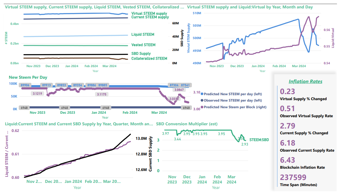
Looking forward and backward, here's where Steem's inflation stands at a moment in time. STEEM price increases during the last quarter made the Steem blockchain deflationary and reduced daily new STEEM production by about 2 1/2%.
Background and Introduction
As quarter 1 comes to a close, it's time to take another look at Steem's inflation curve. I think this is the first quarter where the STEEM price has been convincingly above the SBD print threshold when I wrote up the summary, so things are interesting today.
When SBDs are not printing, the forward-looking chart of new STEEM per day has always been a sort of an upper limit. Now, however, when SBDs are printing, it's not. STEEM price movement can affect the virtual supply size in a positive or negative direction. That, in turn, can move the daily production of STEEM up or down. So, we had some uncertainty before - and now we have even more. Before I get into the numbers, let me try to explain this with a picture:
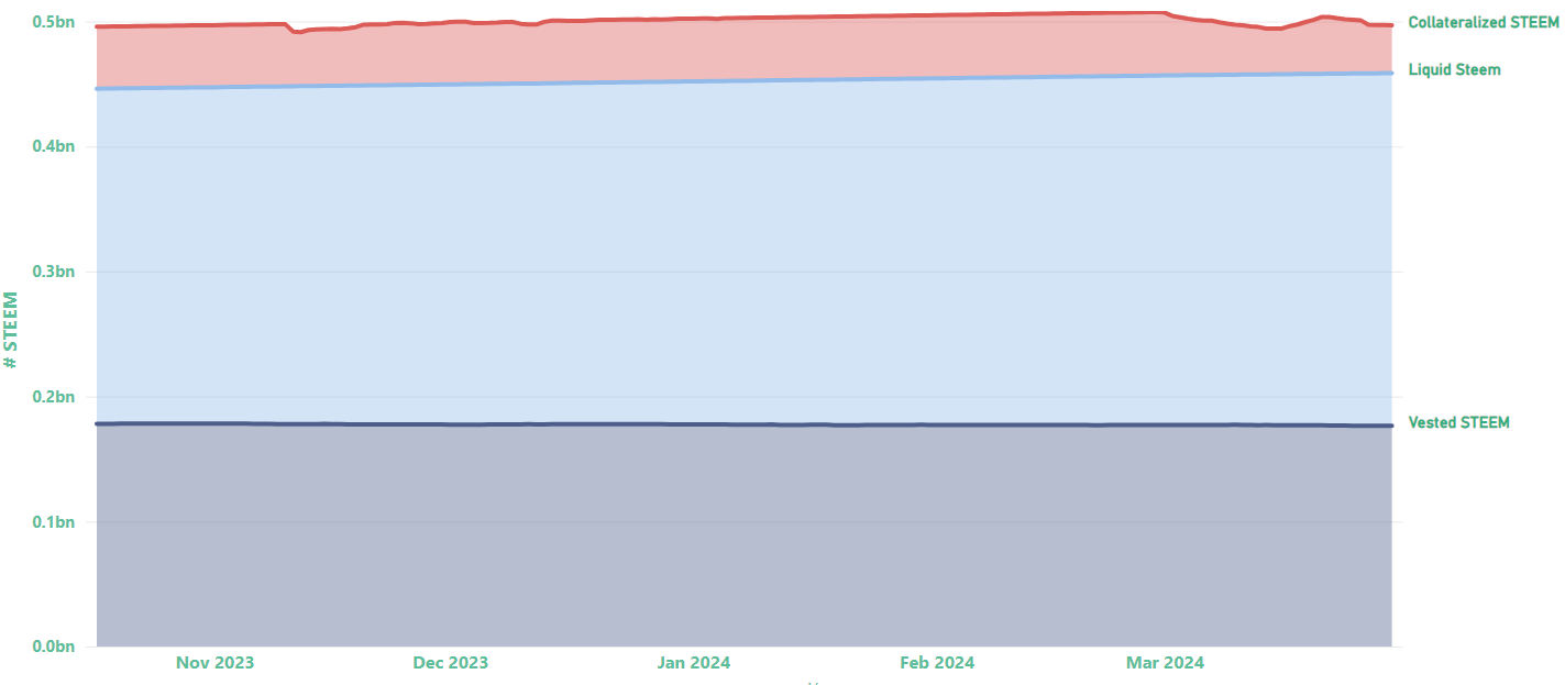
This is the virtual supply of STEEM from November, 2023 until today, and it's broken down in three sections:
- Vested STEEM is STEEM that is powered up.
- Liquid STEEM is STEEM that is not powered up. It might be in user wallets, or it might be on exchanges.
- "Collateralized STEEM" is STEEM that doesn't exist, but the blockchain will print it in return for SBDs if Steem account holders convert their SBD holdings to STEEM (this is conversion, not buying/selling on the internal market).
The first two factors comprise the blockchain's current supply value.
The 3rd section is the one that makes things interesting when SBDs are printing. When account holders convert SBDs to STEEM, the blockchain burns the SBDs and creates $1 worth of STEEM for each SBD. So,
- when STEEM is worth $0.33, the blockchain gives back ~3 STEEM per SBD; but
- when STEEM is worth $2.00, the blockchain gives back just 1/2 STEEM per SBD.
The collateralized STEEM is the accounting of how many STEEM the blockchain is "on the hook" for if every account holder converted every SBD. The higher the price of STEEM, the lower the collateralized STEEM.
This changing value in collateralized STEEM is what causes the virtual supply to move up or down when SBDs are printing. (As discussed in the past, different rules are in effect when SBDs are not printing.)
All of this means that the forward looking projections in today's post are just a model, but since we know the price of STEEM will fluctuate, we also know that the model is wrong by some amount. If prices go up, then it's too high. If prices go down, it's too low. Since the December charts were based on an upper limit, we also know that the curve will never climb back to those levels again (barring parameter or rule changes by the Witnesses.)
I'm thinking that if/when time allows, it would be better to do these charts with three curves: upper limit - when SBDs are not printing; lower limit - based entirely on the current supply and ignoring collateralized STEEM - and a final curve based on the current values as a starting point. As of now, the third one is the only one I have, though.
One final caveat: This is my understanding, but there is no authoritative documentation, and my understanding may be incorrect. So, let the reader beware.
Now, with that introduction out of the way, let's move on to the numbers:
1. Consistent with December's projection, we are definitely past the peak. From April 6 until June, the new STEEM per day is projected to fall from 87,538 to 87,503
| Date | Block # | Inflation Rate | Supply | New Steem Per Day |
|---|---|---|---|---|
| 2024-04-06 09:56:52.242067 | 84000000 | 0.0642 | 497690537 | 87538 |
| 2024-04-15 02:16:52.242067 | 84250000 | 0.0641 | 498450412 | 87536 |
| 2024-04-23 18:36:52.242067 | 84500000 | 0.0640 | 499210259 | 87532 |
| 2024-05-02 10:56:52.242067 | 84750000 | 0.0639 | 499970076 | 87529 |
| 2024-05-11 03:16:52.242067 | 85000000 | 0.0638 | 500729859 | 87524 |
| 2024-05-19 19:36:52.242067 | 85250000 | 0.0637 | 501489604 | 87520 |
| 2024-05-28 11:56:52.242067 | 85500000 | 0.0636 | 502249306 | 87515 |
| 2024-06-06 04:16:52.242067 | 85750000 | 0.0635 | 503008964 | 87509 |
| 2024-06-14 20:36:52.242067 | 86000000 | 0.0634 | 503768572 | 87503 |
- You may recall that in December, the upper boundary (and current) projection was that new Steem per day would increase from 89,885 to 89,887 in March.
- In practice, however, we knew in December that token burning was already overwhelming the projected growth, and we suspected (correctly) that the peak was already passed.
- As a result of STEEM price movement and token burning, the current value of 87,538 new STEEM per day is about 2 1/2% lower than the December projection.
2. Here's what the curves look like for 1 year, 4 years, 8 years, 12 years, and 20 years
Remember: In the past, this visual has represented an upper boundary. That is not the case now. The curve's shape will stay the same, but its starting point will move up or down every time STEEM's price changes (unless/until SBDs stop printing again).
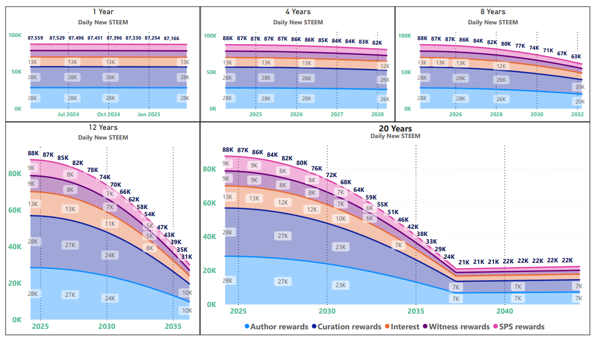
Key points here are:
- The curve is sloping downward and getting continuously steeper for the next 13 years.
- At 87,559 new STEEM per day, today's blockchain production rate matches the rate that was projected for about 2026 in the December slides. The changing price of STEEM has shifted us forward on the calendar by ~2 years.
3. Here's a simple graph showing the inflation rate, virtual supply, and Steem production for the next 30 years
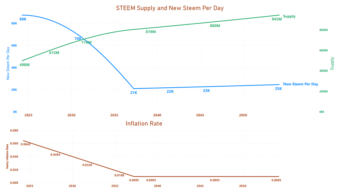
- In December, the virtual supply was 502 million. Today, it is less than 498 million. Despite producing close to 90K new STEEM per day, the blockchain has been deflationary this quarter.
4. New for this quarter: New STEEM per day vs. New BTC per day
Just for fun, I made a new chart this quarter that shows how daily STEEM production compares to daily BTC production over time. I think of it as "the Porcupine Graph" because the 16 year chart reminds me of the porcfest logo. Here it is:
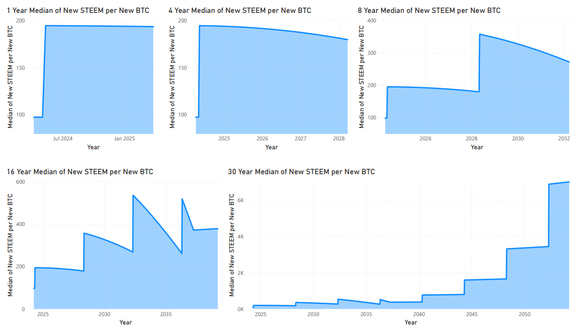
- This will be the last quarterly update before the 2024 BTC halving.
5. Here's what our deflationary quarter looks like in the rear view mirror
Update:
Key points:
- In the past, you may have noticed that the observed inflation rates for current supply and virtual supply were identical. Now, with SBDs printing, that is no longer the case.
- The virtual supply inflation rate from November until now was just 0.51 APR, despite the fact that the blockchain's inflation rate was 6.43%
- The current supply inflation rate of 6.18% is also lower than the blockchain's defined rate.
- I believe that the current supply rate is lower than the blockchain's rate because of token burning; whereas the virtual supply is lower than the blockchain's rate (mostly) because of STEEM's price movement above the SBD print threshold.
- Even though the blockchain was deflationary from December until now, the STEEM price would need to move up a bit more to be deflationary over the whole time span that's delivered here.
- Despite producing close to 90K new STEEM per day, the net change per day was just under 7K STEEM per day.
6. Zooming in on the projected vs. observed supply changes
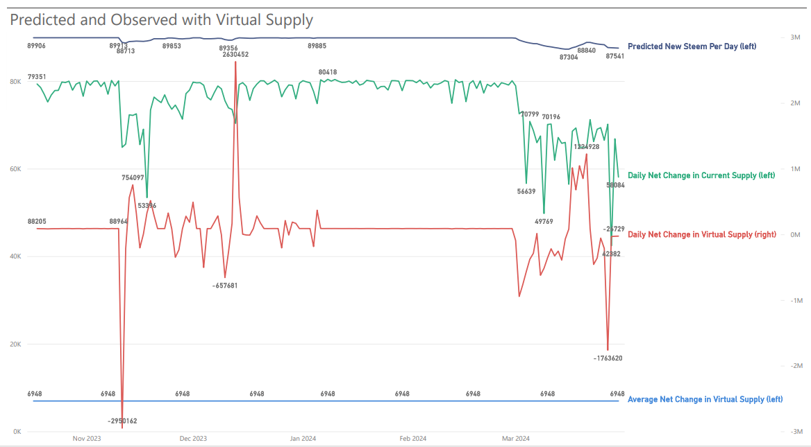
- The red line, daily changes in virtual supply, needs to be tracked on the right-hand axis because it moves by millions vs. thousands. Otherwise, changes in the other metrics would be invisible.
- In Q4/2023, the average net virtual supply change was about 86K (vs. 89K produced). This quarter, that number is 7K (vs. 88K produced).
Wrap-up
I cannot emphasize strongly enough that the forward-looking information above is known to be incorrect. The starting point can move up and down, based on the changing price of STEEM, and factors such as token-burning and missed blocks by witnesses can shift it downwards. Additionally, the witnesses control an SBD interest parameter - currently set to zero, which could move the curve upwards (or downwards????). Finally, a hard-fork could change all of the rules in unpredictable ways. In the past, the forward looking information was something like an upper boundary, but with SBDs printing, we can't even say that any more.
In closing, I want to repeat three points that I've already mentioned, but that I think are important for understanding the so-called tokenomics:
- There is a virtuous cycle where a rising price of STEEM increases scarcity, which (in theory) would put upward pressure on prices.
- There is a vicious cycle where a falling price of STEEM decreases scarcity, which (in theory) would put downward pressure on prices.
- If we assume that the SBD interest rate can affect STEEM prices, then there may be a "sweet spot" where increasing SBD interest payments (counterintuitively) promotes scarcity by increasing the value of STEEM. To my knowledge, the real-world conditions where this might happen have not been explored and are not well understood, but (IMO) learning about them should be a priority, especially for the tier-1 stakeholders and top-20 witnesses.
Thank you for your time and attention.
As a general rule, I up-vote comments that demonstrate "proof of reading".

Steve Palmer is an IT professional with three decades of professional experience in data communications and information systems. He holds a bachelor's degree in mathematics, a master's degree in computer science, and a master's degree in information systems and technology management. He has been awarded 3 US patents.
Pixabay license, source
Reminder
Visit the /promoted page and #burnsteem25 to support the inflation-fighters who are helping to enable decentralized regulation of Steem token supply growth.
This is a very good update of previous knowledge.
Unfortunately, it also very aptly reflects the fact that we do not (yet) know all the correlations. This means that there are also no reliable assumptions about the effects of the change in certain influencing factors (e.g. interest payments). At present, the change in virtual supply simply seems to depend on too many variables.
I was very surprised when I first looked at the "New Steem Per Day" diagram. At first I thought you had slipped a decimal place :-)
How do you calculate the average change? I would assume by
(Virtual Supply at the end of Q1/2024 - Virtual Supply at the beginning of Q1/2024) / days.But isn't average growth still inflationary (albeit at a lower level)? Would it not only be deflationary if virtual supply were lower than at the beginning of the considered period?
I would also be very interested in this :-)
I've been toying with the idea of setting up a testnet for a long time, where I can set various parameters independently of other witnesses and the real chain. Maybe I really should do that sometime to be able to play through various test scenarios...
I should have been more clear on this point. It's almost certainly confusing to the reader. Sorry.
I jumped back & forth between two time frames in the text, but the charts in sections 5 & 6 show just one time frame. The visuals run from October 18 'til yesterday - roughly 5 1/2 months, but I was only claiming that the blockchain was deflationary for the quarter from December 31 until I posted yesterday (and still today). On December 31, the virtual supply was about 502 million and today it's ~497 million, so we are deflationary for 1 quarter, but I didn't do the actual calculation to know the growth rate for that time frame. My only observation during the quarter is that the end is lower than the beginning, so therefore deflationary.
For the average new steem per day, I think I do the calculation per minute and then scale it up to days, but it's basically what you posted. Unfortunately, with the way I implemented the calculation in PowerBI, its not easy for me to change the start date, so I can't visualize Q1 alone. I have to give back all the dates from here. And you're correct. During that time frame, we were not (quite) deflationary. Which is why I wrote,
To see the deflation visually during the quarter, the best place to look is probably the blue line in the top-right visual, here. Unfortunately, you can't see the exact dates, but you can tell that the virtual supply is lower now than it was in the December/January time frame. (or, you could check the raw numbers if you want to see the difference on the precise dates. Technically, skimming through the data now, it looks like we're deflationary back to about November 20 or earlier.) I had really hoped to get a visual of a negative average growth, but no such luck. It was negative during the entire period about a week ago, but it inched back up again before the quarter ended. 😞
This would be good for observing the technical mechanism, but even with a testnet, it would be hard or impossible to anticipate how interest rates would change stakeholder behavior, which is the real driver of price. I really wish @biophil were still here. I think we need economic/game theory analysis to have a chance at guessing. And, even then it might eventually come down to just running the experiment and being ready to make adjustments as we learn in real time. (Which is why I've been thinking about dynamically setting -- those values. But right now, I don't think we even know reasonable values for min/max settings.)
It is really shocking for me per day 90k new steem is adding. Thanks for information
It would be nice if there was a canonical list of accounts used by exchanges to make this an easily-discovered number. I imagine the big ones, which would be the ones that matter most, are basically already known.
I have wished for this, too. You can make a decent guess at some of them by browsing through here, but it would be nice to have a simple list to refer to.
This post has been featured in the latest edition of Steem News...
Upvoted. Thank You for sending some of your rewards to @null. It will make Steem stronger.
Well in my point of view your 3 Rd point is understandable that SBD determine the steem price.