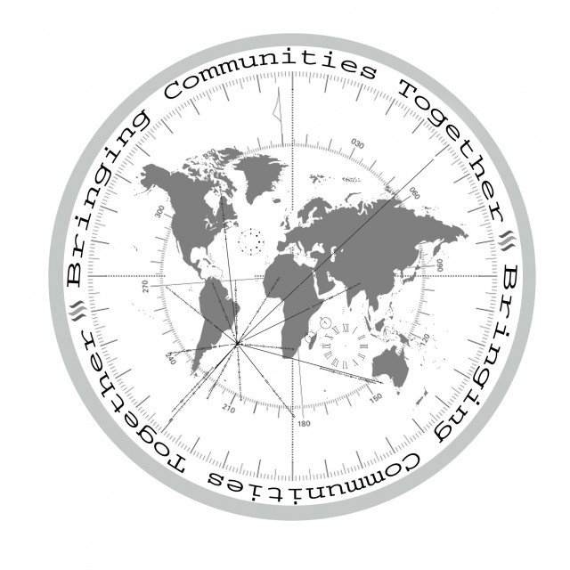
My Submission For The Steemit Silver Round 2018
Here it is.
I have a couple more ideas but this one was the first i have produced.
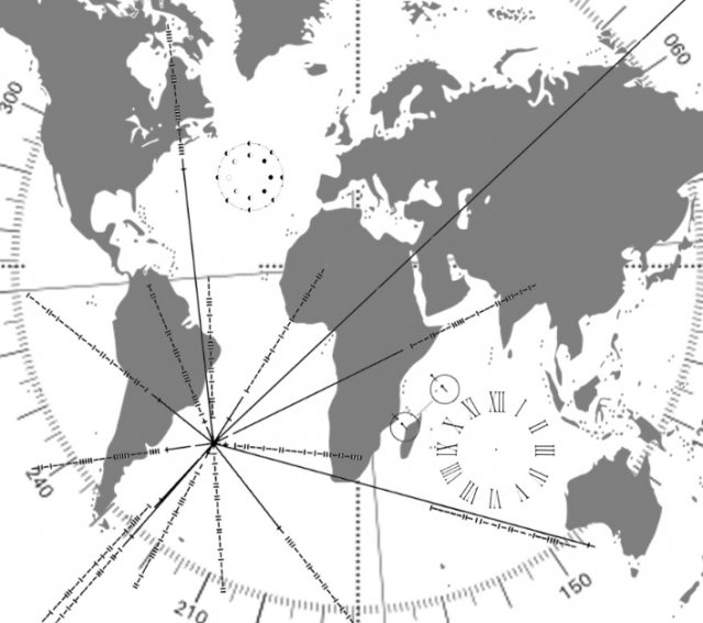
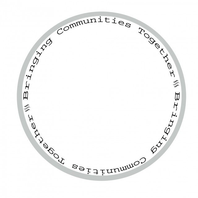
here is a zoom so you can see the detail.
I am usually anti "community" because there are a bunch of "communities" on steemit not just one. So what better slogan then "bringing communities together"? Originally i was thinking "bringing the world together" or "bringing people together" but steemit is so stuck on the "community" idea i thought i might fix the whole direction of "muh comunnity" (or try to). lol
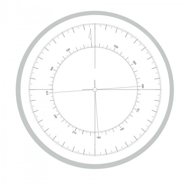
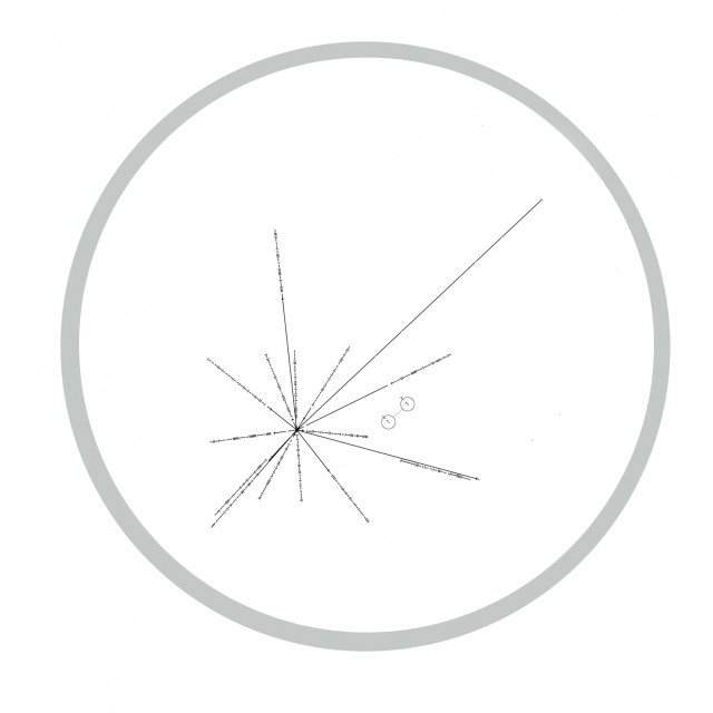
The picture is made up of a couple differnt parts.
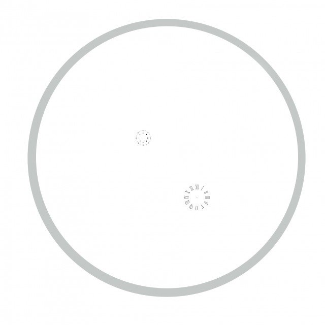
The world

The compass how to navigate the planet with magnetic differnce.
The location of earth in the universe
and the words
Added a clock and the lunar cycle to it. they are kinda small so they might not even matter.
other ideas for the coin slogan:
Bringing the world together one block at a time.
bringing communities together block by block.
Let me know what you think!
Cheers steemit!
I like it! Nice work and interesting elements chosen. It'd be a stunnah!
Thank you.
:D
anything you would change to make it better?
I have all the layers and stuff saved to i can inprove it.
Do you think the clock and lunar cycle are to much?
Personally i like the design. Changes like you're talking about would be made as the design moves on through the competition. I wouldn't expect the winning design will be submitted "complete" and left unchanged. Judging from last year anyways.
Cheers
:D
thank you
I understand its not final, just trying to make it as good as i can.
👍
It looks pretty good, but why is it in grayscale, would not it be better to use the blue color of the steem logo?
Its gray scale cause if it wins it will get made into a real silver coin.
:D
https://steemit.com/steemsilvergold/@phelimint/it-s-time-to-get-art-and-submissions-for-the-2018-steem-silver-round-the-contest-is-now-live
https://steemit.com/steemsilvergold/@sevinwilson/2018-silver-steem-coin-introductory-post-community-input-requested
I would flip if i won.
lol
That's pretty cool dude!
Thank you.
:D
Is there anything you can think of that would make it better?
Besides, you already have several of us from a community that follow you.
:D
I want all the communities, not just the ones the whales are part of.
This community is newly formed, I belong to it
https://steemit.com/@steemfamilyhi
:D
i followed.
I am in a community, of Venezuelans, but it is not easy. You better go on like this.
steemit helps connect the Venezuelan community to the other communitys.
:D
Dude that is stunningly beautiful, if that was a coin I could look at that for hours.
aww, thank you.
:D
It was fun to make and there are a couple things i still want to add to it but i didnt want it to become a mess from to much going on.
Im glad people are liking it and commenting on it.
:D
Is there anything you would change to make it better?
Tbh I think you nailed it with the design graphics not sure on the wording but that is not so important to me.
Carpe Diem "seize the day"
Thank you!
Your not suposta tell people what carpe diem means, you let them carpe online looking up the meaning while the rest of us are taking all the diem's.
xD
I've noticed that everyone is using the old logo for their designs.
Just a thought...maybe do a version with the new Steemit logo. I know it's a kind of awful logo but the judges will get a choice.
The difficulty with the old logo is that it sometimes looks like, "SSS" especially on the design by @marlon241982.
After looking at the other entries I thought maybe also include more features that scream, "Steemit" e.g. include the post button somewhere and have some fish around the edge.
The new logo is for the frontside interface and i was told when they came out with it that its copywriten so if you use it, steemit owns your work and can actually sue you for using it. I dont think they would but if they took the insicitive to copywrite it and make it illegel to use im not going to mess with it.
Also i hate the new logo, looks horrible imo.
Yeah sith has a triple logo next to his name and it looks like 666. lol
Im actually supprised the new submission didnt get called a satanic symbol. :D
Last one was called a flat eart coin even though i didnt use the flat earth map.
lol
Give it a day i guess and people will be calling the coin satanic.
The front screems steemit already but your right, next one i make needs to be yelling out STEEMIT!
:D
Nice work skeptic, and the logo is sick really, about the contest cool and good luck, I hope you win.
thank you!
im going to try to come up with a couple other submissions too.
I would lose my mind if i won.
lol
I like the idea, but why not put "communities bringing together communities" instead of "bringing communities together bringing", that way you would have a entire circle of "communities bringing together communities bringing together communities bringing together communities".
Well i guess you get the point of a circular message haha, that way Communities bring together communities, anyway, great work @skeptic : D.
Btw i don't know if you can mold a coin with any kind of logo, i mean how much details can you put into a single coin?
That is an awesome idea for the wording! I was told repeting might not be good but if it repetes into infinity i could see that as really cool.
Im not sure how much detail tbh, the whole thing gets redone by hand by an artist so its kind of just like an idea and not what the finished couin would look like even if it did win.
I do know they make the original carving like 10x bigger then the coin to get the detail.
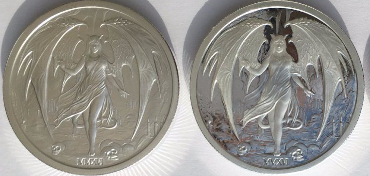
IDK but check out their other coin, its prity detailed.
The coin makers will know whats up cause i sure as hell dont. im just guessing tbh.
lol
At first i thought "Lets put Pi into spiral Fibonacci series then forming a flower" but then
As soon i read this, i thought lets put a freaking insanely hard labyrinth impossible to be drawn, just in case it ends wining and needs to be done by hand into the coin haha, (i am evil that way man)
Btw that's a cool looking coin, but i would use Albedo as the model haha, anyway, i hope you win man, good luck.
LOL
the sculpter would be cursing the whole time.
:D
I love it!
Maybe try using the flat Earth map that the UN uses; see which looks better.
OK, so like originally the map i was going to use was a flattened out top down map because it fit in a circle so well but then after searching and finding a map i liked i realized it was on a flat earth site and i was just like damnit. It looks way better but i could see it starting a whole conspiercy flat earth illuminity thing. pluss i could see people not liking it just because it had the map the flat earth people worship.
:D
You have to use the flat earth map, that would be so awesome!
Also I doubt many people still believe it's round, seriously, it's not 2008 anymore.
LOL, its not 2008?
Maybe ill make a second one with the other map.
:D
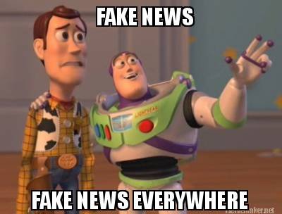
OMG! Stop listening to him and his fake news!
LOL
LOL
Bro on the post for the coin submissions so far, down in the comments there is someone talking about how the map i used is flat earth and stuff.
Kind of the same argument, "the flat earthers will love it cause the whole earth is on one flat disk. LOL
So i guess i could have used the flat earth map and it would of had the same reaction.
The meme is awesome, my reply to the person asking that would need to have an orange and a knife though. :D