You are viewing a single comment's thread from:
RE: SteemPeak - Update v2.2 - Better Publish page and improved vote value estimation
I am always impressed with the work you all do. This update is a little difficult for me. The space that I now have to write the text means that I will be scrolling soooo much.
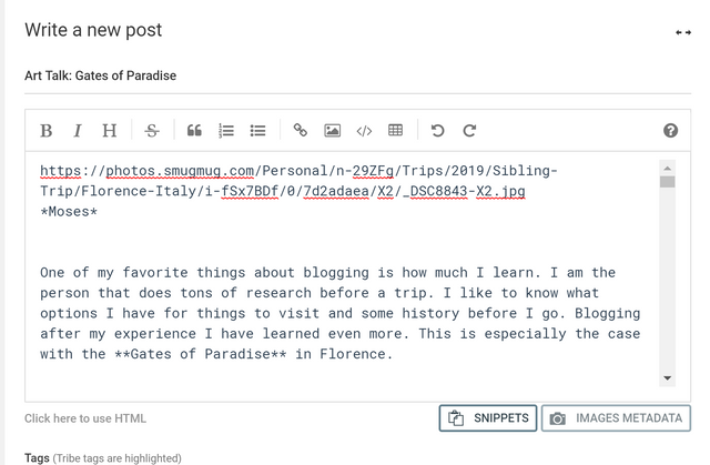
You can see in the example below. I can see only one picture and one little paragraph.

Hi Sara, can you ping me on Discord when you have a bit of free time?
Silly, but I don't remember how to get on discord.
I've tried to increase the available space. The new version should be online soon.
Thanks Sergio. Just checked and the space is still the same. I'll check again later today.
I guess this could all be solved by allowing the user to expand the posting area. I think she doesn't care if the buttons and input area for keywords are all on the main view ... she'd rather scroll down to those.
The last update should already have this. At least in my tests.