[SNEAK PREVIEW] Steempay design concept - payment processing
Today i was working on steempay.io design concept.
Thanks to @steve-walschot, lead developer behind steempay.io
(currently offline due maintenance)
I'm trying to support him as best as possible,
this why i was playing around with some GUI ideas
for steempay.io payment screens.
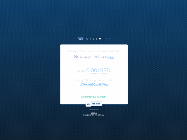
Payment Processing - dark background 1/2
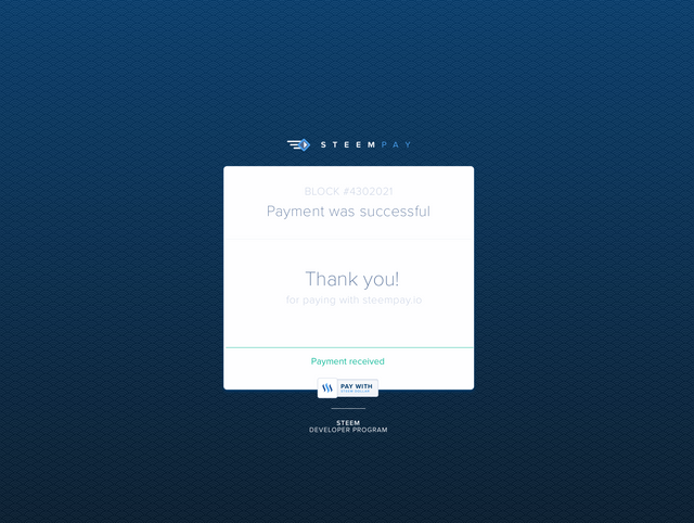
Payment Processing - dark background 2/2
edit: added animated .gif versions
Dark version .gif animation
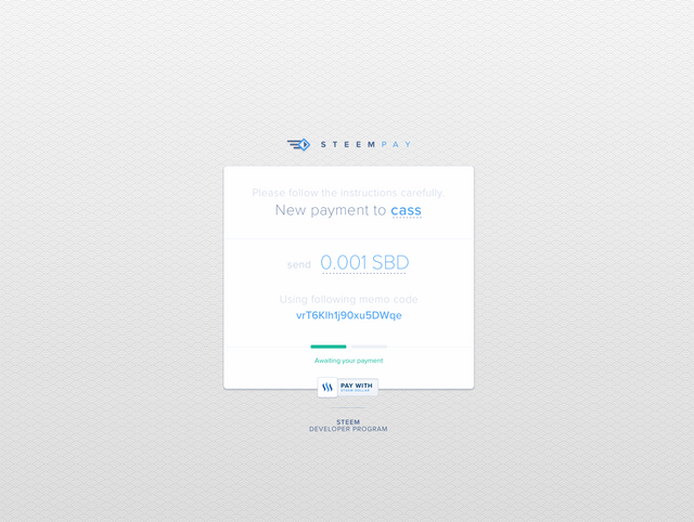
Payment Processing - light background 1/2
(slighty different progess section)

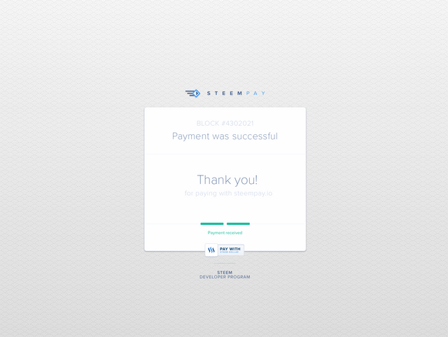
Payment Processing - light background 2/2
(slighty different progess section)
Light version .gif animation
I really like the idea of an easy to implement payment option with SBD,
just imagine a wordpress shop plugin etc .. endless possibilities - holy moly :)
Let's make it reality !
Thanks for your time and (maybe) vote
stay tuned
c


Looking smooth! The UI will be a pleasure when using steempay ;-)
Hello! This looks very, very interesting. I really like the blue designs on top...but the concept is what has me intrigued.
I can see Steem becoming the new bitcoin and people using it in cyberspace as regularly as PayPal or "Sign In With Facebook". We've been warmed up enough to the concept of cryptocurrency as a viable tradeable asset - that I think we will see it start to become the norm. Excited about this!
exactly!
good info, thanks @cass
Looking good, nice and slick...good luck
I click to generate a link but nothing happens...(
Sleek design and concept!
This is honestly a great idea. This can make payment processes easier for users and lessen the chances of scams that the user might bump into. Good work and very sleek design @cass!
Looks really good, I like the darker blue a lot
when i see such ideas, i know, their are great hope for the future of steemit
Is this one of the developments that the community will be using in the future?
Great looking interface. Can't wait to start using it.