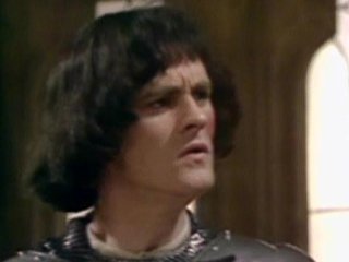
#steemlords Lord Percival the Magnificent and Sir Muxxy the Brave meet Madame Arly
Starring @tremendospercy, @gmuxx and @bearone.

No I don't know what's going on with Lord Percy's fringe either. From Lord Pervical the Magnificent Arrives in New Cowardonia. There's dialogue in there, I deliberately left it out because it makes composition easier and to make you go read the other post ;D

- Lord Nenad sketchy
- more steemlords character sketchies
- Dat ass tho... steemlords comic
- steemlords art test character sketchies
Thanks for looking! ^_^
And come join us in the #teamaustralia Discord channel :D

nice! i upvoted you!
PD: for all steemians on this post... follow me and i follow you bros! :D
Thanks! :)
Just so you know most of my friends hate follow for follow XD
What have you done to my hair! 😫

My hair is part of the magnificence.
You got me mixed up wth Muxxy.
See.
Nice work though 👍
LoL sorry I have to draw what's in my head and that's apparently how it looked XD
Entirely possible I got you mixed up with Muxxy [laughing so hard it hurts now]
Thanks ^_^
ahhh!!!! that is so awesome!! I love it. Thank you @ryivhnn - see I knew you could do it! <3
Glad you like it XD That frame with Madame Arly in it was rather ambitious for quick sketchy XD
And I'm slumping against the wall 😁😁
It came out great hun. I love how you remembered to include my bottle ;)
Madame Arly is looking pretty sexy there. I also like Muxxy's unicorn.
Yay! XD Haha yeh Muxxy's unicorn doesn't seem to be an alicorn but apparently the donkey could fly? So had to make it able to keep up somehow XD
How good are these!
Acceptable enough I hope XD
The cartoons are a great fun addition, keep it up.
Thanks ^_^ They're a lot of fun, they take slightly longer than the steemwars sketchies though and steemlords is moving quicker than I expected, but hopefully I'll catch up soon seeing as my advantage is I can do multiple posts in one ;D
Since the images are divided into panels, would it be better if you extracted specific rows so it zooms in to the panels? I mean, I think your work gets shrunk down, it's a shame it isn't displayed as it should be. I played around with it and I found 1700x985 as an optimal dimension in terms of the cover, so maybe you could use that as a point of reference to give your panels more emphasis.
I'm pretty sure this thing is less than 1200px wide :)
Congratulations @ryivhnn! You have completed some achievement on Steemit and have been rewarded with new badge(s) :
Click on any badge to view your own Board of Honor on SteemitBoard.
For more information about SteemitBoard, click here
If you no longer want to receive notifications, reply to this comment with the word
STOP