SteemitPhotoChallenge Entry - "help" - @papa-pepper
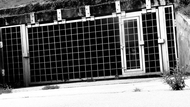
Took this opportunity with my daughter. When it rains, the waters rushed out of here into the lake.
I had thought about using this one with the contrast turned up, but black and white looks more DESOLATE.

Personally i think the B&W works best. the colour distracts from the content. it makes your eye want to look at the colours, and the colour in this instance is irelevent to the subject matter. love the pic m8. keep up the good work.
please check my work out and see what you think. cheers
@pcste
I like the dead fish (the other photos look great too). My next entry is going to be a dead fish... I call him "FLYMOUTH"
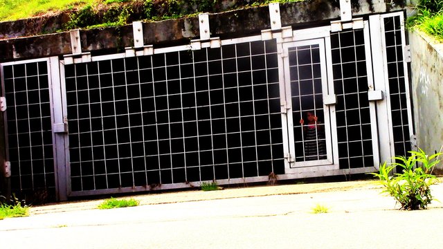
I think I will have to agree. You can see things more clear with the color version, but the appearance of your daughter is better camouflaged in the black and white. When you finally see her little hands clasping the cage, it draws attention to her face. Digging the emotion it brings.
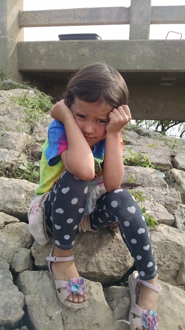
Thanks for the compliment. She can carry a good deal of emotion in her face, and switch rapidly. These below were taken just seconds apart, yet they both look soooo authentic.
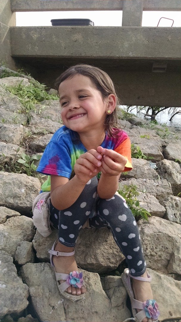
I would call this "glee".
Yet this looks like "torment".
I upvote U