Flatland Minimalism (photography composition rules + quick tips) - SteemitPhotoChallenge Entry
Minimalism doesn't mean simple ! It's a tough style to seek out and compose correctly. In most circumstances, it requires a little bit of luck and a lot of patience. Timing can be the difference between an elegant proportioned photograph and a chaotic, awkward composition. Light is a variable that can shift quickly and your subjects can shift even quicker... Below, I'll get into a few quick thoughts on minimalist photography and some helpful tips that I use in my own work.
"Five Depths in Cinque Terre"
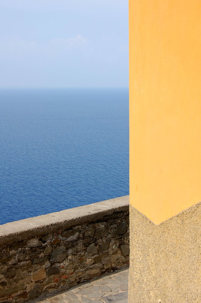
Sky, water, wall, ground, facade. This photograph took 5 environments and attempted to capture them in a single frame. Cinque Terre (Italy) is not a minimalist place. It's a sequence of five coastal towns that are rich in colorful homes, ancient walls and brilliant aqua-blue shorelines.
In this image, I waited for shadows to hit all surfaces evenly. Flat lighting and aligning the facade perpendicular to the horizon-line helped create a collage of strong shapes and contrasting textures.

"Pacing Thirds"
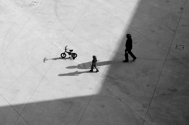
There's an age old rule of thirds in photography. It's a helpful composition strategy; where you align a subject using guide-lines and intersection points. In my photograph below I waited for my three subjects; bicycle, son and father to be equidistant from one another. Since I was positioned above them, the concrete paving helped in creating a flat environment to contrast with geometric shadows and silhouettes.

"Sifting Grain"
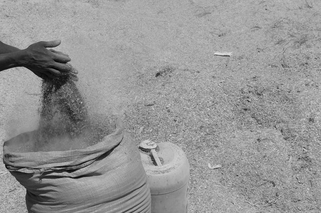
Similar to the "Pacing Thirds" image, I photographed this subject from above. The soil in the background acts as a flat backdrop for my subject to come into focus. Also in thirds, this image is divided by:
- Hands (still)
- Grain (in motion)
- Bag (still)
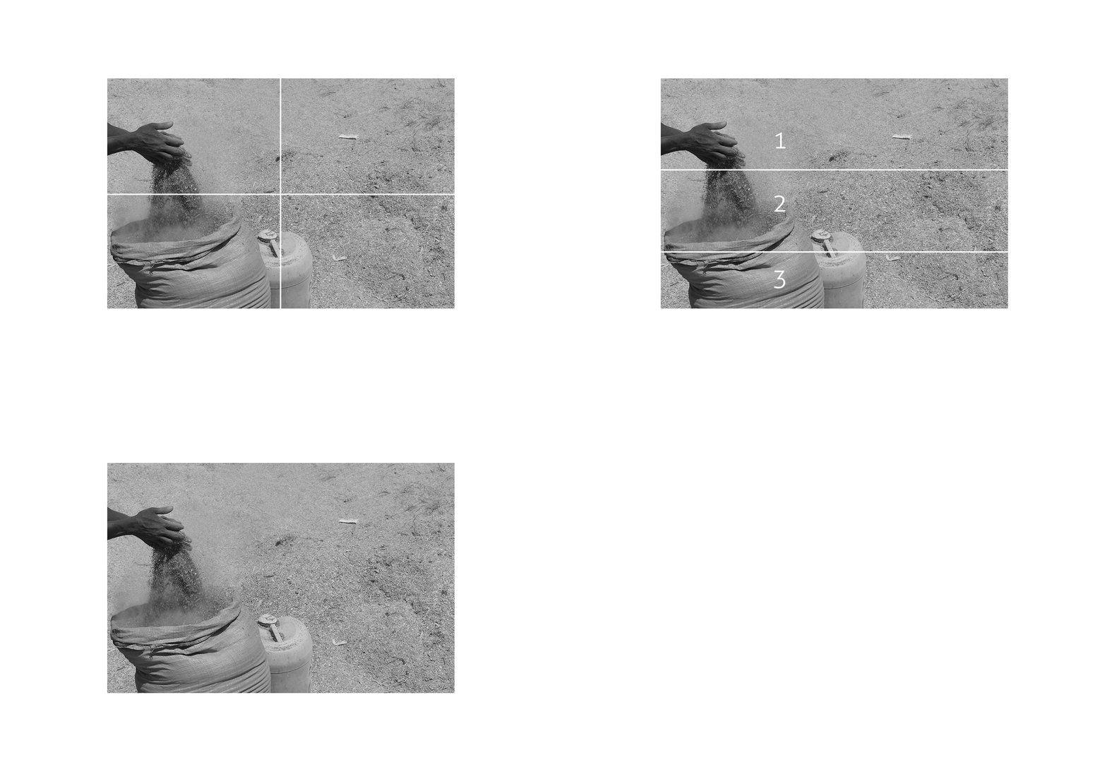
I like the way that these compositions boil down to simple actions and geometries. To me, minimalism in photography is about boiling a complex environment down to a legible pattern. Whether that pattern is about 3's, 5's or 5 thousands, the goal of capturing something balanced and unique remains the same. I hope that some of these strategies resonate with you and your camera! Good luck and get minimal!
Thank you fellow steemians! Check out my blog for more on photography, art and architecture. (All photos in this post were taken by me with a Nikon DSLR camera. All tutorial GIFs are originals I made for this steemit post.)
By lgm-1

Great compositions. For the first one I would find a crop like this even more appealing (applying the rule of thirds horizontally and vertically):
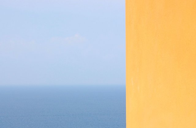
But this is of course my very subjective preference (I love Rothko to maybe explain a bit ;-)).
Thanks for sharing!
Thank you! ... the steemit thumbnail made me feel the same way! A happy accident!
excellent formidable technical work congratulations
Thank you so much!
great shots and tutorial. Congrats on your pacing thirds shot, I was thinking top down would be a good theme for a future SteemitPhotoChallenge, this would be a good reference image.