Cold versus Warm
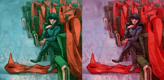
This illustration got itself some coloring, but I'm really feeling it double. I am usually more into colder palette's lately, bu I go curious about the warm version as well. So here are both versions that for me bring their own mood.
Let me know your thoughts. This is always helpful for future drawings and ways of coloring.
First off, your work is beautiful as always!
To answer your question: Both work well, so I guess it just depends on the message you want to convey. The cool palette provides more color contrast. This creates a sense dynamism and makes the hooded figures jump from the page. The large amount of green also gives the piece a spooky, sub-aquatic feel, sort of like the Bioshock universe.
The warm palette, while technically more saturated (at least when concerning the red tones), feels a bit more natural and subdued. This, to me, is due to the green being muted by the warm cast. It feels a bit more organic and inviting and has less ominous overtones as the cool palette.
I personally prefer the warm palette, but that's simply a matter of my own tastes. If it were in my hands, I would take the warm palette and try to shift the carpet and background to a cooler, slightly darker tone to help bring those hooded figures back out and recreate the blue shift that created the depth mentioned by @enternamehere.
No matter how you decide to proceed, the linework is gorgeous, you composition is solid, and your tonal variation is great. In other words, whatever colors you pick, you can't go wrong.
Very interesting work. I like your style. Personally, I prefer the image on the right. I think the red tones give it a little more charm.
To me the cooler palette shows more depth.