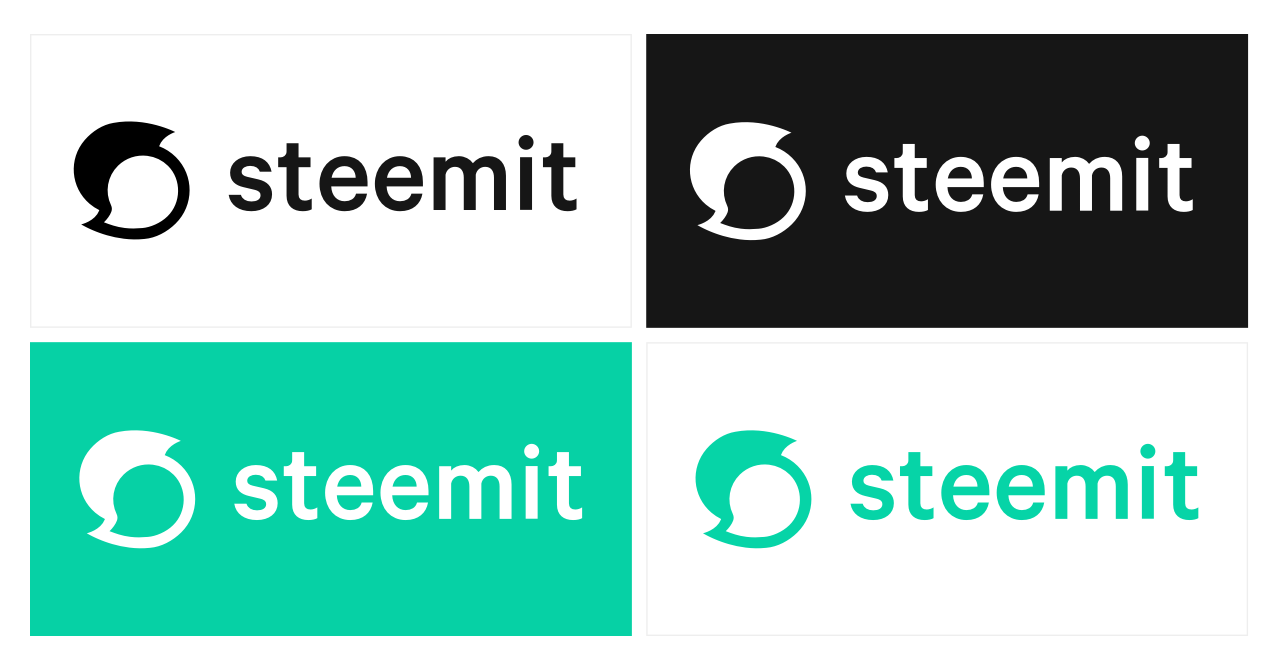
The New Steemit Logo
My thoughts about the new Steemit logo.
The blue color was way better, more attractive. Look at the social networks logo colors and you'll find most are blue.
The old 3 S signs represent the 3 Steemit cryptocurrencies
The new logo looks like a 69 ! May be it represents a strong connections between 2 things, but doesn't represent the Steemit community.
We are still in the Beta so hope this logo is developed more in the next months.
by S+
Beware, this logo is not free to use!
Emphasizing that steemit is not steem
the old one will always be the best logo :)
I agree I like the original better
I hope it gets better soon
Thanks for share @splus