Innovative Adventures - I changed the way Steemit looks
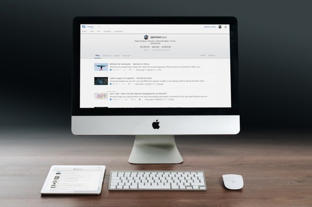
I created a Google Chrome Extension to pimp up the CSS styling of Steemit.
I've seen it around - simple extensions which simply have an alternative CSS styling. Want your Facebook to different? Or your Github? There are plenty extensions for that! Steemit? No idea, but why not try it myself?
It's totally not me but I've been digging into the CSS of Steemit to style it a little bit differently. My CSS skills are limited, but that didn't stop me from trying it out!

I looked into the creation of Google Chrome Extensions, which apparently isn't so hard to make - so off we go! In addition to a tutorial I used, I am also using a Sublime extension to make it easier to alternate and code the CSS. It's called Emmett LiveStyle and realtime updates the .css file as I play with the page in Dev Tools.
Some things are double, or something aren't captured completely - but it it pretty handy for lazy people like me!
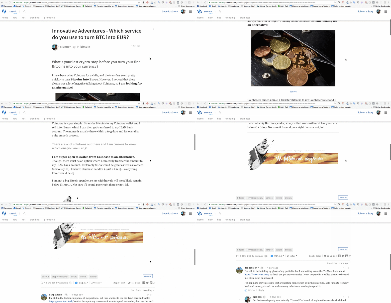
I think one of the biggest changes I did to Steemit was the whitespace and fonts. I allowed the blog more whitespace, which in my opinion makes it a bit easier on the eyes.
I also changed the font size and font itself in some places to improve readability.
Maybe a bit on the downside - I removed the custom header image and made it prettier to blend in with the blog - comments - replies-menu.

There's a lot of crap in the .css which I might or might not take out later.. Also the files will probably make the eyes of developers bleed :)))) Yay coding by designers! To be continued :D
Enjoy ~

Great job! Whether or not the code looks bad, it's great that you went your of your comfort zone and fiddled around with the css. Everyone has to start somewhere, so don't worry if your first attempt doesn't look perfect. Even after 15 years of making websites I still worry my css looks like shit :P
Thanks for the kind words :) I appreciate it!
I bet yours look amazing though! Love your work on @spectacles :D
nice..follow me too
i think you'll see a completley new front end (condenser) pretty darn soon. maybe released at steemfest 2 or something ;)
I am pretty sure! Can't wait 'til they release one themself!
be about time eh? :)
Yeh, I've been waiting for a long time now!
Looks good, im gonna try it out, they should change the ui of the website and add more functionalities.
Thanks for sharing
Hopefully they'll come with something themselves soon!
Nice work :)
Thanks!
So cool. Can you send me the files :D I want to try it lol.
Oh and PS.. I finally got my MacBook!!! :)
Haha sure! It's probably shit, but just try it out for funzies. You have to download the complete folder and then drag it into Chrome Extensions.
https://www.dropbox.com/sh/b4upuzkuphrobzh/AABR3oPE4JSUV_IdaSTg_3Sqa?dl=0
OoooOoOoO! Which one did you get?!
Got a Gold MacBook 12", fully specced though :) Will try that!
Sweet! Congrats! I hope you enjoy it as much as I do!
Oh I love it! It's helping with my productivity just as much as I thought it would too :)
Only thing that I regret it maybe to rather going for your model.. Because I also do quite a bit of designing, which is draining for both the processor and the graphics card. So yeah.. But for typing work etc I love it!
Come leave a comment on my blog ;) Talk soon.
Thanks for helping Steemit, we need to streamline some of the info and access things, from my noob perspective
Yeah. However this is just the styling, hehe. Hope to have enough skills in the future to make a working redesign :p