You are viewing a single comment's thread from:
RE: [Future Food] Thank you Steemit! I’m spending my Steemdollars on 500 posters distributed around the city of Amsterdam. Vote for your favourite poster design!
Great idea, I also would vote for a version without all the names on it. Instead, as someone already said; I would center the poster with a big qr-code that leads to a special post you should create to welcome all the poster readers.
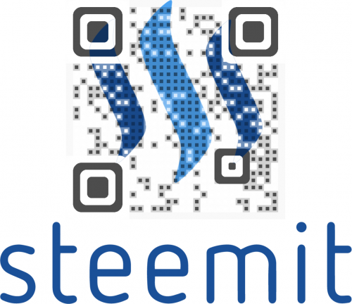
Here is an inspiring example from another post: https://steemit.com/steemit/@minion/the-steemit-qr-code-making-this-world-a-better-place#@fuzzyvest/re-minion-the-steemit-qr-code-making-this-world-a-better-place-20160727t044446895z
Further you could say something like: 'Futurefood Documentary' - Proudly got fundet through (supported by) steemit. Visit Steemit! Blogging. Funding. Charity
I like your "proudly got funded through" I do think it's important to put something that makes steemit different than reddit etc. That's their monetization. So that should be clearly explained.
Yes, that punchline is a great way to deliver the message of Steemit and at the same time it allows some insight in my documentary process. It could make film people in Amsterdam curious as funding is pretty tough game to get into at the moment.
Thank you for the solid feedback @shortcut Food for thought indeed. Refreshing to read those punchlines you came up with. Will work with that for sure! And the post is a very good example of how QR can be integrated.
Thnx!!
You're welcome, I'm happy if I can help. I tried a free online QR-generator, but this one embeds an advert when using the free acoount. Maybe there are others that don't.
That's something to look into. Worth spending on I'd say. The QR could be used for other offline expressions. I'll let you know if I found something proper or on a budget. But.. for the poster would it matter to just get a free QR code and slide a logo under it?
If you buy the monthly plan, you could get the code for $15 .85 with unlimited scans according to the pricing page. http://www.visualead.com/pricing/
Maybe you can create something similar in photoshop but the biggest problem would be that a black code in front of the blue logo will not work very well.
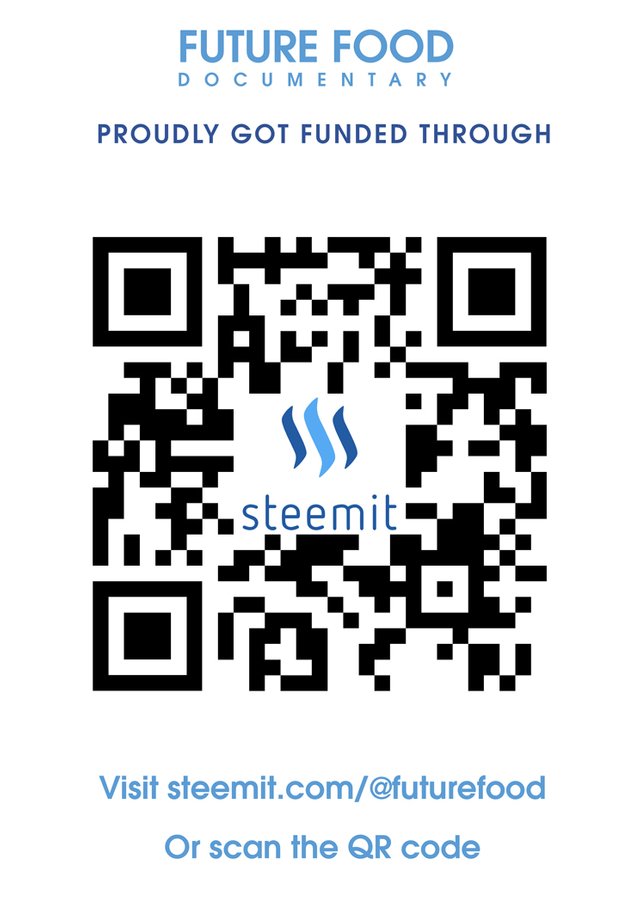
So the design is much more rigid. And I kept your punchline

: ) Curious what you think!
ah yes I see what you mean. Cause I'm working on a free QR code now with a logo in the middle. But it's not even half as big as the one you showed.
Any way will post it in a bit. Almost there : )
Sorry, I cannot reply directly to your new design-post below. Must be a bug. I found the layout of the Version #3 a lot better than the new version. I would just change the punchline and consider adding the qr-code somewhere. The visuallead version looks great, but I can understand that you don't want to spend more money than neccessary on that. I just wouldn't center all the words and 'scan the qr-code' isn't neccessary, as most people already know that.. Also the 'Blog. Get paid.' punchline is not so bad in my opinion. Just my 5 cents. I'm sure, you will do a great design anyway.
That looks so great! But yes, it is possible to just "fake this" if its offline. Just a few layers in photoshop / indesign? or...?