Tips & tricks for pimping your Steemit posts
I don't know if you have been following me, but if you do you might have noticed that I like to play around with my blog format a little. I use markdown and I try to avoid using the full-sized vertical images for instance. This way my blogs are (hopefully) more slick and pleasant to read.
So please, let me share some tips & tricks how you can be creative with your formatting beyond the standard markdown.
Multiple columns
One of the things I use most in my blogs is splitting my blog into multiple columns. You can either just use text in both columns, but if you put images in them, you can build a bit of a photo collage in there.
To the left a screenshot of one of my previous blogs where I used this technique to create a little collage with text combined, without filling up the whole thing with photos that didn't add that much to the story that they deserved a full page.
There are multiple ways that you can use this. In the example, I filled the top block with 2 photos next to each other and below that, I made a block with both a text and a photo. I have also seen people use 2 columns both for text, for instance when they write bilingual stories.
The basics to do all this are as follows. You basically create a left part and a right part that you put something in. The pull-left and pull-right refer to the way you align your text/image in that block. So if you work with text, you might want to go for pull-left for both the left and right block. Also note: The blank line between the div and the image code needs to be there to make sure your image is visible.
<div class="pull-left">

</div>
<div class="pull-right">

</div>
Experiment with it a little. You might need to crop your photos a bit for a nice fit, but the 2 columns also give you the option to do something like this: (example also from the California blog)
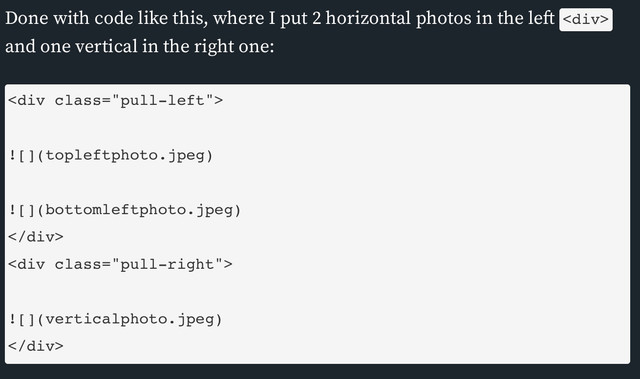
Done with code like this, where I put 2 horizontal photos in the left <div> and one vertical in the right one:
<div class="pull-left">


</div>
<div class="pull-right">

</div>
All very fancy right? There are however a few small issues that can come up when you use multiple columns this way.
- Markdown will not work anymore within the
<div>area. You might have to change to HTML code like<i>for italic and<b>for bold. - There is space left between the left and right
<div>. To solve this you might have to add a few line breaks<br><br><br><br><br><br><br>until the text is again where you want it to be. If you write this on your phone, it won't look great on desktop and v.v. though. I sometimes choose for<hr>or---instead, which creates a horizontal divider and forces the text to start at the beginning again.
And a final option. You can also just use only one left or right <div> have a photo just sit in the text.
Subscript & Superscript
Ever thought about referring to your sourcessource like this? I think it looks good and is not too distracting. The way you do this is by putting your sources between superscript tags <sup>and </sup>. You don't have to put a link between the two and you can also use subscript(like this) with the tags <sub>and </sub>. It is also a neat trick to use a smaller font as extra information underneath an image that you posted. To do this I used the below code:
...your sources<sup>[source](http://www.google.com)</sup> like this? ..
and
...use subscript<sub>(like this)</sub> with the tags...
Emojis
Adding a smiley or 2 to a post can add a little personal sauce to it. But how to insert these? I found that the easiest way (that works) is by simply using the tools that your computer offers you. No need to go into complicated codes for emojis, you can select them all in just a few clicks
- Mac: Command + Control + Space
- Windows: Activate the Touch Keyboard by clicking the keyboard icon in the lower-right corner and click the "smiley face"
No need to go into the raw editor and play around with HTML codes!
Last but not least:
Steemit has the option to view in "Night Mode". If you haven't found it yet, go to your avatar in the top right corner, click it and select "Toggle Night Mode". Many people use it, so you should take this into account while creating your blogs. It will cause 'problems' when you use irregularly shaped images, like below. In "Normal Mode" it doesn't seem to cause any issues, but go ahead and switch to "Night Mode". To avoid this, try to create a transparent .png file instead of using a white background.
That way, the image will work in both viewing modes.
PS. I used <div class="text-justify"> for this block to get a fully justified text.
I hope you liked my tips & tricks and they were helpful to you.
Good work! This is some very useful tips for a better looking post, keep it up! I will for try out some of this in the future :)
Good luck, let me know if things are still unclear when you try!
Thanks, I have a winter post that I'm working on at the moment. It will consist of several photos and your tips should come in handy. So far I've mostly done the one photo per post thing and having fun with all the photo contests :)
Super useful post. I'm trying to create better posts and applying some markdown as well. Thanks for sharing.
You are welcome. Promised to write this some time ago and finally found the way to do it ;)
I was going to write up a post about this, but you've beaten me to it ;)
One thing I'd add is, when you add multiple rows of images with the
<div class="pull-left">image.jpg</div> <div class="pull-right">image.jpg</div>it does not have a gap between the two rows. To get around this, add a horizontal rule after the columns eg.<div class="pull-left">image.jpg</div><div class="pull-right">image.jpg</div>---<div class="pull-left">image.jpg</div><div class="pull-right">image.jpg</div>I usually do this and then throw a few full size images in to mix it up a bit. This gives you a much cleaner looking 'gallery' with equal spacing.
As @r00sj3 said though, you need to make sure your image sizing is the same for each column to keep it even, I just crop all of my images to the same ratio in photoshop to keep them consistent.
You can see in the example image below all of the images in columns are 16:9 and the full width images are different.
Image from my 'Explore Adelaide' account Morialta Conservation Park - Explore Adelaide
what if you put 2 images below each other in 1 left div and 2 in the right div. It might work to not have to use the divider (
---). Didn't try it, but is gut feeling ;)okay, so I tried it in a draft and it works. So there is a way around the small grey line ;)
ah ha, never thought of that, and it means less
<div>shave to be put in.The
<hr>is still useful if you want to add a full size photo in there too though.... I'm going to have to change how I do mine ;)
Excellent tip! I learn 2 things from this.
Thanks!
can I ask what was new?
These 2
awesome!!
It has so useful things. I bookmarked this page. Thanks for sharing!
This is very useful. I got to try it myself. Many thanks for the pointers.
Yea thanks, I have been wanting to research how to sort of "collage" some photos...
Thanks
you can also put them in a table, but I just don't like how that looks...
I just gave it a try last night, not in a table though! It looks great thanks
Wow! This is a super useful post! All your points are great. I'm already incorporating some of these in my posts and will try others too. :)
This post has received a 0.03 % upvote from @drotto thanks to: @banjo.
Hmmm Interesting !