BOTBUSTER Steemit Network Graph Diagram V2.0 RealTime Data
Steemit network diagram graph V2.0 RealTime Data.
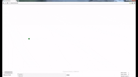
You have to be a little patient, this is real time data, take a couple of seconds for the data start to come.

You can recognize the bots and ignored all his trash, to try to find the real lost gems in Steemit.
here is the page:
http://www.steemitstats.tkHere is how its looks this post in real time

Let me know what you think.
And let’s keep working together to improve Steemit!
BR
[UPDATES in V2.0]
-Remove Nodes.
-Add Counters.
-Inclusive and Exclusive Filters.
hey i dont know exactly how this works but i think the reason why people are not giving it enough attention is because they dont get what it can actually do. when i start the page, first of all i had to disable adblock in order to see anything (or maybe it was just taking long but adblock definitely blocked one script or resource). but then again you are just looking at a white page for 30 seconds and that may be too long for users to convince them to actually use it and find this useful... i guess you can still work on it a bit and maybe introduce the next version to everyone again, i would be happy to check it out :))
Thank you for you feedback.
Find it difficult to explaint this things in english. I'm not so fluently to speak o write.
I'll try harder next time.
I am good with english, if you explain it in raw short words i can write you a text in english if you want. You just need to explain what people see there and how to use it. Also maybe add a small loading animation for the first period when you don't see anything loaded yet.
Hi @dunja,
Thanks for all the help.
I upload a couple of videos on youtube and a gif to the top of this page also.
Let me know what you think.
hey :)
i think it is better. you still need to work a bit on the presentation. you can for example center the elements in your post if apprioriate.. like images and videos.
the videos are a good idea. i would maybe just use 2-3 graphics for your next post. so the reader doesn't loose overview. and in regards of format check out: https://guides.github.com/features/mastering-markdown/ you can also make proper listings etc for your planned features for example.
now to the website itself. it gets a bit messy very quickly. maybe one user could have one color. and every line is attached to one interaction of that user. and the one with most lines is obviously a bot. so you could also automatically mark them as bots (BOT DETECTED!!) or you allow people to automatically filter those kind of people...
hope this was helpful :) looking forward to see an improved version of your tool
one more thing: i could also imagine it to be interesting to have this chart only for @wang for example. so that one could see how crazy this bot behaves... when looking at it for a time frame of 2-3 minutes... i know one can include only him for example but it could be cool for average people to see this more easily... like actually interesting...
I'll keep working on it!
Thanks
Very nice way to see posts and upvotes. Thank you for creating this tool.
Thank you! Is nice to see this kind of comments.
I'm glad you like it.
Rock On @maximiliano711!