My Steemit Logo Design
I created a concept design for the Steemit coin logo, and thought I'd share. I have a few variations below the one I settled on. For this I only used Photoshop, although I know AI is more ideal for logos. I really just started and couldn't stop, so I rolled with it :)
 This is the one I liked best, but would love to hear your thoughts too.
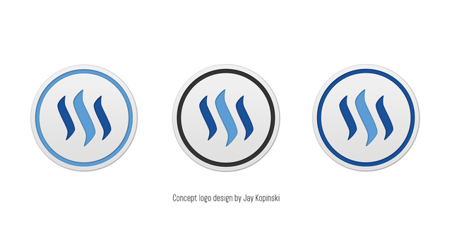 Variations on the original concept
 Work in progress
I just did this for fun, but if @ned or @dan want to use them for anything, let me know.


I personally like the first of the series of 3. The one where the middle color matches the inner ring near the edge. :) Just my opinion, but they're all great! Nice work!
Word, the light blue works best, black introduces distraction and dissonance to the color harmony
Fine!! you guys sold me too, light blue is now my fav as well, haha :)
The same for me. I guess because it makes the inner circle fells lighter.
Yah, I think so too the more I look at them. :)
Yah I was torn between the top edit and that one too. :)
Me too. It seems to work better.
seems to be consensus :)
I use adobe as well but i do most of my designs through phone as it is portable and easy to use.
I like it! Specially the light blue one. Good job!
thanks!
These are sick! @ned and @dantheman should totally use these!
Not bad, but then honestly I prefer @mauricemikkers' design proposal; not necessarily in gold, I'm more the silver type of guy:
Good philosophy behind the 9 corners too, I find.
I like it too, but not for the coin logo. I'd worry scaled down that it would be to busy.
Cool I use this logo for a shirt I would make only for me? Thank you!
Interesting post. Well done :)