New website design for Steemit
So, guys, i was wondering how Steemit could look like in near future. I'm decided to make design concept for Steemit website. I’m planning to develop this website soon more.
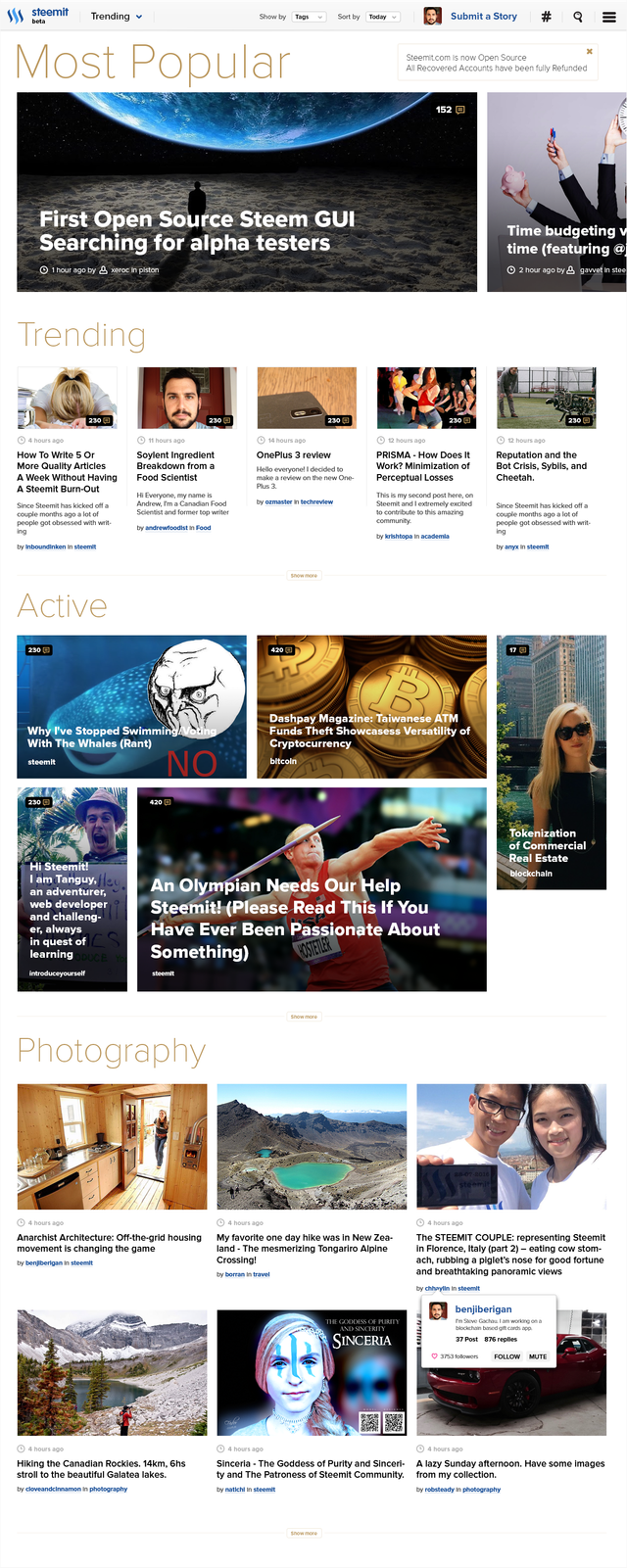
Website Main Screen
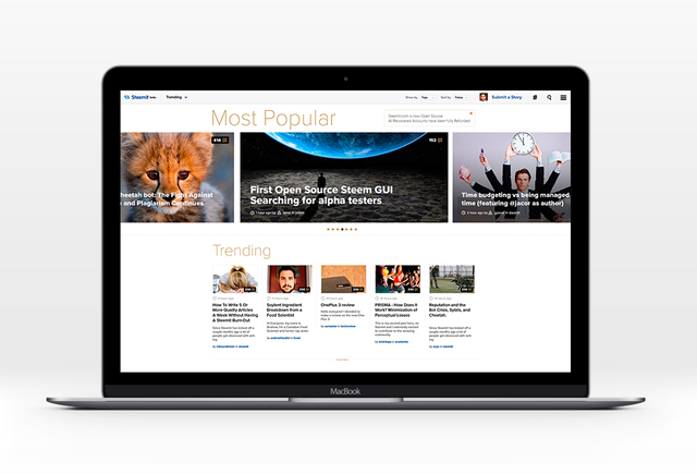
Active Post Block

One Tag Block

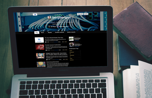
Dark Theme
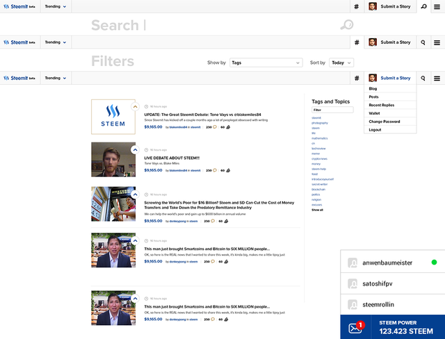
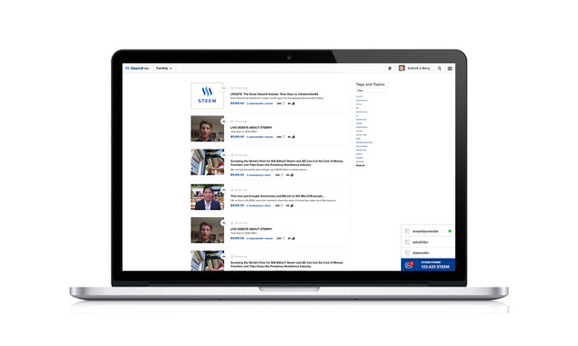
Minimal Theme
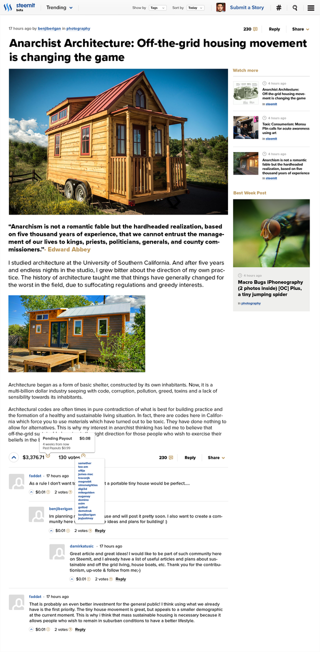
Post Single Page
Profile Page
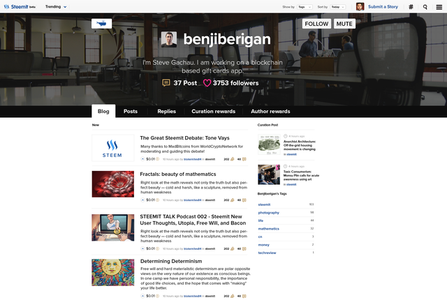
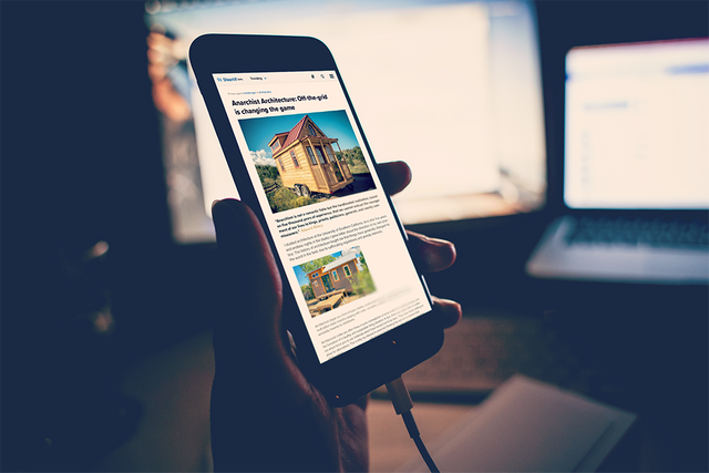
Mobile view
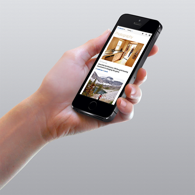
You can find high resolution picture here http://etherdesign.io/ below on the website.
How was it done? You need to keep all major things in place but make it look more awesome and convenient.
So what do we need? Redesign menu section to make it look solid. Make different grid for post thumbnails with the separate tags. Show what are the popular posts right now. All this little things important to make it look more joyful to communicate with. What do think? Should i continue? I wanted to make interface design for account panel and some other inner pages of Steemit website.
You can watch how it will done live on stream - http://etherdesign.io/stream I’m streaming all my design process so you can see it.
Thank’s for watching!

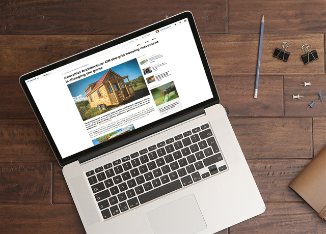

Fantastic work, very pleasing to the eye. It would be great if such a professional, magazine-y look like this was the first impression people got when visiting steemit.com. But I definitely agree with others who've suggested there should remain an option (at least when logged in) to view all posts one below the other.
As for the fact that anyone can create an interface to the steem blockchain hosted on their own domain, that is true. However, to avoid confusion, at least in the early stages, I really hope any additional steem sites will be limited to foreign languages (e.g. steemchina.com), or perhaps sites with a focus on specialized content.
Etherdesign made minimal version with such "all posts" feature check update on post
Great work. A lot of people will prefer the minimalist design, something like we have currently. But if there's a choice, I'm sure others would prefer the richer design that you have shown. Could we have both and be able to decide, turning one off and the other on for a while?
Great work @etherdesign - Dude! great you're STEEM :P ! - i would tend to agree @donkeypong with the minimal some also are preferring, but - there will be not just www.steemit.com as a front end. So there is a lot of room for you ideas and design! Upvoted .. let's get in contact soon.
it would be nice to include a different design, depending on the speed of the Internet
Guys You do Know that steemit.com is on a blockchain right? https://steemit.com/piston/@xeroc/piston-web-first-open-source-steem-gui---searching-for-alpha-testers This proves you could just make use of another domain and display the content there...
yea, piston-web amazing work!
This guy gets it! Lol
Yeah those are all really awesome!

(There is supposed to be stars but you can't really see them)
My fav. gif!
Looks great! And my article about an Olympian needing our help was in the concept design! Unfortunately that article didn't take off and catch the attention of the big hitters.
👍amazing design @etherdesign, looking elegant website... Great work
Your work looks amazing! I would love to be able to pick but when I am on my phone the most simple option will be very needed :D
It has nothing to do with the speed of the Internet, it has everything to do with the speed of reading. People who can sift through information quickly (a skill which can be honed by spending years on reddit) will prefer more text and fewer photos.
I think that new design is still very minimal when compared to most websites.
I love the aesthetics of the proposed design but the main reason why the current design works way better than the proposed one is this:
With current design you can scan the new posts much faster with your eyes.
The proposed design makes your eyes jump around the screen. The current designs requires minimal movements of your eyes to see the next title. Also the smaller thumbnails of the current design don't grab attention from the titles.
In information dense sites the design should always follow functionality - not the other way around.
nice comment))) lets go make simple version and add swith?
Hello @etherdesign, are you coding this interface for steemit or you are only designer? If latter do you know any coder building a new UI based on your design?
Awesome work by the way!
3/4's of the world has shitty internet and can't even run the site as it so good point. No point in polishing this ponzi scheme turd though.
https://steemit.com/steemit/@apocaloptimisto/dantheman-ned-please-remove-my-content-from-this-site
well this will make im sure the 6 or was it 8 current trending posters all very happy im sure, While the mass of minnows will be washed up onto the beach of total anonymity . If the site was to turn over to this style of magazine estethique, clearly to the current of internet tech norms, there would need to be at least one window set up to house the present regime of real time in the now posting from whoever and wherever they might be, we must not i feel ,let the pipes of steem be allowed to be channeled to just the " lucky few " who for whatever reason, hopefully good , attract the attention of the bigger pipes of steem ; - ) no pun intended of course !! as this is certainly against and detrimental to the concept of this economy !! no ?
Yes!
I like the minimilist Theme! :)
That is really amazing, doesn't it? I'd love to have such a design, cause, unfortunately here is a mess now..
These are pretty great. I have some concerns with the emphasis on imagery (since not all posts have images), but it's still awesome work.
Are you on steemit.chat? I'd love to chat a bit. I've been working on a few steem related projects, and even if this doesn't end up being what steemit looks like, there's nothing to say it couldn't be done on another steem project :)
Dark theme


Hi-res on Click
Love the design , we need channels also , we have to dethrone youtube , cheers steemers :)
:-D
Love the concept!
There will soon be interfaces that will allow us to choose which content to display and how, with which layout and bandwidth. Functions, visualizations, analytics, correlators, skins, games will comes as modular apps andor sidechains, markets develop for banlists. The feed filters will be customizable, tags and their relations be shown as 3D-clouds.
I would be inclined to bet that the steemit crowd would uptuck a pretty penny to most devs who opensource an interface that gives curators full control to browse and evaluate new content.
Absolutely beautiful! I hope users can pick different home pages. I notice you had photography section (from tagging I'm assuming), which is great. As a lover of art it would be able to customize that instead for my personal landing page.
My favorite thing on Steemit right now is #SteemAway and I created a curation link with http://SteemAway.Win to make it easy. I would love it if people are able to customize the tags that are most important to them.
There is a saying "if it aint broke dont fix it". Current steem design is doing fine. It loads fast. I dont see any reason to confuse this nascent community with a new design and heavy CSS.
How do you think Youtube will look like now and what functions will it have now if it will not be redesigned so many times?
You'd probably still be able to browse the top videos on the site. Where has that option gone?!
Please do not confuse text content with video content. Steemit is not video rich. It is text rich. And to be great at serving text quickly, u must have light CSS. Please look at reddit.
wellcome
you have some serious trick up your sleeves in this one. thank you so much for sharing your expertise on the matter, fantastic post, you got my upvote! Namaste :)