New First Impression of Steemit
Today I unboxed a new laptop, (bought in part with some earnings because of Steemit), of course what was the first website I visited?
You guessed it, http://www.steemit.com.
I really liked the design and the feel of the splash page but I got a fresh perspectives from seeing it for the first time on my new computer in 3k resolution, which left me feeling uneasy.
Would it be better to show something different than the top paying posts as the splash page?
The Default Page
The message "Welcome to the Blockchain!", the wonderful graphic and the tagline "Get free STEEM POWER when you sign up today" is very inviting.
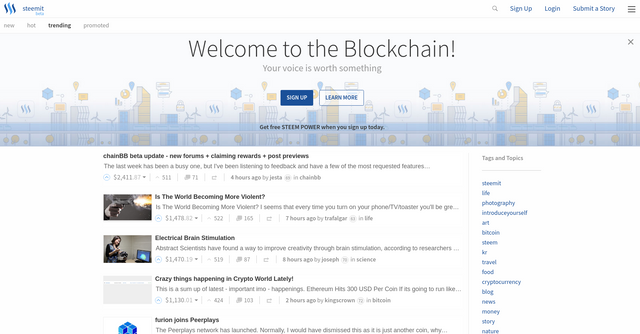
Being critical what stood out to me the most was the default selection of trending posts as the splash page. The payouts are staggering!!!:
- $2,411 for a post about chainbb to @jesta?
- $1,478 for a post about life to @trafalgar?
- $1,470 for a post about Science to @joseph?
If I was new I would be thinking, I can do that lets give it a try!! Great right?
Inflated Expectations
For my first visit to the site the issue is my expectations are being set very high at this early stage. In reality I have been on Steemit for months and I know how much work these guys do, and the talent it takes to make posts like that but if I was new from seeing this I would have very inflated expectations.
I would propose that something positive, but attainable for the masses should be the first sight people get of http://steemit.com. Something that people will respect and think to themselves, that looks good I will give that a go.
Other options for the default selection
There are three other options already along the top; new, hot and promoted.
Promoted
If Promoted was selected it would look like this.
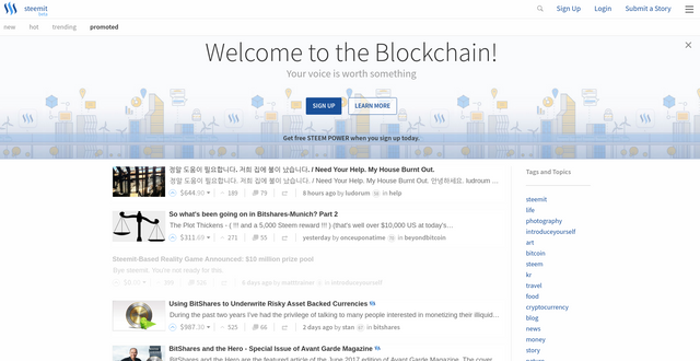
I think this looks a bit more realistic in term of payouts, but content may be limited and obviously people can manipulate this page so it may not be a good option to put as the splash page.
New
If New was selected it would look like this.
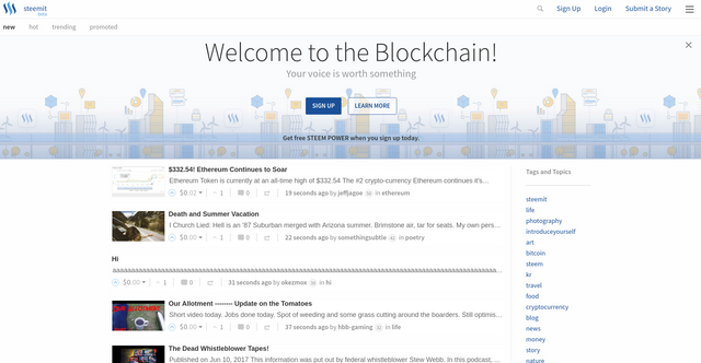
This might be fairer, even dare I say it more realistic but lots of 0's or aaaaas may not be as desirable to show to new users for the first time. We obviously want to give some sort of fair representation of the platform and what is possible, i.e. some view of curated content.
Hot
If Hot was selected it would look like this.
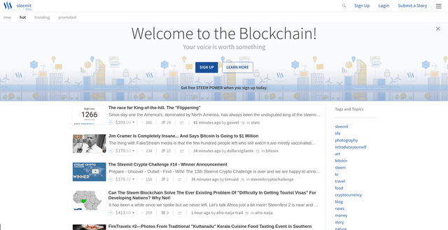
For me Hot would be the fairest out of the 3 other options, the posts would be dynamic and would represent what people are voting on and what are the bread and butter of Steemit. It still shows very favourable posts first, with big rewards but some more realistic and attainable rewards.
Would one of these be a much fairer way to present Steemit to the world?
Other Options
There are also many other options that could be considered and may have been considered already but I will list some I can think of in case the are helpful for discussion.
Curation
Some form of curation such as listing "good" posts, active posts, or even advertising.Scenarios
A realistic and best case scenario, such as a mixed selection of hot posts and top paying posts could be shown.Videos
Is it even a good idea to show posts on the splash page. Should we be showing a video to explain how steemit works.
What do you think?
Thank you for reading this. I write on Steemit about Blockchain, Cryptocurrency, Travel and lots of random topics.

Yes Show a video!
Think about it, People are lazy, they would lots rather watch than read. If you don't believe me, do a search on Google for anything it doesn't matter, and if there is a video on the first page, 95 % of the searchers will watch the video before they click to go to a website.
Great post, I'm new here and I'm following you now. Thanks
So true.
You have really evaluated the options for front-page well @eroche. In my opinion hot would be the best out of all the tabs as it shows the right balance between the trending and new posts.
@eroche and @gyanibilli - I agree with both of you that the HOT tab landing page for new users, as it provides a nice balance.
I do want to add that new users need to come into the community and be ready to learn. I have made a lot of mistakes, but I am learning about the community from the community. Some people are joining because of all of the hype they are hearing and are not taking the time to learn. But would changing the landing page focus fix this problem for new users. It definitely would for some people, but I think that there are people who will join (with high expectations) and leave, because they did not take the time to learn what Steemit is all about.
Steemit has a responsible to new users to help educate, and new users have a personally responsible to be ready to learn!
I agree with hot making the most sense, and some basic info on the homepage would be helpful, perhaps a short video explaining the technology
I think hot provides an interesting insight. I actually agree with you, in the current form - hot is probably the best.
This post really just shows how much work steemit needs to do on their front end. Communities can't come sooner.
People lose interest very quickly if they get the wrong impression. This front end is the shop window for steemit.
Exactly. I think Reddit's "front page of the internet" is a pretty good grab to new users, minus some inside jokes.
The problem here on steem is, I think @jesta has earned his 2k on that post. There is very much a reason he is making that much on the post - there was so much more value behind what he wrote, not directly tied to what he had to say in that post. Most people wouldn't even want to read it (sorry @jesta, not everyone is technical).
The thing with steem is the value a post is earning might not be correlated to the "clickablity" or value of the writing in a post. There needs to be more segregation of content here on steem. Niches will be the key. @kushsmokers is making strides in the very arena I am talking about.
I really hope communities fixes a lot of this. Just don't show the trending posts from /developers on the main page. Boom done.
Well said.
A quick fix now is to use another tab as the default, with communities you might be able to show localised content or relevant content first which would be great but if its left as trending I am sure there will still be some great technical articles, or celebrity posts that make it to the top.
Anything reasonable that can be done to improve the clickability is welcome in my book.
You had me at "Today I unboxed a new laptop, (bought in part with some earnings because of Steemit)"
Next Stop Moon!
Well ... you made a good choice to come here. Welcome to the family.
Loving every minute.
Congrad's on the new computer.

When I see those high dollar amounts makes think wow it is possible.
It's like you were there 😁 😁 😁
Great post eroche. I get that they want new users to see huge payouts showing what is possible, but then when your intro post doesn't make anywhere near that, it is probably tempting for a lot of people just to give up. Keeping users here is what's needed for the long-term growth of Steemit, so I think it is definitely worth looking into the point you are making, and you give some great suggestions here. I hope the devs do some research into this or at least consider your suggestions.
@bitgeek has done some analysis of introduceyourself posts recently and the average payout is between 7 and 12 dollars (depending on the day of the week). A far cry from the thousands that some posts are getting. I am not saying that people are told to expect thousands but if that is what they see when they go to the site first that is their lasting impression.
Agreed. And if its a technical post with tons of Steemit lingo they havent learned about yet, then it probably wont make any sense to them either. Something of quality and middle of the road payout that is within their interest are would be ideal. Maybe there should be a dropdown asking them to pick their favorite topic(s) and then some examples pop up?
That is a great idea. A drop down or Pictures from a few general Topics that they could click into.
Yeah that woukd be nice. As well as a solid article with advice to new beginners. Im sure a lot of people think it looks cool but are overwhelmed and dont know where to start. So something explaining markup, whales, curation trails, Steem vs. SP vs. SBD, etc. could be beneficial.
Great ideas, anything that makes steem better is a go for me! 🤑🙌🏼
👍
Showing off huge payouts is something that would attract new users. I mean, let's be real here, people see pages of posts with tons of amounts in earnings. You can't really walk away from that. But then again, when they actually sign up and begin posting, they realize it's a little harder than that. Before being able to make money like that, they need to be discovered.. So the expectation is not set correctly. Something to rectify that, is more spot lighting on the newer posters, perhaps. To fix something like this, it'll need a lot more than shifting of page elements. I agree with what you're saying in this post. I hope the development team look more into this. I have confidence there will be improvements made. Great post!
Thank you for reading. We have to remember we are still in Beta so the more technically minded people will expect some rough edges but the masses can be a lot less forgiving in my experience.