Steemit Gets A Few (Nice) UI Updates
It's been more than a year since the last significant UI update in Steemit (or Condenser, that's how the front end part it's called). So I've been pleasantly surprised this morning when I saw a few changes.
Let's take them one at a time.
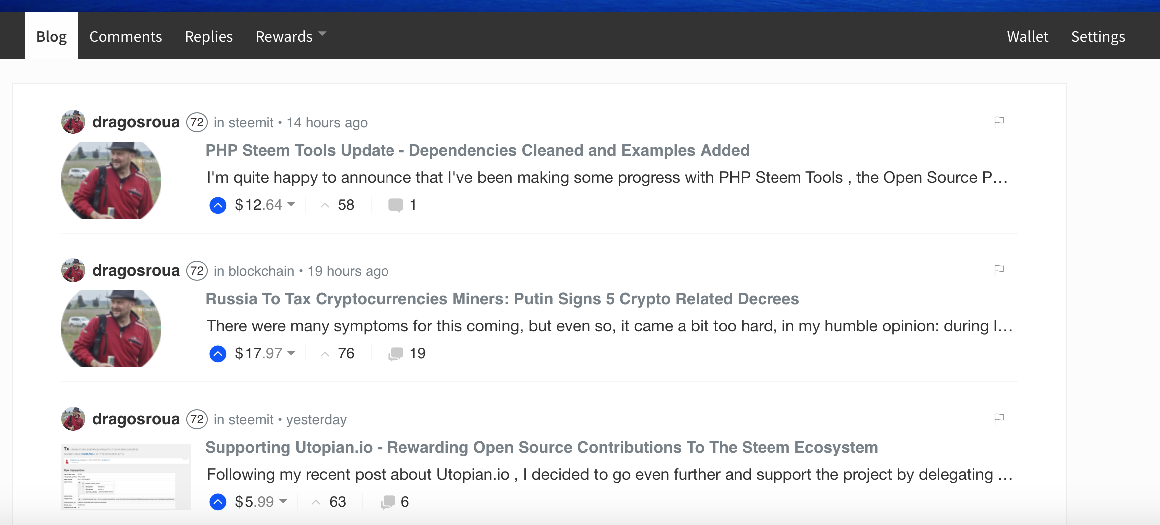
Blog
- font family change across the Blog section
- font colors for the active part of the theme (the blue became a bit more electric)
- small user avatar displayed on top-left (consistent with other changes across the site, more on that in a moment)
- reputation gets displayed in a more contrastive and consistent way
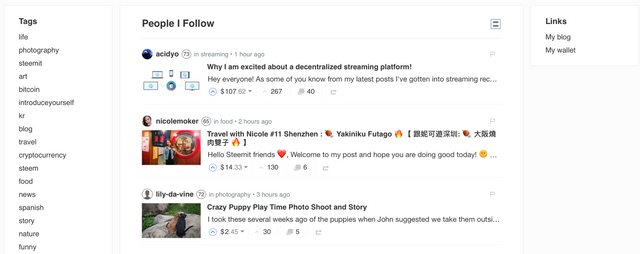
Feed
- tags have been moved on the left column
- same cards as in Blog, with more prominent display of user metadata
- new column on the right, with links to Blog and Wallet (reminds me of some three columns WordPress themes)
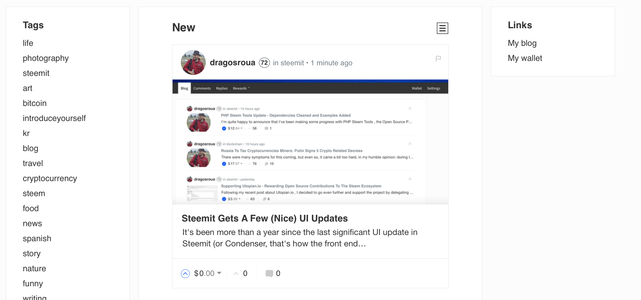
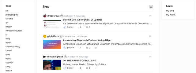
Cards versus List Display
There is also a choice between cards (with the featured image bigger) and list display on all the feed pages. Here's a card display:
And a list display:
The most consistent change is the display of the user reputation. As far as I know, this is a vanity metric (it just goes up when people with higher reputation than you are upsteeming your posts, but other than that it doesn't influence payouts). These changes hints at the fact that reputation may become a more relevant metric in identifying valuable content producers on the Steem platform.
All in all, good stuff. Really good stuff!
Congrats to the team!
I'm a serial entrepreneur, blogger and ultrarunner. You can find me mainly on my blog at Dragos Roua where I write about productivity, business, relationships and running. Here on Steemit you may stay updated by following me @dragosroua.

https://steemit.com/~witnesses
If you're new to Steemit, you may find these articles relevant (that's also part of my witness activity to support new members of the platform):


I especially like the small user avatar displayed on top-left and the higher contrast reputation. All in all, it feels a lot cleaner and it helps me to save time. I’ll have to give it a thumbs up.
Now if we can just some similar results for the posting and upvoting issues we’re experiencing.
Yep, as they say, no shit.
Yeah its good, I just wish it wasnt so slow that I cant post replies any more
@dragosroua Yes the changes to the website are nice. That being said it is not always easy to get used to right away...........
like other people are saying, the comment and upvoting part is not working properly
I think there are quite a few more changes on the way between now and SteemFest... I'm overjoyed nonetheless ☺
Wow. AND the website is loading and working again as well? wowiwoowi!
I just noticed the changes this morning. Pretty cool stuff :D
Oh yea I love this new design..
They fixed the lagging too 👍
The changes are really nice and cool have to admit but i think the best part is that the platform is performing without major problems like in the last days!
Interesting point of view as well about the Reputation Level... i always thought it's very important and not only from the vanity aspect. I think Steemit is moving in the right direction!