A thought on updating my brand - Discordiant Revised

I want to talk about how I will be re-branding my Steemit presence, though not greatly. I still haven't found a really specific niche to write into, and I am not sure if I want to. This really is a personal blog, and I want to be able to write about what I am working on, thinking about, or find important.

Before I go too far into the changes I am making, I wanted to discuss what I mean by 'brand'. Not everyone would consider having a personal blog a 'brand', though it most definitely counts.
- What is a brand? - The perceived emotional image, as a whole.
- What is identity? - The visual aspects that form part of the overall brand.
- What is a logo? - The identifying mark, in its simplest form via the use of a mark or icon.
While I don't have time to delve into each of these entirely, as they each could probably take up a series of blog posts, I do want to discuss the parts I am looking at. Identity and logo.
Identity:
This can best be described as 'what people see when they look at your brand'. These will fall within certain guidelines about things like color, font choice, and theme. These guidelines apply to the Identity through visual devices such as a logo, and other media that will be seen by a consumer. The guidelines ensure that the identity of the company is kept coherent, which in turn, allows the brand as a whole, to be recognizable.
Logo:
Only there for identification. It identifies a brand or product in it's simplest form.
Logos derive their meaning from the quality of the thing is symbolizes, not the other way around – logos are there to identify, not to explain.
justcreative.com - Branding, Identity & Logo Design Explained
So, what have I done with my 'brand' here at SteemIt? What have I chosen for my Identity and Logo?
Some of it you have no doubt noticed already, but lets take a look at where everything comes from, and why I have gone this route.
The Re-brand:
Discordiant - My Identity
Writer, computer enthusiast, free-thinker and devout proponent of liberty and libertarian values. A belief in both order and chaos, with a neutrality in almost every aspect of his personal life. Passionate and yet balanced. Dichotomy. Also, a fan of big words.
I actually chose my username more than a decade ago, as I had a need for a quick name in an online game. I got the inspiration from a fellow gamer I knew in the past, Eris Discordia. I have since kept it as a pseudonym online, and a fairly available name when I go to a new online service. In the end, it actually fit me more than I knew.
Discordianism is roughly defined as:
...three core principles: the Aneristic Principle (order), the Eristic Principle (disorder) and the notion that both are mere illusions. It is only by rejecting these principles that you can truly perceive reality.
While I don't hold with all the Greek deity stuff, I do think that realizing both order and disorder are an illusion is an important step to finding a greater truth.
This really did turn out to be a great symbolism for my online presence.
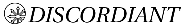
Now, let's take a look at my logo:

As you can see here, it's very simple.
Line-art with a fairly large amount of negative space. Black and white, no color, and easily printed.
This symbol is often associated with Discordianism. I personally found the symbolism of outward pointing rays in a sunburst formation to be visually striking. In the end, this is all that matters. A symbol that can be recognized.
I did shift the arrow-burst off-center to the circle though. This helps differentiate it from the usual symbols, and common uses of the image.
What about some of the other visual devices of my Identity?
For a font, I have gone with something mildly Greek in appearance, without being disorderly or hard to read.

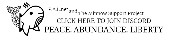
Below you will see a new, monochrome, animated image for my footer. I wanted even my Minnow Support Project / PALnet material to match the theme of my posts.
I feel having a unified identity to my presence here on SteemIt is a good start towards really refining and improving it.
Now I just need to consider that question I posed at the start...
Thanks for reading this far.
It seams that you have a great idea about how to brand yourself and I really like it. Well thought and connected to the username you chose many years ago. I think I need to do some work on my brand to, haven't even got a logo yet, as a designer, LOL.
I really like the clean style in black and white!
Love the new look!
Post made while listening to the following:
Sync | A Chill Mix - Vibes
Congratulations! This post has been upvoted from the communal account, @minnowsupport, by Discordiant from the Minnow Support Project. It's a witness project run by aggroed, ausbitbank, teamsteem, theprophet0, someguy123, neoxian, followbtcnews/crimsonclad, and netuoso. The goal is to help Steemit grow by supporting Minnows and creating a social network. Please find us in the Peace, Abundance, and Liberty Network (PALnet) Discord Channel. It's a completely public and open space to all members of the Steemit community who voluntarily choose to be there.
good
I dig it. Nice and clean look.
Mine, not so much ---->
That isn't bad, and could be made into something simple and black/white really easily.