Steemit redesign 2017 deconstructed.
I just joined recently but as a researcher and designer couldn’t stop myself from doing a little bit of a research and looking at the platform from different perspective.
For me it is particularly interesting experience - because I joined right before redesign then DID NOTHING for..3 months. Came back and it looks so different! It is also my..first post (besides intro). So I decided to dive into and investigate what actually happened?
I think it would be also interesting as well as surprising for all those who joined the community recently - that nearly 3 months ago the platform looked so different! The platform had a different logo and colours and also in alfa version the information architecture and whole structure were not really that user - friendly. I am not writing that to criticize but most of all to highlight the fact that we can now have so much better experience as Steemit users! And since I have read today so many negative comments from people complaining about Steemit - related stuff, maybe it would be a nice way to stop for a second appreciate how the platform looks and what we have got here and now :)Why Steemit needed redesign?
Because it is no longer the ‘new kid on the blockchain’ 😄
How did it look before?
Alpha version 2016

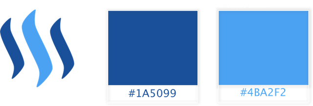
 Old logo and colors
Why Steemit needed a redesign?
But first things first - why actually the platform needed a new look in the first place? New logo, color scheme and changes within the interface have been introduced. The main goal was obviously to improve the user experience but also underline the difference between Steem (cryptocurrency) and Steemit as a platform - simply because they were using the same components which made up the Steem brand identity (logo, colors).What is actually new?
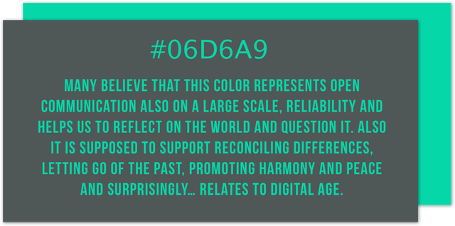
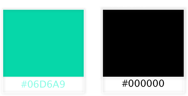
1. New color scheme (buttons, logo and links). There is a discussion about what this color actually means. Some says it is light teal some mention aquamarine or turquoise. Analyzing many many resources I came up with a summary of what it is associated with.First of all it might refers to rewarding system and monetary aspect that is involved. Also while researching the meaning of this color “family”, very interesting and quite convincing associations can be found:
 2. New logo
You can see two overlapping chat babbles if You really try! And what is so good about it:
- it is simple and minimalistic - flat design is a plus
- you might also try to associate shapes..with the S!
- clean, clear and most of all distinguishable from the Steem blockchain logo!
- Night / dark mode
is also part of the 2017 November redesign
Something for all the night owls out there!
Redesigns can be tricky
As we all know most brands have to go through makeover and improve their brand identity from time to time for many important reasons. But it is not easy.From a UX design point of view - there are many traps but also huge possibilities.
Once a poster or a signboard was enough for us. Since the inception of the Internet there have been new challenges when it comes to creating the brand image. You have to present it on the Web keeping in mind different devices, multiple spaces and channels of communication in order to convey the same character and values that the brand, product or organization brings with it.
Firstly, the key to successful redesign is consistency. Being consistent and sticking to the same principles and building with recognizable elements creates the trust and confidence of users who are assured that it is still the same brand.
The user limits his time and does not put in any unnecessary effort to find himself in a chaotic space, when the individual components of the website, or even entire pages look just different - am I still on the same site? Or maybe it’s a scam? Consistent design does not burden the user and allows for more efficient navigation within the space of a given website.
According to many authorities within design industry, there are 3 areas / layers of focus (Schneiderman):
- Visual layer - at the beginning of the design process, focus on creating rules, simplifying, designing basic components and maintaining consistency
- Visual layer - at the beginning of the design process, focus on creating rules, simplifying, designing basic components and maintaining consistency
- Utilities - cover optimization of user activities, do not require unnecessary actions
So.. how the Steemit managed to do?
I honestly think the team did a good job and we should all remember it is still a beta version!- New logo was created while keeping in mind that it should represent main principles that stand behind the creation of Steemit like the freedom of censorship-resistant publishing space, values that comes with community and interactions within decentralized platform
- new site is recognizable and asier do navigate
- the look is more modern and pleasant
- except the bugs causing temporary delays or slowing down the operation of the platform, nothing unexpected or counterintuitive can interrupt users actions
Summing up
Maybe the old navy blue seemed like a safe choice, solid one, the one that eliminates the risk of distractions and most of ux design veterans would approve. Also some people disappointed with the redesign outcomes point out the mistakes saying that shape of the logo is not obvious, looks bad in thumbnail version and the combination of bright green and white falls out badly while testing the contrast which is against the basic rules for accessibility.I am aware of those, but to be honest I will still support the redesign because it was needed. I respect this bold, brave choice when it comes to new color scheme. The site looks vibrant and with this new, interesting logo - while it will catch up, might make it more recognizable in the end. Steemit community is growing very fast and platform needed to fresh up its image and improve usability. Baby steps!
And what is important - it’s good to remember that design is not the priority for Steemit and the most important stuff goes in the “background”. Maintaining the platform and most of all the blockchain so it works properly and algorithms serve the community in the best possible way. Besides, it might not be clear for everyone, but the Steem blockchain supports a lot of applications within its ecosystem and Steemit is just one of them.
For all those who do not know - Steemit.com is only one of many apps built upon the Steem Blockchain!
There for You can take 2 easy steps to improve Your experience as a new Steemian for a start:
- Add browser extension called Steemit More - here
With this one You can:
- see users Vote Power, votes given that day
- set Your voting weight and see its value $
- there is histogram when u can browse older posts and see its quantity easily
- see how much particular voter actually contributed into the total reward
- browse latest upvotes given and received of particular user with new tab Votes
- you can easily access external tools with a dropdown Links - also new tab
- Mentions tab and more user-friendly search box
- access the table view with some detailed info about all your followers and users you follow
- see a preview for post during writing and ..so much more! It’s very amazing and very useful !

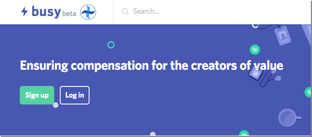
- And for all those who miss facebook-alike interfaces, here is busy.org - another frontend for the Steemit platform.
Just log in here and see for yourself!
This piece is helpful and illuminating. Thanks, Anna!
Glad to hear it helped somebody!