Steemit.com User Interface updates!

The Steemit Team has been working hard and has pushed some much needed UI updates to the Condenser interface today!
Most notably:
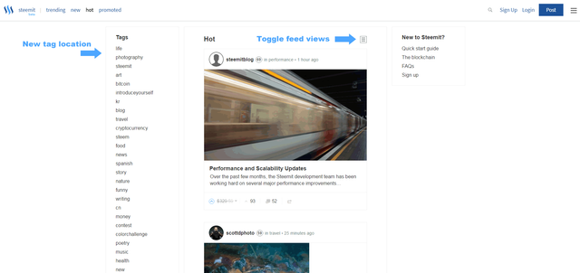
The tags box now appears on the left of the screen instead of the right.
You are not able to toggle between two different ways posts are displayed in your feed.
The whole experience feels faster and more responsive than it has been these last few weeks.
I like these changes and feel it gives Steemit a more modern and polished look like found in other social media/blogging sites and I'm looking forward to more frequent changes in this direction. Updates also seems influenced by the new Busy.org beta interface.
What do you think? Like it? Love it? Hate it?
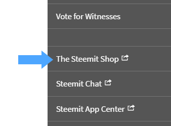
P.S. Be sure to checkout The Steemit Shop!
The link can be found on the right in the hamburger menu.

great design & update
but why steemit stop.
Steemit is very beautiful designing! Excellent update
I just got on and did notice the new look and it does look better. I also had better luck with upvoting showing up as completed. Still an issue with posting though :(
Hopefully resolved soon -
yes, it looks great now.
Has been looking good lately - and performing alot better, despite still getting the “transaction broadcast error” messages when posting...
its looks great but the site needs to work properly too :(
Congratulations @adept! You have completed some achievement on Steemit and have been rewarded with new badge(s) :
Click on any badge to view your own Board of Honor on SteemitBoard.
For more information about SteemitBoard, click here
If you no longer want to receive notifications, reply to this comment with the word
STOPYea great post bro the steemit shop is awesome