You are viewing a single comment's thread from:
RE: STEEM GIG: Design a logo for "Nanzo Scoop" brand ($200 SBD)
Nicely crafted by the idea is not original. Simple search on google and dribbble shows these:
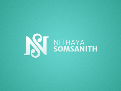
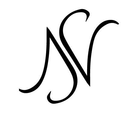
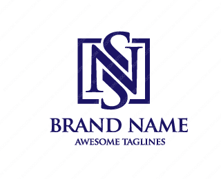
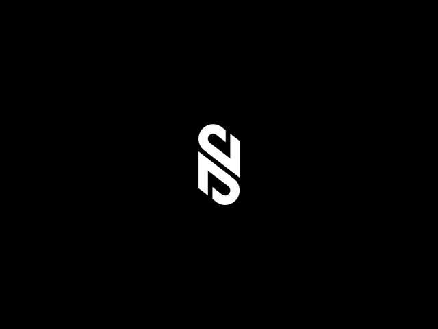
Nicely crafted by the idea is not original. Simple search on google and dribbble shows these:


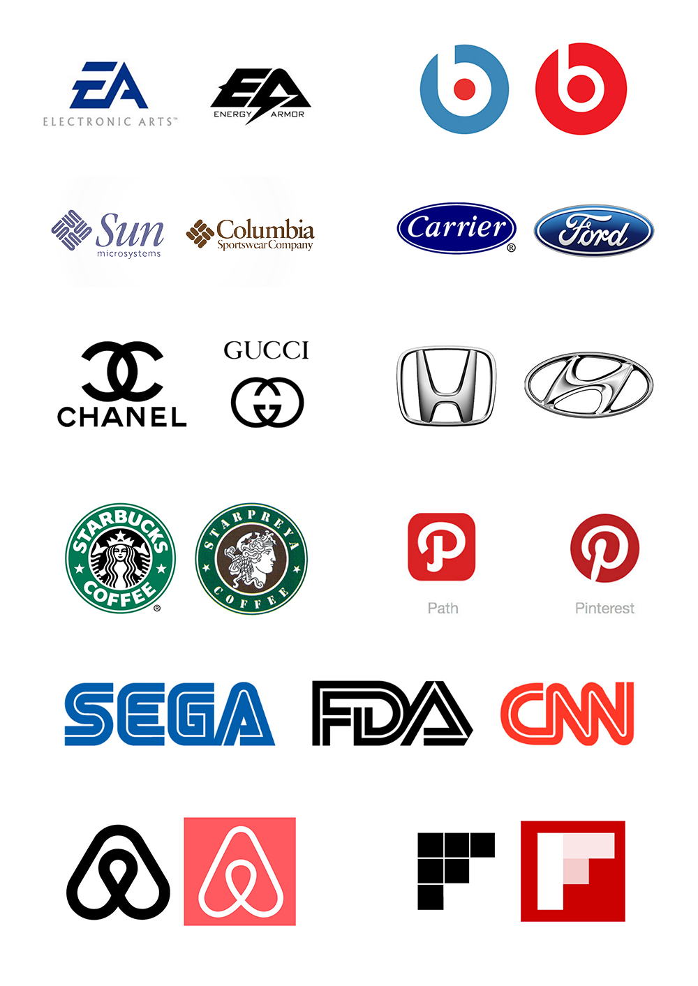
The real story is that there are a lot of different forms and styles a N and S can link together and this is just another random form that it seems somebody else before used, and now I'm using the same without knowing that and my proposal it's even so different and so much more compact from the examples you are showing, but anyway I proposed another great minimal logo design to @nanzo-scoop in this comment: https://steemit.com/steemgig/@nanzo-scoop/steem-gig-design-a-logo-for-nanzo-scoop-brand-usd200-sbd#@andren/re-nanzo-scoop-steem-gig-design-a-logo-for-nanzo-scoop-brand-usd200-sbd-20170808t180245070z and you can see another example of how N and S link perfectly together, the bad thing in here is that I didn't used google image search when I finished the first proposal to search if there are same logo lookalikes, you should know that in the world of graphic design there are many different companies that have some sort of similarities on their logos, here are some logo lookalikes:
Thank You :)
Well, nobody said you stole the idea.
If you didnt look at inspiration, you should have had. Maybe you wouldnt create something so similar. Unintentional similar ideas happen to everyone. Im sure you could search really hard and find something similar to my ideas too.
It's so disheartening really after you've expended a lot of time and energy on a work only to find a similar concept on Google later. This still happened to me yesterday. I had to start all over again