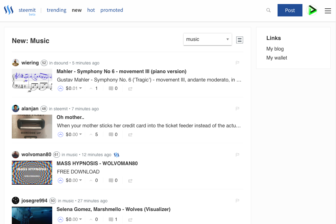
STEEMIT.COM Facelift!
While I was hitting the refresh button on a story checking if my upvote went through, I was pleasantly surprised to see the new look of Steemit.com. I first looked up at my browser because I thought that was using the site Busy.org which has a pretty nice UI. When I realized that it was steemit.com I began to poke around. Usually when a social media site changes their look and layout people get frustrated. Mainly because they have to get use to the flow of the site again. Facebook is an example of this. Every time they make a change people post about how much they don't like it.
BUT...
THIS CHANGE IS WELCOMED!
Steemit.com can be intimidating for new users. I am still not completely used to it. These new changes definitely makes it feel like a large social media site. The changes are not drastic but it is a much needed facelift. I hope to see them continue to make it better so that new users feel more comfortable interacting with the community.
OVERALL LOOK AND FEEL...
The look is much more modern. The fonts look smother which makes it easier to read and the upvote button color is a darker blue.
THE TOPICS SECTION...
I would always have trouble using my phone and trying to access this menu. It is now easier to see and doesn't cut words out. It is much more responsive. The hamburger menu on the right side changes the layout from wide to slim. This could be useful when using different devices.


It's awesome! Looks flash lol