State of the Sndbox Competition Entry ^.^

.png)
I just couldn't resist joining this contest. ^.^
Also, it helps me practice my skill in logo design (at least, I hope so, haha).
This is my entry for the State of the Sndbox Competition. It looks simple, but that is exactly what I was after. :)
Let me explain the steps. ^.^
.png)
The Structure
I spent more than a day polishing the idea in my mind before decided to open the Photoshop. :P
I wanted to make very simple, but stylish design with the only two elements needed - the logotype and the sign.
Here I made basic structure using geometric shapes and sample text.
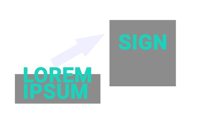
Another thing that I had in mind was some additional background elements to direct the user's eye from one to the other. That was the arrow's purpose.
First Version
Next was adding the components in an appropriate dimensions and position. This needed some tweaking.^^
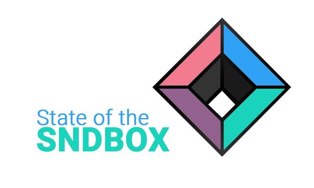
At that point I wasn't very sure about the background's color, only that white is not helping my composition. I remember my lecturer in graphic design - every time we got stuck with choosing the right color palette, he offered us to use dark gray or even black. That way any other color will pop and have a decent contrast from the background.
So why not use that technique? I also realized not many artists used dark colors in their entries.
This will make mine very different. (but I kinda like it) ^.^
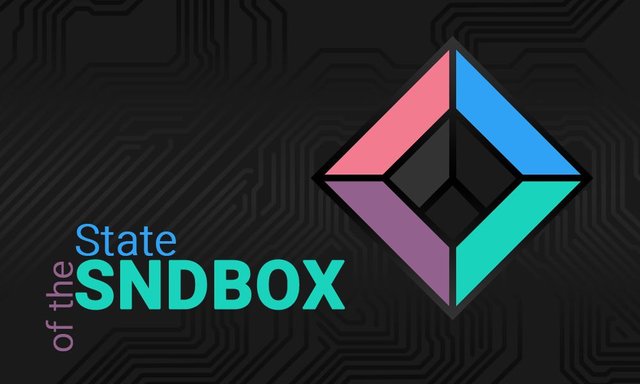
Second Version
I didn't want to use total black, so changed the background color to a dark gray tone from the inner part of the sndbox' sign.

Also changed the logotype a bit. That way it matches the colors from the sign and even their arrangement.
But still, something was missing. Remember the arrow from the structure? Decided to implement the idea of many circuits starting from the text to the sign. I also hope it will make the transition between elements and background smoother.
Final Version
I looked for circuits on pixabay and then drew many vector lines on Photoshop. I didn't want to cover the whole background, only the center of my composition. Finally, placed a gradient overlay on the circuits to emphasize the center part with light gray, also from the inner part of the sign.
And that pretty much explains my idea.
Wishing all the luck to the other contestants.
^.^ Hope you like it and have a great day, everyone! ^.^
Thanks for stopping by!
I think It's a really cool thumbnail
Thank you! Glad you like it! ^.^
Unfortunately, the circuit from the background doesn't show on the thumbnail. It could've been lighter :(
Very nice.
I have been watching these guys and the competitions. I love the community aspect they have thrown out there to designers and artists. Keep up the entries.I have not had the guts to join in yet haha.
Don't worry, @trinumedia. It's better to make an entry than regret not even trying. ;)
You have the advantage of 3d design, i believe you can use this strong side for an even better entry. ;)
looks so sleek and nice, katalina! i dont know much about good design but i know i like this :>
GOOD LUCK WITH COMP!!!
upvotes
Thank you, @veryspider! ^.^
What I've learned about good design is based on three main things:
I don't know if I achieved those three, but there's a forth unwritten rule - it's not important for the designer to like his own work, the main goal is for the recipients/clients to like it. ;)
I'm really glad you like it, dear Spidey. ^.^
Very nice and elegant! I'm keeping my fingers crossed for you. Well I can perfectly understand a need to practice logo design, creating a logo is always a hell for me. I can't think of any idea, I feel the pressure of how important it is to come up with a great design, and even when I get the idea I have a hard time creating exactly what I had in mind :)
Good luck! :)
Thank you, @shinyforest! I don't know if this design is similar to their style, but it's my interpretation/vision of the thumbnail cover.
Yes, the pressure can create a wall in my mind, stopping me from making a good, original idea.
But in this case I think it's better to go loose with the contest. I believe you can create a great design, more importantly because this is not for some specific client so we don't lose anything. Even if the design doesn't win, we gain experience. ;)