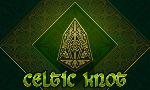
Celtic Knot [EOS Edition] ^.^ Crypto Logo Art Challenge - Entry ^.^
.png)
Finally, I found some time to do an entry for @sndbox's next Crypto Art Challenge! ^.^
This one was exceptionally difficult, because it was another geometric shape like the previous crypto Ether logo.
And I don't like to use the same style all over again.
Why?
It's simple - "What Got You Here Won't Get You There", very well said from Marshall Goldsmith.
Also, there're tons of different styles and methods, you can choose whatever your heart desires. This time I was inspired by the celtic knot. Sounds simple... well, not so much. :D
Because this design took me two days to complete. xD
.png)
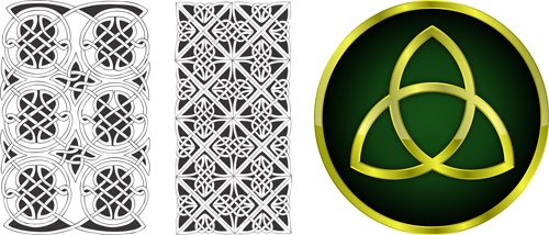
I searched throughout Pixabey for inspiration and found these two images that helped me shape my idea and decide on the right colors:
Links are shown below:
Source 01
Source 02
Maybe the most difficult part was to make the knots for the logo. It took a lot of transformation, but I hope it's worth it.
Here are the two motives I had to adjust:
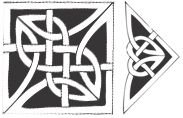
into this:
I used the Pen Tool to turn them into vectors, making them easier to distort.
.png)
Next was adding the basic colors for this composition - green and gold/yellow. ;)
Simple but effective. ^.^
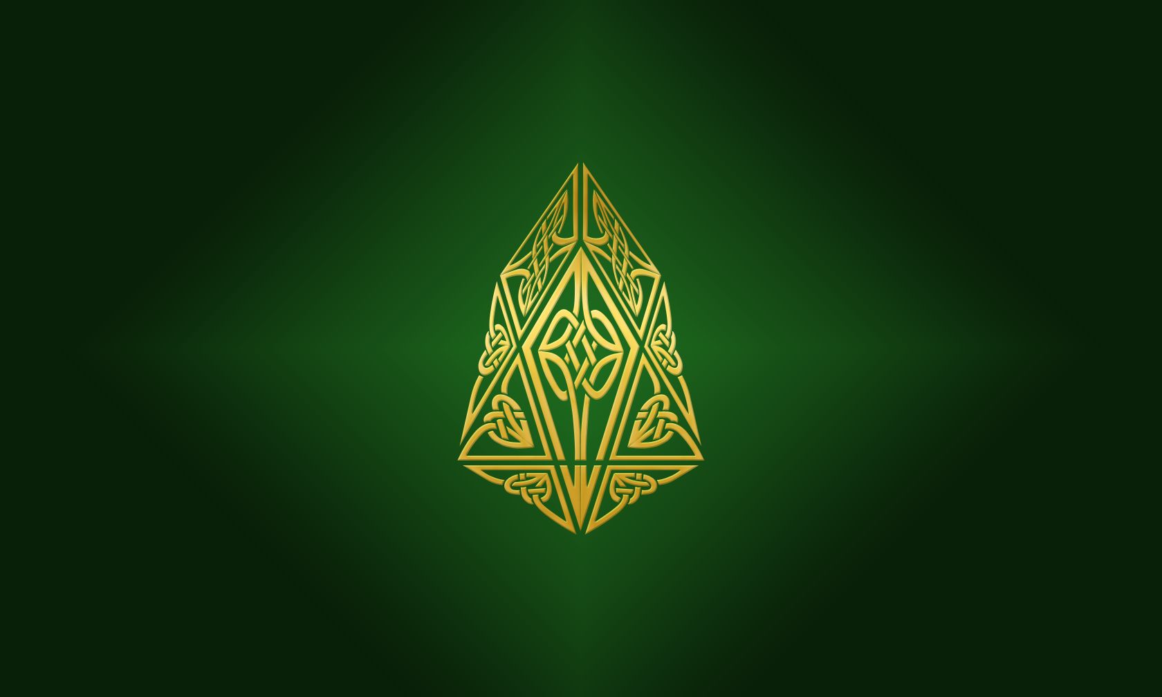
Time to add a base for the logo. At that time my idea was to make it as statue or a stone covered in celtic runes.
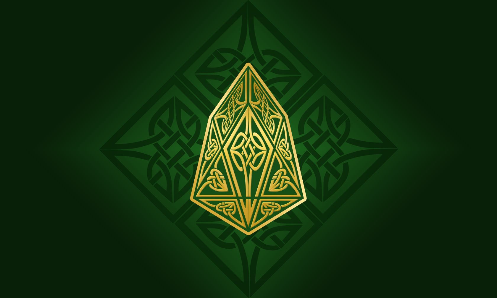
Adding more knots. A lot more. :D
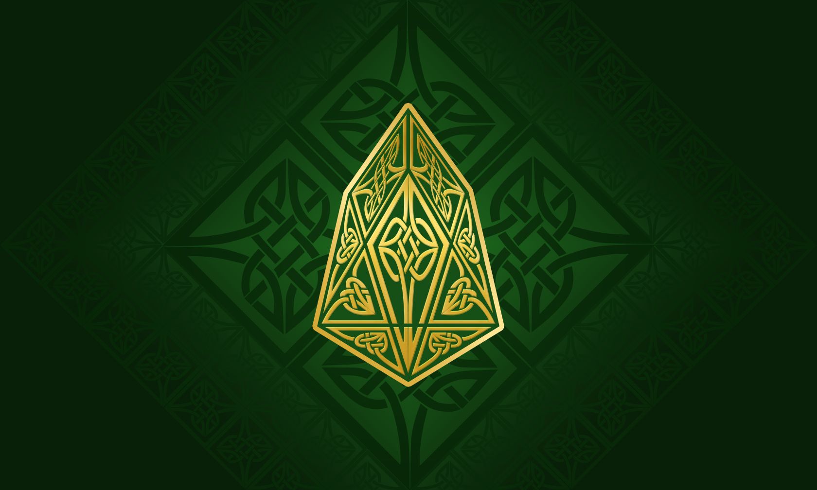
I didn't like the green gradient so I decided to change it a little. After a night of trials and errors this is what I came up with:
Something still wasn't right so I left the work for couple of hours and then went back to it. After I took a break, found what was missing - too flat, too green, and the center piece needed more work.
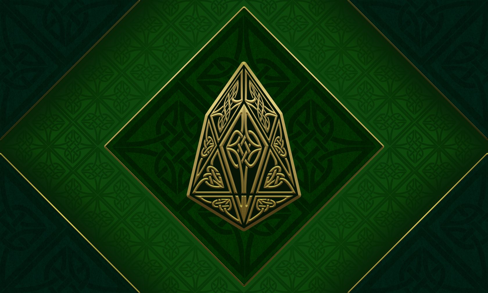
Now it looks more like a garden with EOS in the middle. ;)
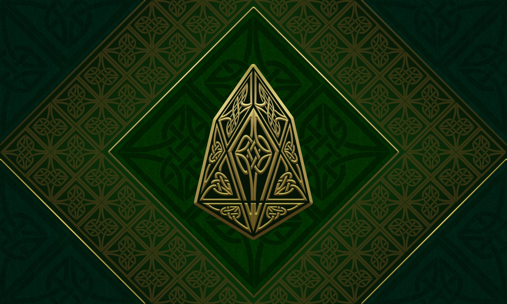
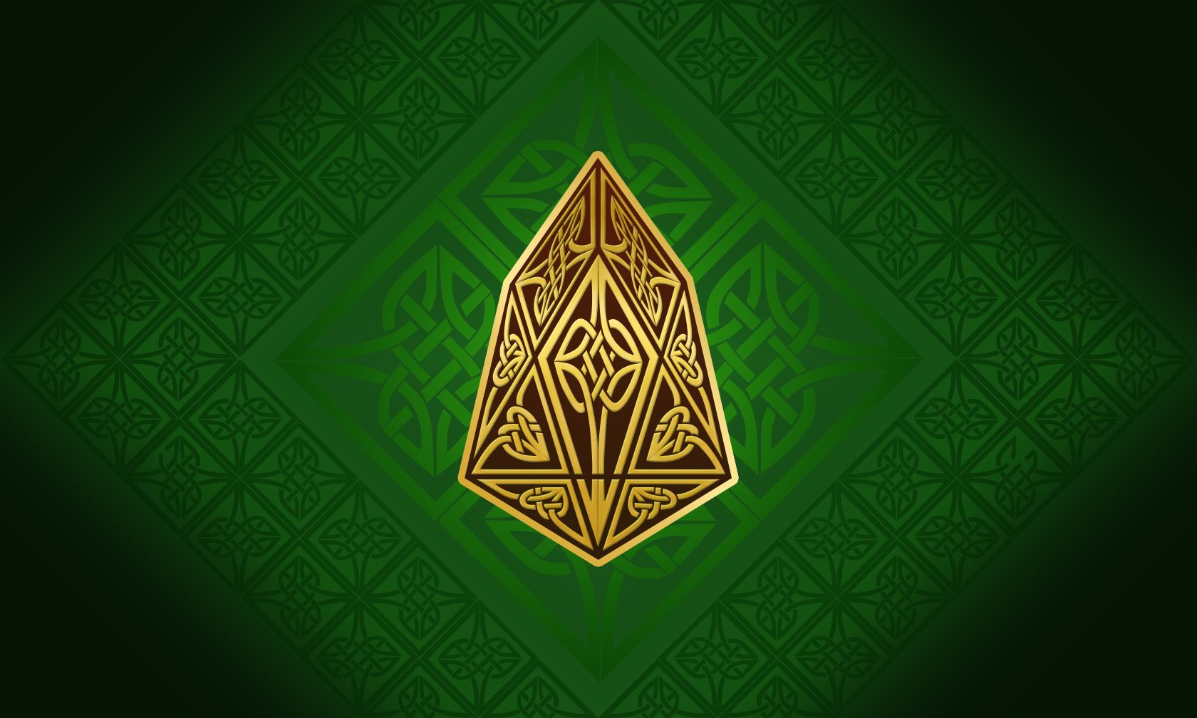
It still looked flat so for the final touch decided to add light and shadow. Why didn't I think of this before... stupid Pet... xD
Here's the final result:
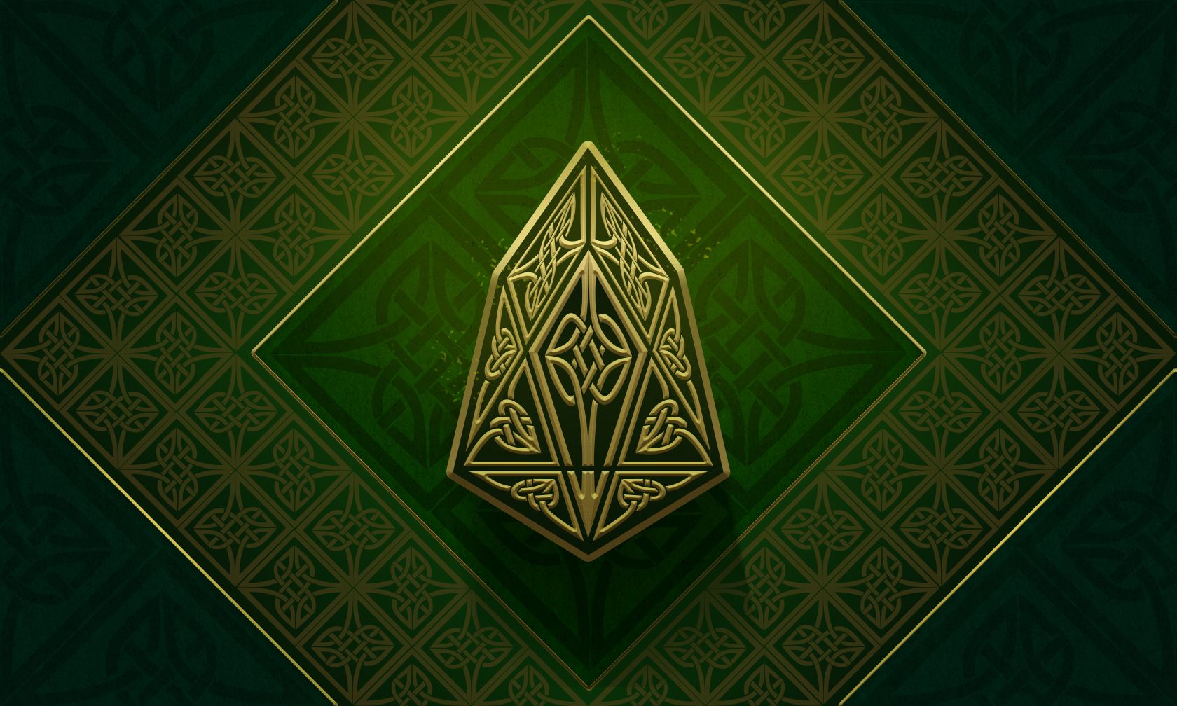
Hope you like it!
^.^ Have a unique day, everyone! ^.^
Thanks for stopping by!
I like this design, i saw this image and it came to my mind, Thor, you design and edition it's great, congrats :D
Wow, I didn't think of him but now that you mention it, yeah, great comparison, thanks. ;)
Наистина е красиво.
Мерси много! ^.^
Love the knot treatment to the logo it fits very well. I am feeling the colors.
Thank you, @allowisticartist! I was a bit concerned, because some of the knots got too distorted in the process.
perfect imperfection
This is so beautiful and elegant, katalina ! I really love it <3 The green and the gold is also very regal and very classical <3 <3 <3
GOOD LUCK IN THE COMPIE \o/
upvotes
Thank you so much, Spidey! ^.^
It was fun doing this entry - I was so fed up with my work on the thesis, that had to make a change for a day or two. ^^'
A break is good from time to time, Katalina <3
Tell that to my supervisor xD - if you ask him, I should work 24/7 and be productive all the time (which is impossible :D).
Thanks to you and the others from the Steemartists community I can relax, take a breath and recharge for battle. ^.^
Awesome work! Looks very elegant :D
Thank you! ^.^
It was a nice distraction from work. ;)