Brief Proposal for Better List Engagement/UX
I noticed Steem had some engagement inefficiencies, here's some thoughts on the matter.
Let's compare Steem to it's proven counter-part Reddit.
Steem
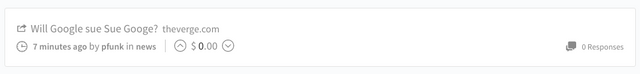

Initial Thoughts
- Comments are way off to the right, my attention doesn't even really go there unless I force myself.
- Steem voting seems arbitrary because of the way it's laid out. The prominence of voting in Steem is unclear.
Possible Solutions
- Stack meta information like reddit does, seems to work well.
- Move comments to the left.
- Carefully consider the context and role of voting within the UX, location is everything.