Steem-cartoon: Jelly Cats Process pt. 1 And Lighting Wood
"Imagine having a cat...maybe two...Now, imagine if they were made of jelly and pudding respectively." And that, ladies and gentlemen, was basically the thought process I had in coming up with the idea for this illustration.
Late night ideas can be pretty amazing...
This isn't the full process unfortunately (hence the Part 1 in the title). Right now, I'm just gonna share how I got to this particularly stage of the illustration process, which I gotta admit, looks pretty good far and discuss some new things I tried in this drawing that turned out pretty well (yay!). Fingers crossed this good streak continues.
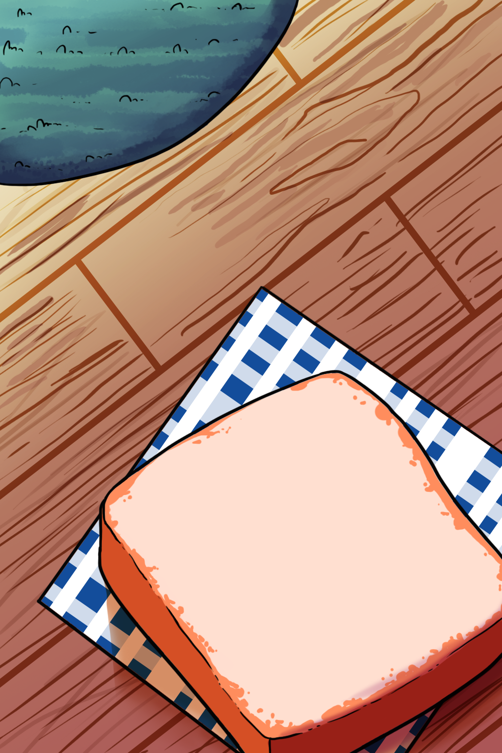
Now in the beginning...
The idea pops into my head about drawing something illustrative. It's been a long while since I did something, especially with a background so I though "Hey, why not. Let's take a break from assignments and give it ago".
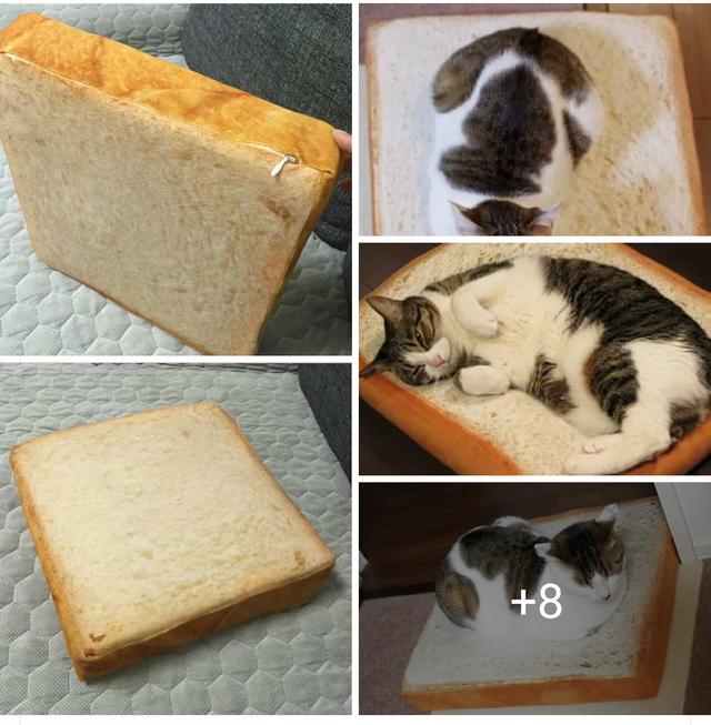
I saw this image on FB a little while back. I have no idea why I found it so amusing and cute enough to screenshot it. Probably just at how darn comfortable that cat model looks on bread. Like, seriously, look how pleased it is. So kiyot.
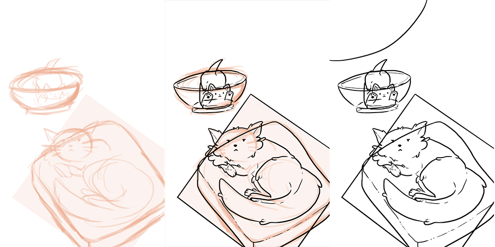
I have a pretty vague idea of what I want in the scene. The story was the bigger and older cat is very annoyed after his owner decides he needs a new playmate. I knew I wanted the bigger cat to be the first thing people look at and look at the kitten next. This is where I utilized contrast between the two characters (playful vs bored, big vs small, welcome vs ignore) in their poses and faces. The top left portion of the sketch started to look pretty barren so I added a simple curve to block a carpet.
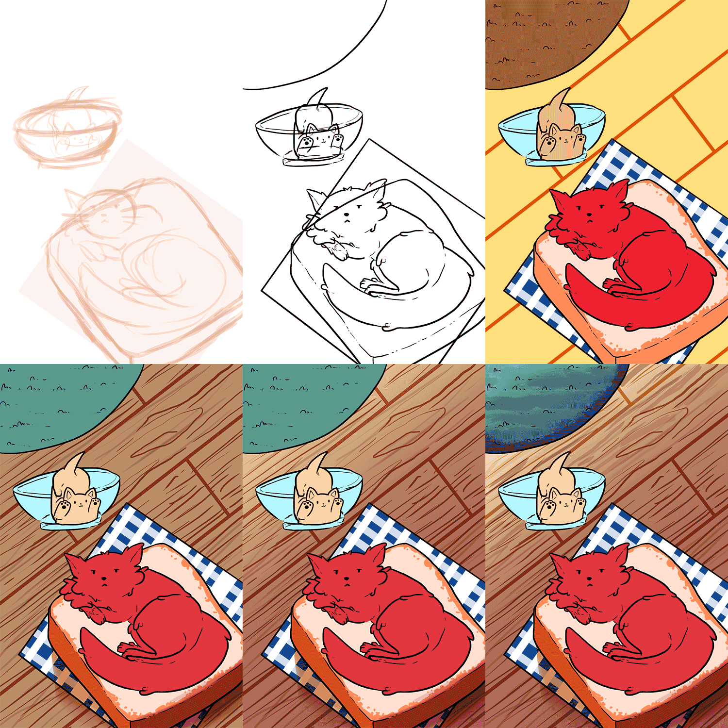
At this stage, I'm happy about all the elements in place. Each object in the lineart right now has its own complete drawing and layer because I'll be playing with transparency with the bowl and the bigger cat later. Now I start thinking about the base colours.
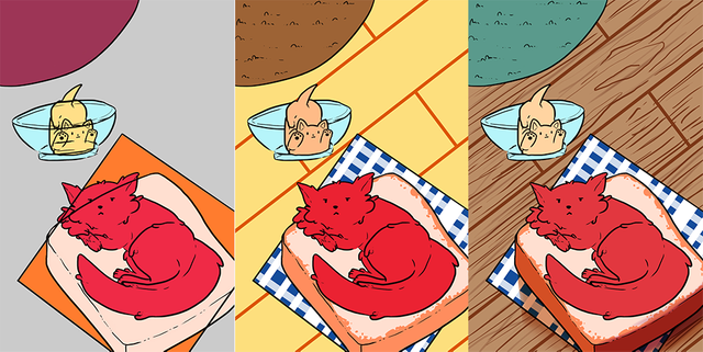
Going into blocking colour, I really had no idea delving it. My first thought was to have a pretty warm colour palette and have the kitten a generally cool one. I wasn't too happy with it because nothing was looking quite right. The bigger cat looked like a squirt of ketchup on top of some turkey and cheese while the kitten looked like mustard in a contact lense. The carpet looked like a discoloured purple carrot.
Moving on to the second colour palette, this time, I played with primary colours and added the carpet texture, brown part of the bread and pattern on the cloth. Immediately, I feel its an improvement from the first picture. The cat is starting to look a little more like ketchup on bread and the kitten looks more like an orange slice. It's getting there, just gotta push it even more, which resulted in the third and finalized colour palette. I was quite happy with it. So happy that I already went into doing shadows on the bread cat bed haha.
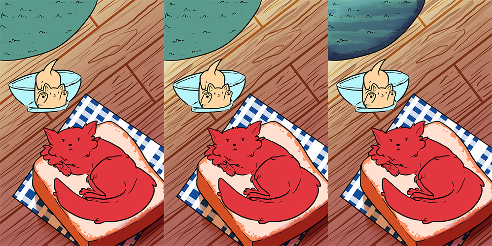
Now getting into the wood. Thanks to internship, I really start to notice how light reacts to other objects. One thing I never noticed was the slight glare like shine on wood the closer it it to a light source and that there is this gradient of brightness from the light to the shadows.
Looking at reference photos (thanks, Google), the glare is still pretty bright so I added a white and pale yellow fade out gradient at the top. One important thing I noticed while doing this part is to, erase the glare in the wood crevices. I think by doing that, it really sells the idea that it's a wood flooring and not a plastic sheet printed to look like wood.
Last thing I did in this portion was give some texture to the carpet. It ended up creating this really funky zebra pattern, which looked pretty cool. I just added a stark shadow at the edge to sell that the thread of the carpet is standing up.
And that is the process~! Hopefully it was either useful or at least entertaining to read. I'll be approaching colouring the transparent textures next (in this case, glass and jelly) and if any Steemian creatives have any tips, I'm always open to learning and improving.
Shoutout to the cool cats that these illustrated cats are based on.

(Mek, our freeloading stray and Kimi, our very much spoiled family cat)
And that's about it so far. Here's a process gif. =3
Cats rules the world!
They are the most gracious of our overlords haha
I like the slice of bread before you put the cat on it.
Haha I can see why. The cats and the bowl are still very much in their bare bones stage. I'll be working on them soon and share the next part of the process. Hopefully, the illustration will be completed by then. Thanks for the input though =)
Nice gif.
Thanks =3
Nice sharing on your steps in making arts and those roti looks delicious...lol
Thanks a lot. It's my first time sharing my process in writing so I'm glad it's well received ^^
This gem of a post was discovered by the OCD Team!
Reply to this comment if you accept and are willing to let us share your post! By accepting this, you have a chance to receive extra rewards and one of your photos in this article may be used in our compilation post!
You can follow @ocd to learn more about the project and see other Gems! We strive for transparency.
If you have any questions regarding the project or nomination, please, let me know.
Go ahead, dudes!
Oo you just got a @curie vote, so probably not XD
I have no idea what that means but its cool beans. Thanks anyways =D
Niiiiiicceeeee!~
=3c
Congratulations @hanbun, this post is the most rewarded post (based on pending payouts) in the last 12 hours written by a Dust account holder (accounts that hold between 0 and 0.01 Mega Vests). The total number of posts by Dust account holders during this period was 3145 and the total pending payments to posts in this category was $758.70. To see the full list of highest paid posts across all accounts categories, click here.
If you do not wish to receive these messages in future, please reply stop to this comment.
haha .. cute =)
Cats are very cute, yes
cute art
Theeenkssss
so cute your art
Awww thanks
wellcome