You are viewing a single comment's thread from:
RE: Steem Cartoon : Cartoon Waterfall Concept

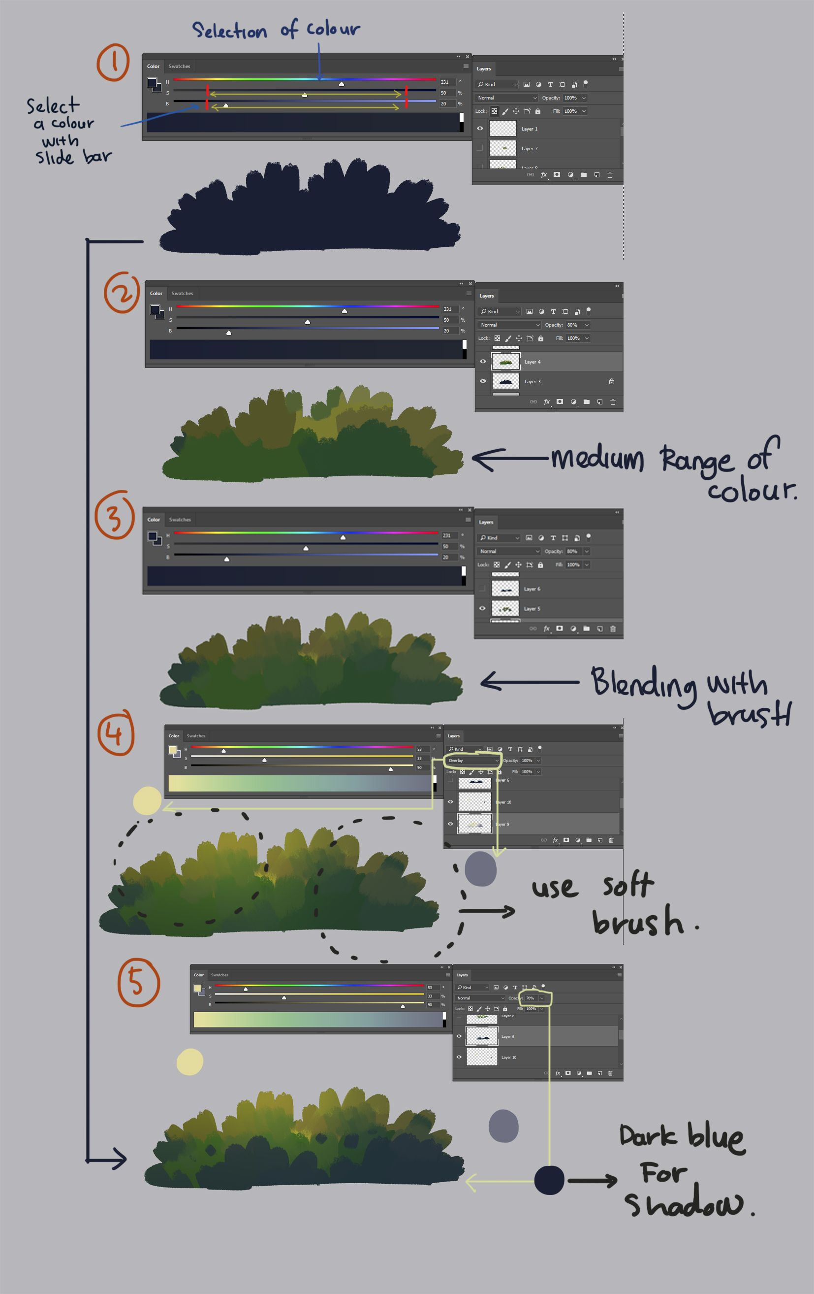
I think @creativetruth, you ask a very good question. for a good choice of colour there are a few theories that we can fall back to. For me, I tr to understand the basic of colouring. When I choose my colour, I will take the medium range of colours. This is to make my job in controlling the temperature of the colour on the pigment. To increase the pigment colour I will use overlay and this is to increase the speed of the entire process. I do a quick post mortem on my earlier painting:-
- To get the medium range of colour I use those within the range of the red line in pic 1.
- Then I reduce the opacity to 20% to obtain a balance to the blue colour. You can use the reference in pic 1.
- You can start to blend the colour by using a brush on a normal layer with 100% opacity. -
- It is important to increase the pigment colour. I will use the overlay to increase the temperature of the colour.
- For the shadow, I use the darkblue with opacity set at 70%.
Wow really in depth. I'll have to study this more, and try messing around with an overlay layer, now that I know what it's for.
It has been my pleasure to help you out! :)✌️