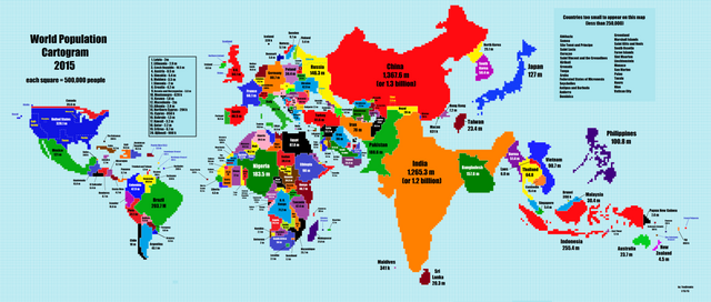
This Is What A World Map Looks Like When Scaled According To Population Size
This map changes your perspective on the world we are living on... interesting how small Canada, New Zealand and Australia are. I found this and thought this is definitely worth sharing.
See the full size image here

interesting.