The Poor Man's Guide to Crypto Marketing
My last post got 19 views and I don't pay for upvotes, so it must be great content for Steem! I can't pay circle-jerking upvote farms, so I'm working like a chump sharing my experience. Thus, I wanted to expand on my last post with resources for marketing on the cheap.
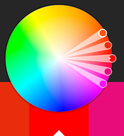
Color Scheme
There are so many resources for color skins out there. Just make sure you choose a palette that doesn't distract from your company's fundamentals. You wouldn't pick feminine colors for a sports-related blockchain project, for example. Not that there aren't women in sports, but that the emotional clash of hot pinks would distract from your overall message.
Color Resources:
- https://color.adobe.com/explore/?filter=most-popular&time=month
- http://www.color-hex.com/color-palettes/
- https://coolors.co/
Logo
Get a logo in a PSD format. That way, you can generate a bunch of different sizes. You need different sizes for items like your website's fav icon, header logo, twitter, etc. Getting the right size for your platform makes you look more professional so that the platform doesn't automatically crop your logo in a way that makes it look ugly.
Logo resources:
Tagline & Mission Statement
Write them yourself. Get an English major to proof read your spelling and grammar. Yes, good spelling and grammar actually make you stand out in the crypto industry. Remember, however, that certain sayings aren't recognized globally. Americans have a hard time understanding this.
Sayings such as, "The more, the merrier" are very cultural. Americans hear these trite sayings all the time and know their meanings. Keep that in mind as you craft your tagline and mission. Keep them very clear without relying on cultural expressions.
Fonts
Folks new to design have a strange belief that the more font families, the better. That's not the case. If you can't get away with enough variety with different weights of a single font, try for one additional family. This is easier said than done, however, because many font pairs clash.
As a design noob, you shouldn't get creative with fonts. When you think you're being creative, you are actually showing your lack of knowledge of design. Font clashes are the easiest thing to see that a company isn't professional. Fonts are one of the finer design aspects best left up to people who have spent a lot of time perfecting the craft. I am not one of them. If you are reading this, neither are you.
But have no fear! Pairing has already been figured out for you. Just ride the wave of the creatives who freely give their work to you. And you won't stand out like an idiot.
Font pairing resources to help you decide:
Conclusion
Your takeaway should be that you'd do well by using traditional techniques from resources like those above. Creatives across the world have released their own fonts and color palettes that work great. Lacking creativity isn't a setback. Instead, having the humility to admit that you aren't creative puts you in a great position, as odd as that sounds. That's because building a professional, consistent company image depends on following tried and true recipes of design. And the recipes are out there for the taking!
Much of my own creativity is merely leaning on the shoulders of giants who have gone deep into a specific subject. I plan to share more of the resources I rely on to generate good work in future posts.