"SEC | S20W3 | Data Analysis with Excel: (Charts, and data analysis techniques.)
Hello friends, it is nice joining the Steemit engagement Challenge for the week. I hope to make the best out of this first entry.
Explain what you understand by Excel charts and discuss three (3) types of Excel charts that you know with clear screenshots. |
|---|
Charts all over in an application platform especially in excel as discussed here are the representation of data collated.and entered for purposes of given a clearer illustration of trends and patterns of an event. No matter how complex os the data collated, charts are medium to simplify them and make them more understandable.
They can also be used when we want to compare values, identify trends and variations during data computation and analysis. It clearly shows us when there are distortations and variations in data. With the use.of excel charts, it gives us feedback capable of identifying areas for improvement and actions driven type, which form basis for decision making.
Examples of excel charts include;
- Column Chart
- Line Chart
- Pie Chart
- Bar Chart
- Area
- Scatter Chart
- etc.
Identifying this chart types, we will simply do one thing which is clicking on the "INSERT" option from the menu bar. We will see a display of these charts.
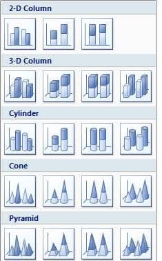
Column Chart
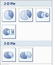
Pie Chart
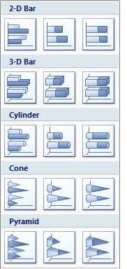
Bar Chart
Verify that you can read the information regarding chart location and creation in Excel and interpret it correctly using Bar Charts based on the data given below |
|---|
- from the spreadsheet, highlight requested data
- click on the insert option
- select the bar chart as required
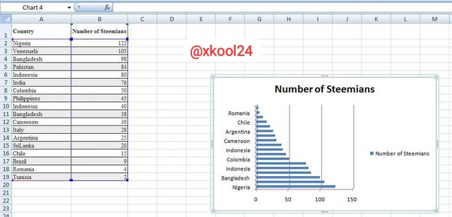
From the bar chart image, we can deduce the following.
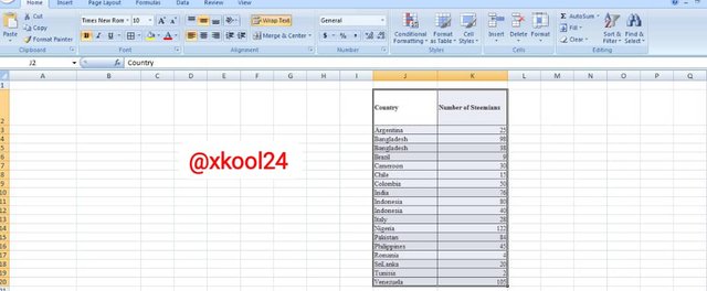
- Nigeria repeesents the highest numner of Steemians as captured in the date with 122
- Second from last in the list with Romania with 4 appearance.
Briefly discuss Data Analysis Techniques In Excel and tell us how we can organize data in Excel for analysis. |
|---|
Data analysis technique in excel is simply the representation of all forms of analytics required in carrying out our desired data computation. By mere entering data in our spreadsheet, it does not make sense not until we add some formulas and instructions.
These are tools when used help give us simple clarity and guidelines on what next to do. Results from the application of data analysis technique help us make informed decisions.
On how to organize data in excel fir analysis, it may involve the following;
- Highlighting working data on the spreadsheet to allow for full capture of data to be processed.
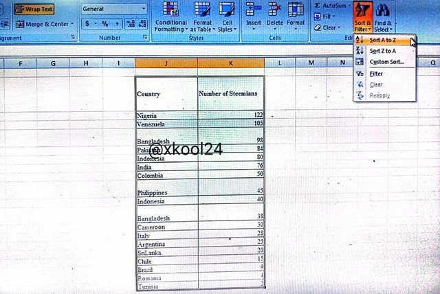
- The use of the "Sort & Filter" option from the home button.
- Apply Formulas which has the autosum, logical, lookup, etc
- Use of data tool that help remove duplicates, enhance data validation, etc
- We have the cell "wrap text", and "merge/center" tool that help organize and reorganize data outlook and description.
Using the data given in question 2, arrange the names of countries alphabetically using data sorting techniques. Screenshots are needed. |
|---|
- Click on the Cell with the name of the first country "Nigeria "
- Click on the sort & filter tool
- Then click on "Sort A to Z"
Thank you.
CONGRATULATIONS!!