"SEC | S20W3 | Data Analysis with Excel: (Charts, and data analysis techniques.)
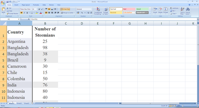
Excel chart is a visual pattern of excel data. It helps in data analysis for range, trends, comparison. Chart can be of various types line chart, column chart, bar chart, pie chart, area chart to name. In early days we had create charts manually on graph paper where there were mistakes and very time consuming. In excel there's no chance of mistake as data are picked and arranged automatically by program. Interestingly one can also create coloured charts of different parameters. Different types of charts made different purposes. It is very easy to make a chart by selecting the data range and insert the type of chart to be produced. Moreover pivot charts are also useful for business analysis. One can incorporate the charts on the power point presentation as well as word document and infographics. In picture below some of charts are illustrated.
Column Charts
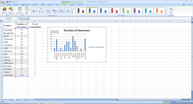 No of Steemians column against Country
Column charts are used to compare between single or multiple data sets. Categories are displayed along the horizontal axis, and values are displayed along the vertical axis. There are various columns option.
Pie Charts
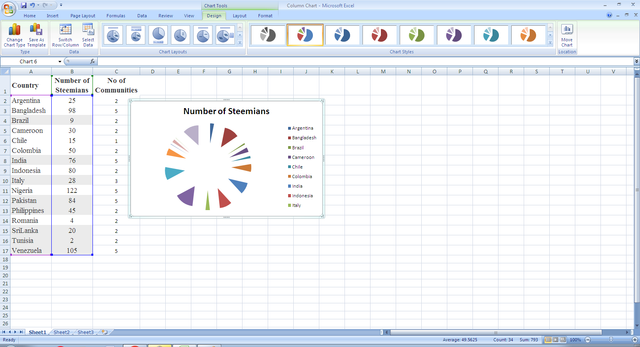 Steemians Share of pie against Country
Pie charts are used to represent one series of data, There are various options in pie chart like 2D, 3D etc.
Line Charts
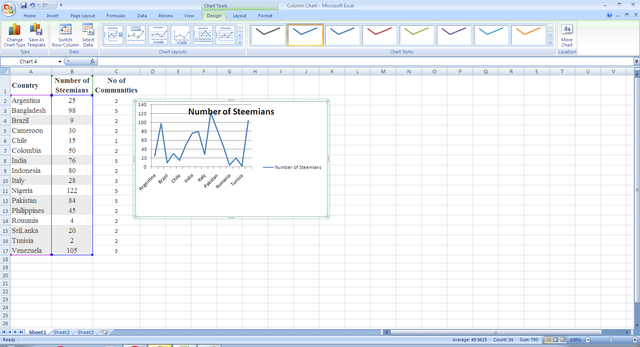 No of Steemians as points connected by line against Country.
Line charts are usually used to show the change of data values over a period of time. Similarly there's multiple lines charts with sets of data.
| Verify that you can read the information regarding chart location and creation in Excel and interpret it correctly using Bar Charts based on the data given below. |
|---|
Bar Charts
Bar charts are used to compare between single or multiple data sets. Categories are displayed along the vertical axis, and values are displayed along the horizontal axis. There are various Bar types options. In this case I have selected the Y axis as the name of Countries and X axis as the no of Steemians.
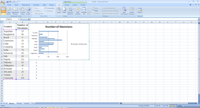 No of Steemians bar against Country
| Briefly discuss Data Analysis Techniques In Excel and tell us how we can organize data in Excel for analysis. |
|---|
Microsoft Excel is a convenient, go-to spreadsheet software that is both comprehensible and familiar. A key aspect of Excel is how useful it is for ad hoc data analysis. Allow user to do different statistical testing within their excel worksheet.
Mean, median, and mode the destructive statistical techniques are used for measuring central tendencies.
Standard Deviation and Variance, Conditional Formatting, Data sorting and filtering are also helpful excel data analysis techniques which are helpful to analyze and interpret data more accurately
| Using the data given in question 2, arrange the names of countries alphabetically using data sorting techniques. Screenshots are needed. |
|---|
Before I conclude I would like to invite three fellow Steemians to participate in the contest
@crismenia
@eveetim
@alli001
Thank you for reading my post.