SEC | S20W3 | Data Analysis with Excel; Charts and data analysis techniques)
 |
|---|
Hello friends and welcome to my article in the SEC: S20/W3 I will be sharing my thoughts on this subject matter, I do hope we all enjoy my article
Excel chart are visual representation of data that enabled users read, analyse information perfectly. They can be used to show patterns and cordial relationships in basic data parameters. Making it quite easy to highlight basic needed data in an overall statistics. Types of charts we have are Pivot chart, Bubble chart, pie chart, hierarchy charts, recommended chart, statistics chart.
 |  |
|---|
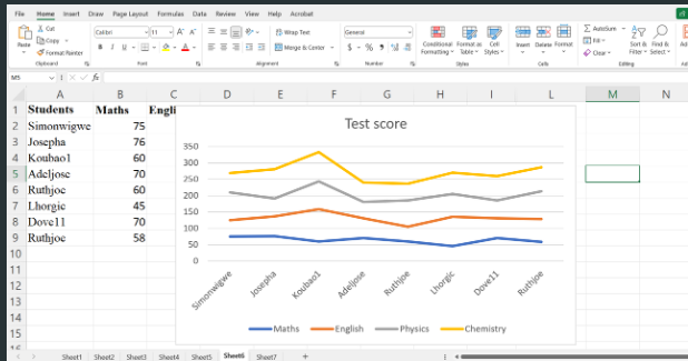
Line Chart: This is used to expressly show trends to compare grades of various students with their performance in a test score. It consists if varying parallel lines connected by data points.
 |
|---|
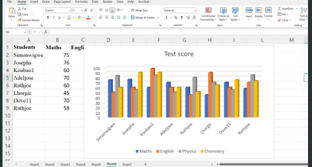
Bar Chart: It is used to compare group of data. It could be used to analyze satisfaction rate of a customer, track sales records, show distribution of data within a genre, day tracking payment plan. It basically consists of horizontal and vertical bars with each bar representing values of corresponding points.
 |
|---|
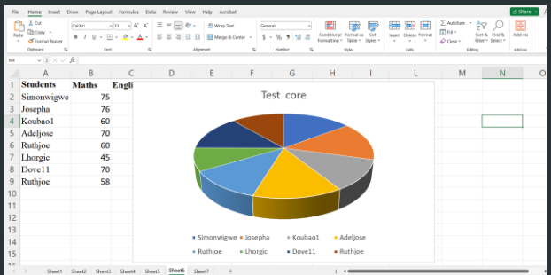
Pie Chart: It is used to highlight the proportion of each category in a group. It does data in a clear manner, easy to read format and visibly shown when comparing particular proportion to varying categories. It is in a circular shape, divided into varying sectors with each segment explaining a singular category.
 |
|---|
| A | B |
|---|---|
| Country | Steemian |
| Venezuela | 105 |
| Nigeria | 122 |
| Bangladesh | 38 |
| Pakistan | 84 |
| India | 76 |
| Indonesia | 80 |
| Columbia | 50 |
| Philippine | 48 |
| Cameroon | 30 |
| Italy | 28 |
| SriLanka | 20 |
| Argentina | 25 |
| Chile | 15 |
| Romania | 4 |
| Tunisia | 2 |
| Brazil | 9 |
Presenting in a chart, there are special criteria we should observe to get successful. Firstly highlight your data showing on the bar chart, insert the menu on Excel sheets, navigate to the area where your chart can be able to find bad chart. You represent information and perform editing. After choosing chart you click on it and it appears on the bar chart
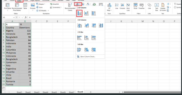 | 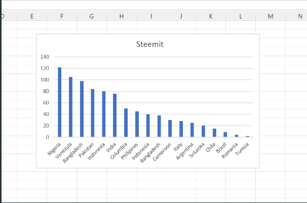 |
|---|
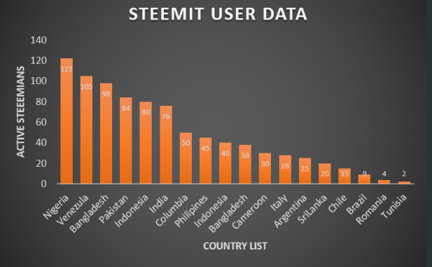
More graphic represent could make it look beautiful by adding titles, legends and also styling the chat to look more expressive.
 |
|---|
From the above you can be able to label and access which one gives more display in results to identify numbers of steemian who are active in a given country. Nigeria has the highest number as shown with 122 and last is Tunisia with a count of 2 active steemians.
There are some technique to expressing and analyzing data. I would be sharing them below.
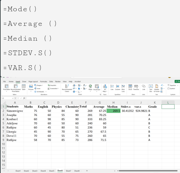
Descriptive Statistics: This type of data shows central tendency of data and also calculates mean, mode, median, standard deviation, variance to understand data distribution.
 |
|---|
Data Visualization: Creating charts such as line, bar, pie chart respectively and identification of trend or patterns.
Regression Analysis: It gives relationship between variables to make predictions or explain cause and effect relationship.
Correlation Analysis: It measures relationship between two variables to determine their correlated relationship
Data Preparation: It prepares data for analysis by observing missing values and inconsistencies.
Visible Header: Clear headings are used to highlight columns and rows ensuring it has an easy to understand data.
Consistent Formatting: It is used for formatting cells, rows and column to improve visibility and maintain integrity.
Data Validation: It sets up data validation rules to ensure data correctly entered in various cells to ensure it meets specific criteria say, data and formatting.
Pivot Tables: Use these tables to analyse and wrap up bulky data set by grouping and calculating values, parameters involved.
Conditional Formatting: Use this formatting to highlight cells based on your point of explanation to identify trends and outliers.
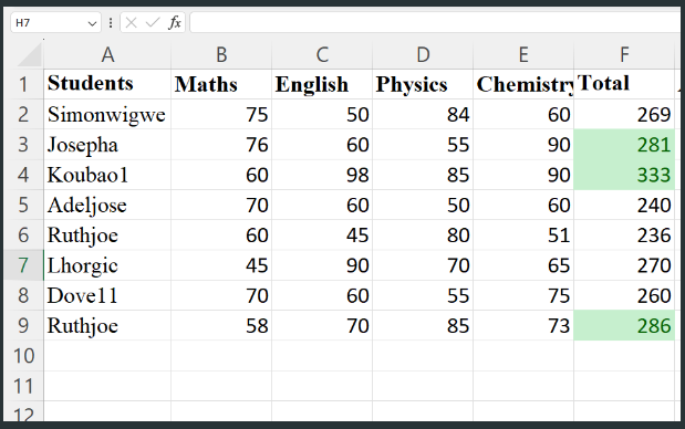 |
|---|
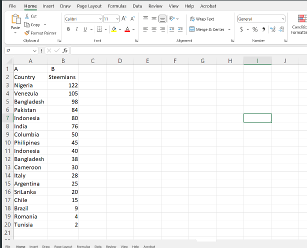
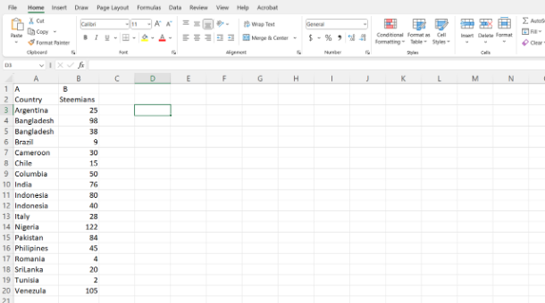
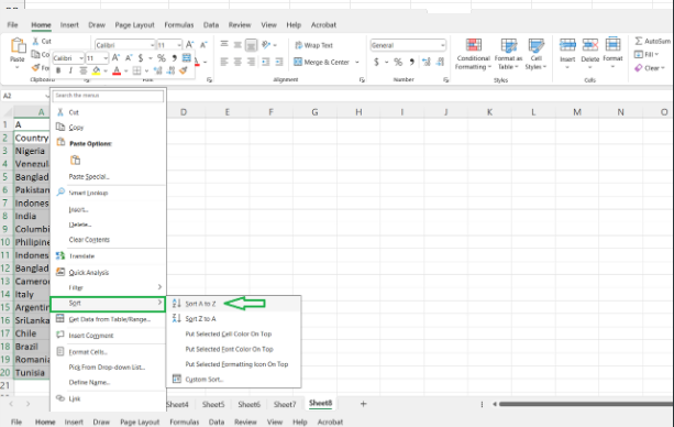
Data Sorting:
It involves selecting, highlighting and special filtering of information needed to make it more clear and visible to readers. In this case we filter out data in succession meaning more relevant ones will be placed at the top in order of special value. Data is sorted accordingly, then right click and move down to show where it could be sorted. From here you format in a way data can be sorted. Sort data in hierarchy basically alphabetical order.
 |  |
|---|
 |
|---|
We can track records and statistically arrange and upload records in research and also when performing project work.
Cc;
@simonnwigwe
@josepha
Hi @daprado,
Excel is an excellent tool that is very useful for data analysis. In it, you can easily visualize information and make different trends and comparisons by creating charts like bar graphs, line charts, and pie charts. You can also use pivot tables to summarize large amounts of data that quickly bring out important information. Through more complex analysis such as trend analysis, conditional formatting and regression analysis, you can better understand the hidden trends in the data.
In the office and business sectors, Excel is used for reporting, financial analysis, and planning. For example, it becomes easy to view sales data in graph form, track project progress, and review budgets. Thus, business decisions can be more effective and accurate.