My entry for the Spirits4You logo contest
Hello everybody!
After reviewing some of the logo contests out there this one really called my attention. It gave me complete creative liberty and a great topic to work on.
Spirits4You is a company responsible for the sale and purchase of alcoholic beverages (SPIRITS) and they were looking for the proper logo. Here is my entry.
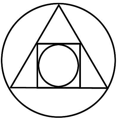
After reading the word spirit the first that came to mind was the fountain of youth (Agua de Vida), the elixir of immortality or something like that... which reminded me of the "Philosopher's Stone", this is often representated by the "The Squared Circle" (an alchemical symbol of the 17th century, illustrating the interplay of the four elements of matter)
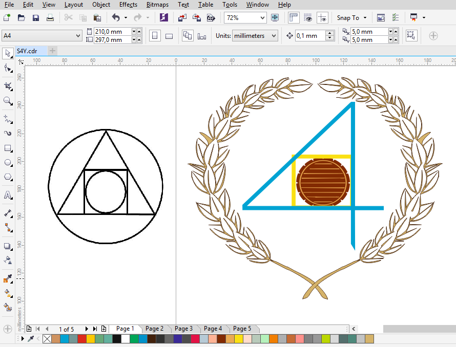
The mindset was to use this symbol as base for the Logo, adapting it to the company's name and inserting images that would connect it to alcohol, so i placed the number 4 as the center triangle, a barrel (used to the storage of many alcoholic beverages) as the inner circle, and some malt as the outiside circle...
Something was off, so i decided that the malt was ok, but i still needed to add the outside circle and increase the size of the barrel and the square...
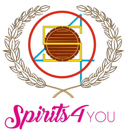
This was a lot better, at least for me.... Then it was time to add the company name, after a while reviewing my favorite fonts and choosing the ones that felt right for Spirits4You, i though of adapting the center square to the S from Spirits...
Almost there, now it was time to select the color set and see how it looked in monochromatic style for different backgrounds.
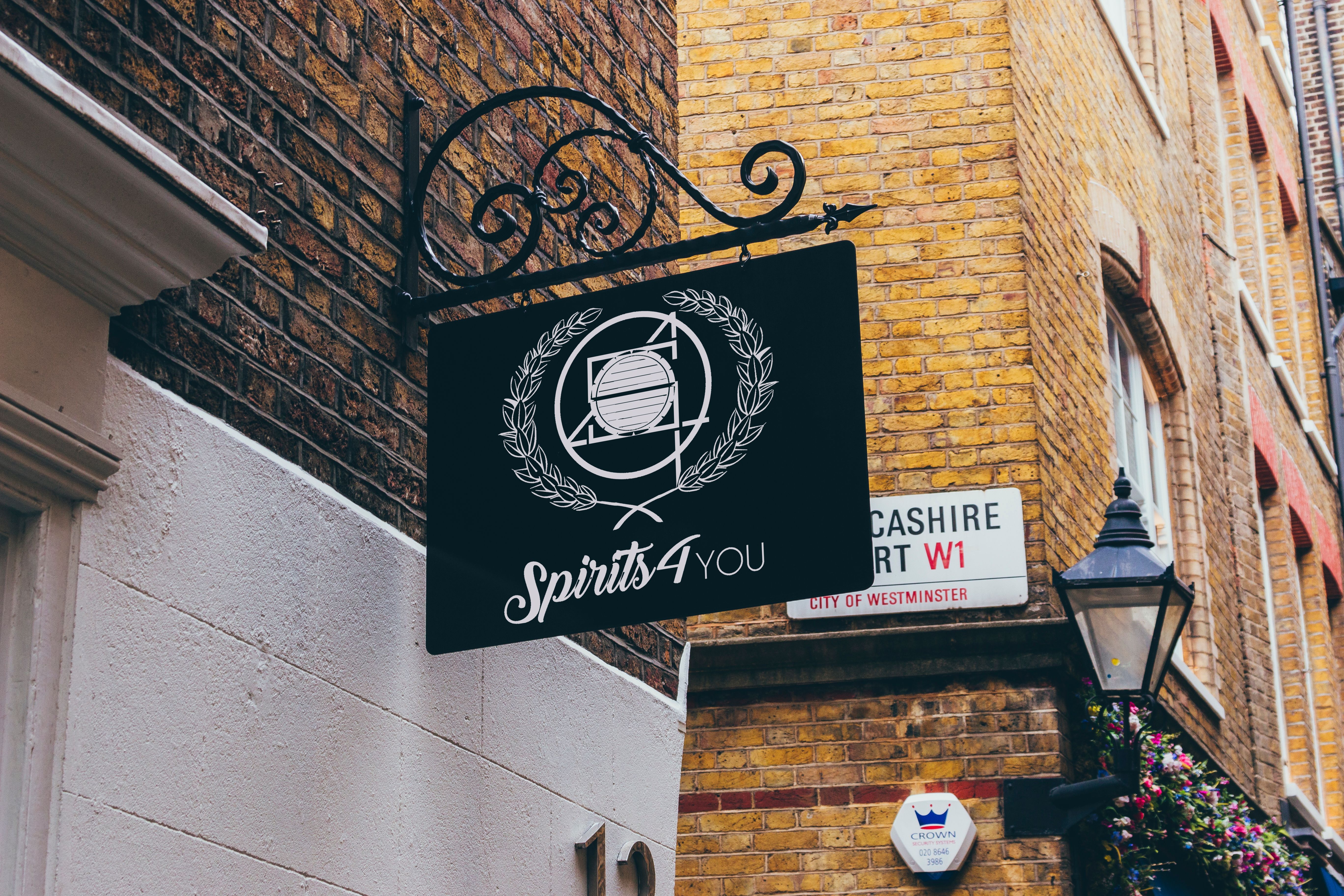
Finally a few more Mockups!
At the end of the day the winner is gonna be the one with the idea that clicks with @Spirits4You, there is no such thing as a good or bad design, just the right one, the logo that comes closer or even exceed the idea of the founder. That being said, i trully believe this an elegant logo that's really nice to look at and, as you can see, can adapt to different situations with the capability to overcome the passage of time and trends...
Good Luck and lots of inspiration to the other contestants!...
.png)
.png)
.png)
nice follow me
hey @davvas,
thanks for your participation. I very much like your approach and thoughts leading you through the designing process.
The use of the malt as well as my company name is very well done from my point of view.... for the other parts however I have to admit though that "something" is not quite there yet - problem is that I don´t know what exactly myself - yet.
Maybe you have few more ideas how to diversify it...
warm regards
Yeah man, as i said, sometimes it click and sometimes doesn't.... without a particular reason.
Here's another direction i was following:
If you have any specific thought for any modification that might approach better to your idea let me know, i'll be glad to work on it...
This gem of a post was discovered by the OCD Team!
Reply to this comment if you accept, and are willing to let us share your gem of a post! By accepting this, you have a chance to receive extra rewards and one of your photos in this article may be used in our compilation post!
You can follow @ocd – learn more about the project and see other Gems! We strive for transparency.
If you would like to be resteemed by @ocd and reach a bigger audience, use the tag ocd-resteem. Three posts using this tag will be chosen each day by our curators to be RS. Good Luck!
@Ocd now has a witness, please vote for @ocd-witness to help support other undervalued authors!
Yes, of course. I'm now following @ocd