Cómo pinté unos caracoles de mar / How I painted some sea snails.

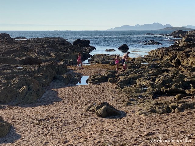
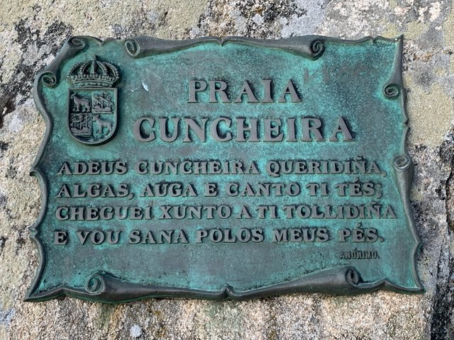
Cuando estuvimos en Bayona fuimos a una playa que se ha formado por la acumulación de conchas marinas. De hecho, su nombre es la playa de la Cuncheira.
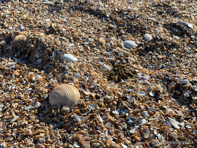
Allí cogimos unos cuantos caracoles de mar que había en aquella playa. Me llamó mucho la atención su forma curiosa y su color variado.
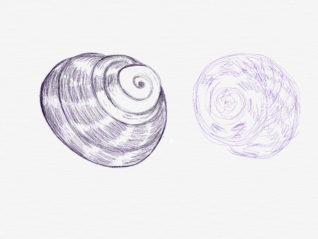
El otro día, al verlos sobre la mesa, pensé en hacerles una fotografía con la idea de pintarlos después. Aquí os dejo los pasos evolutivos del dibujo.
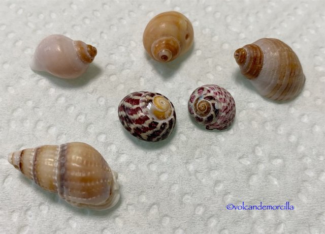
Vistas de cerca, las caracolas con su aspecto nacarado y colorido me parecieron una cosa fantástica. Es increíble lo que puede hacer la naturaleza.
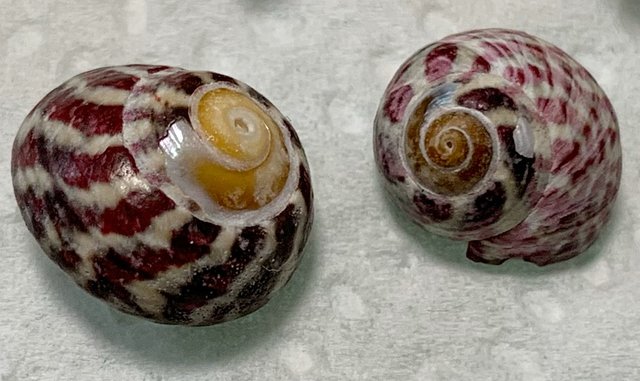
Quería resaltar las franjas y el aspecto rallado de las caracolas porque, si te fijas bien, la superficie no es lisa, sino que tienen pequeños surcos como los discos de vinilo.
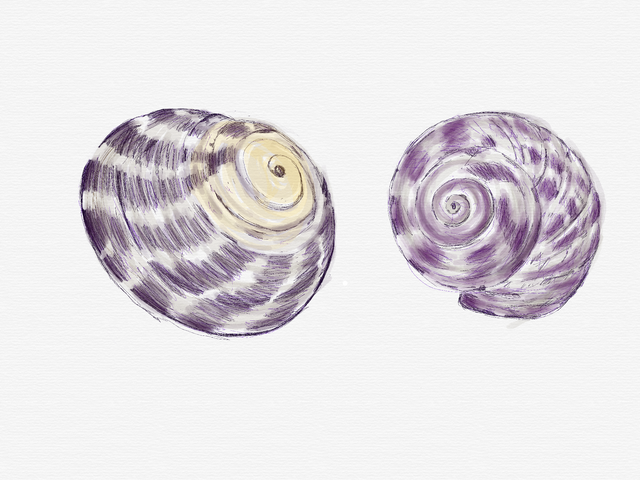
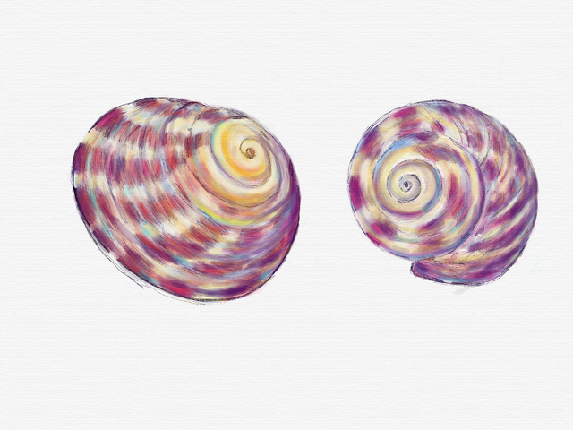
Lo primero pinté un suave tono gris y amarillo pálido de fondo sobre el que incluí los colores oscuros.
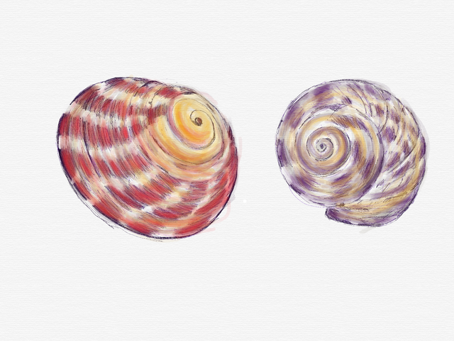
Luego dibujé los tonos rojos. En todo momento pinté los trazos curvos. En las caracolas no había ni una sola línea rectas.

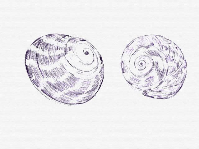
A continuación introduje los colores azules.
Y luego el color amarillo y el verde.
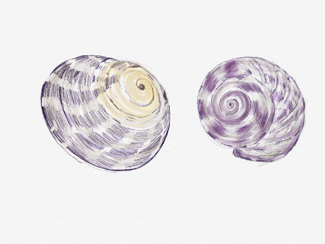
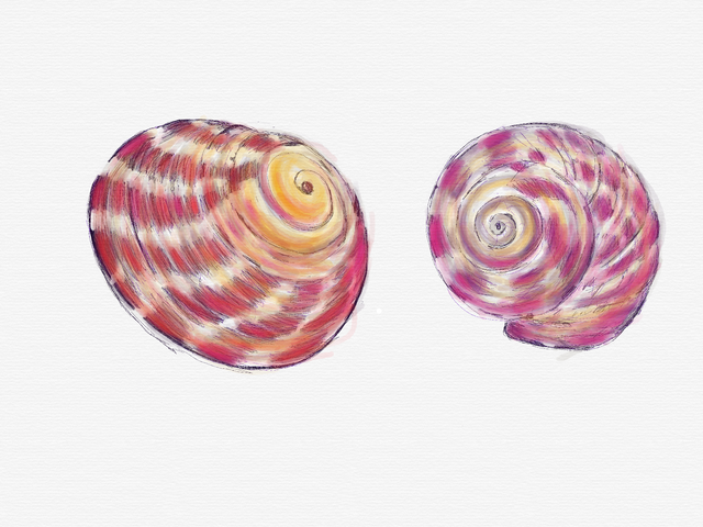
Aumenté los oscuros y potencié el violeta y el magenta para dar volumen y acercarme a la intensidad de color que tienen estos crustáceos.
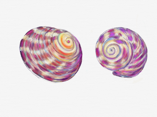
Me di cuenta que lo difícil era conseguir que ambas caracolas estuvieran conjuntadas. Ambas son distintas y tienen colores distintos pero intenté conseguir que ambas caracolas estuvieran integradas y formaran un conjunto.
Por eso es importante irlas pintando a la vez. Aunque tienen colores distintos, en las dos busqué que existieran los mismos tonos. Es como si los colores rebotarán de una a otra.
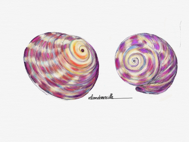
Resalté algunos colores de más intensidad como naranja en el centro de la caracola izquierda o el violeta de la caracola derecha. Estos colores vivos son precisamente lo que a mi me parece más bonito de las caracolas.
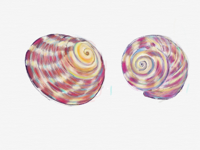
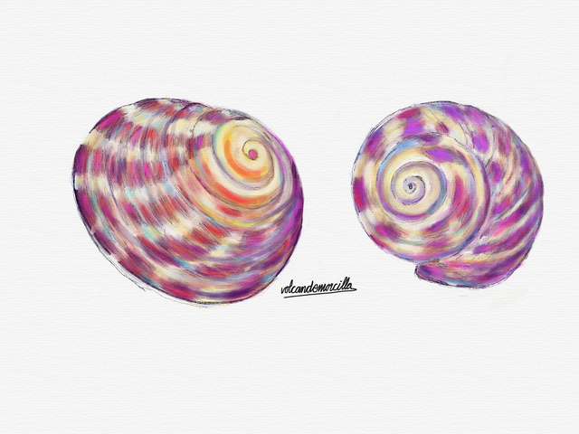
Creí haberlo terminado y lo firmé.
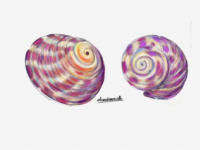
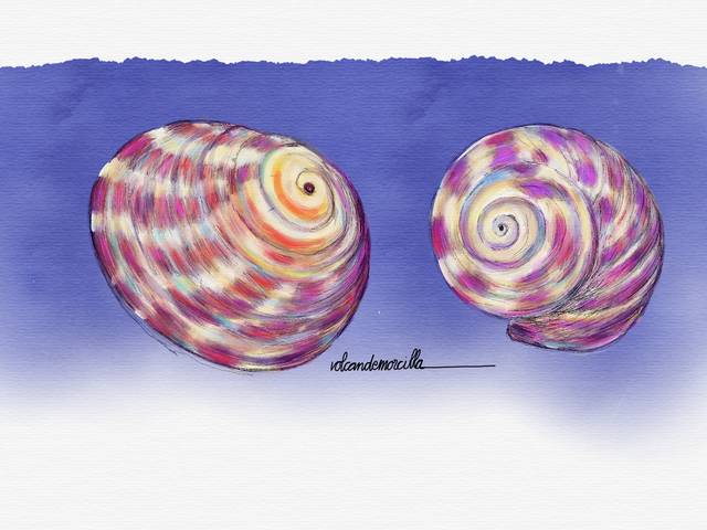
Sin embargo, me pareció que estaba excesivamente subido de color, y como quería resaltar los aspectos irregulares y rallados de la caracola, le introduje algunas lineas finas con la herramienta rotring.
Y cambié la firma por otra que los integrará más aún.
Hay que estar atento porque existe un momento en que se debe parar. Lo difícil es darse cuenta cuando es el momento óptimo. La insistencia y el exceso de detalles suele llevar a terminados excesivamente “relamidos”. En mi opinión, en la pintura suele ser mejor dar una sensación de inacabado. De todas formas, cada uno tiene su estilo y su forma de interpretar la realidad.
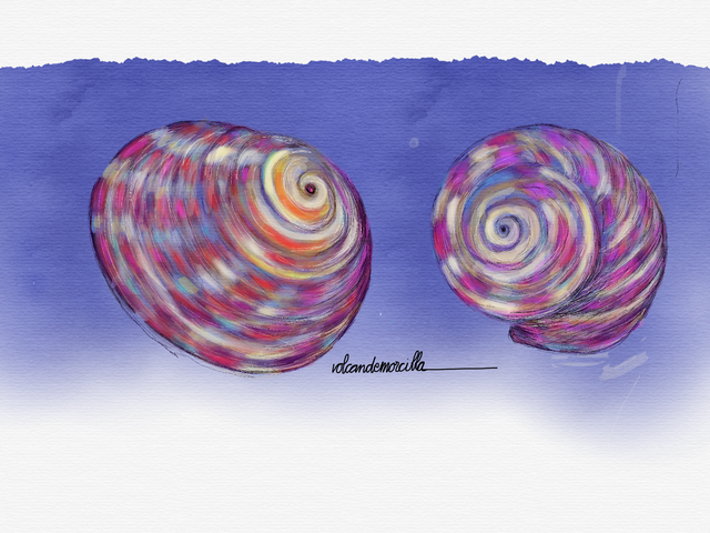
Me pareció que las caracolas, sobre un fondo blanco, parecían flotar. Pensé que sobre un fondo podían quedar mejor. Probé con un azul degradado de acuarela. Para lo cual hice una nueva capa donde pinté el fondo azul.
Finalmente borré la zona en la capa de fondo, exclusivamente en la zona de las caracolas, pero no toda. Así, conseguí que no existiera un salto brusco entre las caracolas y el fondo.

How I painted some sea snails
When we were in Bayonne we were on a beach that is made up of shells. In fact its name is the beach of the Cuncheira.
There we took a few sea snails that were on that beach. I was very interested in its curious shape and its varied color.
The other day, seeing them on the table, I thought of taking a picture with the idea of painting them later. Here you have the evolutionary steps of the drawing.
Seen up close, the shells with their pearly and colorful appearance seemed to me a fantastic thing. It's amazing what nature can do.
I wanted to highlight the stripes and the grated appearance of the conch shells because, if you look closely, the surface is not smooth, but they have small grooves like vinyl records.
The first thing I painted a soft pale gray and pale yellow background on which I included dark colors.
Then I drew the red ones. At all times I painted the curved strokes. In the conch shells there was not a single straight line.
Then enter I introduced the color blue.
And then the yellow color.
I realized that the difficult thing was to get both conch shells together. Both are different and have different colors but I tried to get both conch shells were integrated and formed a set.
That is why it is important to paint them at the same time. Although they have different colors, in both I looked for the same colors to exist. It is as if the colors will bounce from one to another.
I highlighted some more intense colors like orange in the center of the left conch or the violet of the right conch.
These vivid colors are precisely what I think is most beautiful of the conch shells.
I thought I finished it and signed it.
However, it seemed to me that it was excessively raised in color, and since I wanted to highlight the irregular and grated aspects of the conch, I introduced some fine lines with the rotring tool.
You have to be aware because there is a time to stop. The difficult thing is to realize when it is the optimal time. The insistence and the excess of details usually leads to overly “licked”. In my opinion, in painting it is usually better to give a feeling of unfinished. Anyway, each one has his style and his way of interpreting reality.
It seemed to me that the conch shells, on a white background, seemed to float. I thought that on a background they could look better. I tried a blue watercolor gradient. For which I made a new layer where I painted the blue background.
Finally I erased the area in the bottom layer, exclusively in the area of conch shells, but not all. Thus, I got that there was no sharp jump between the conch shells and the bottom.
Cómo lo hice / How I do it
Utilicé el programa Sketches para la creación utilizando la herramienta lápiz y acuarela.
Use the Sketches program for creation using the pencil and watercolor tool.
Los dibujos son míos y originales.
¡Espero tus comentarios!
The draws are originals and mine.
I await your comments.
Buen Camino!
Yo pienso que las caracolas son hermosas, realmente una bella inspiración para un gran dibujo; a veces dicen que no dan mucha suerte eso es mental, dan creatividad y eso es valioso.
Encantada siempre de leerte y ver tu arte.
Saludos cariñosos.
Posted using Partiko Android
Vaya!! Cantidad de caracoles. Que curiosas sus diferentes formas , tomaste riesgos al queres dibujarlas porque esa morfología no es nada sencilla sin embargo, el resultado fue muy bueno. Saludos amigo.
Muchas Gracias. Estoy cogiéndole el truquillo. Jejejej Un abrazo 🤗
Posted using Partiko iOS
Votado por el trail @team-mexico
Servidor en Discord TeamMexicoPRO ¡Te esperamos!
Delegaciones para @team-mexico ¡Ayúdanos a crecer!
10 SP - 25 SP - 50 SP - 100 SP - 150 SP- Mas información.
.png)
Muchas Gracias amigos 😊
Posted using Partiko iOS
Ciertamente cada quien tiene su estilo. Te han quedado muy bien ;) elaboradas y parecidas a las fotografias, ¡upvote!
Muchas Gracias. A veces, el estilo personal no es del agrado de la mayoría, pero eso no debe importarnos. Creo que es mas importante que el resultado le guste al creador.
Un saludo 😊
Posted using Partiko iOS
Todo un mundo maravilloso, cuando voy a la playa me encanta recoger caracoles, conchas y piedras.
Es muy entretenido buscar bonitas conchas. Lo difícil es parar de coger... jejejej 😊
Posted using Partiko iOS
Curamos la etiqueta #spanish con el token SPACO de la Comunidad de Hispano Hablantes, te invitamos a formar parte de nuestra comunidad.
Muchas Gracias por vuestra amable apreciación. Un saludo 😊
Posted using Partiko iOS