State of the Sndbox Competition Entry.
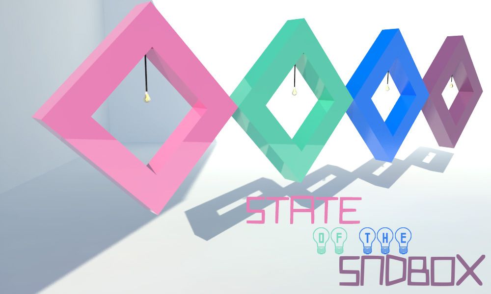
Hello everyone! Today I want to share with you my entry to the monthly competition for the the Thumbnail of @sndbox. This is my second time participating, if you want to participate too you can click here to know more about it.

Software Used:
- Google SketchUp 2016.
- V-Ray.
- Photoshop CC 2017.

The Premise:
Design a landing image that is 1000 pixels x 600 pixels, uses the @sndbox color palette and has the title “State of the Sndbox” clearly legible.

The Inspiration:
I was inspired by the light bulbs representing ideas. I wanted to add the light bulbs into the logo of @sndbox to show the ideas and creativity that surround them.
.jpg)
The Process:
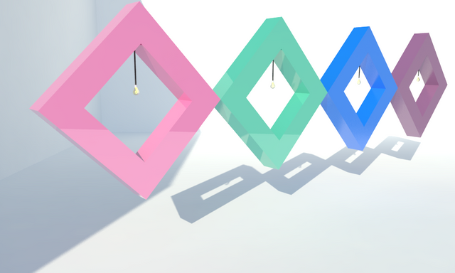
I started by making the volume with a diamond shape in Google SketchUp and I added a light bulb to represent the ideas.
.png)
I copied the volumen four times and I added a material to each. For I used Vismat materials I find here. I used plastic as the material.
.png)
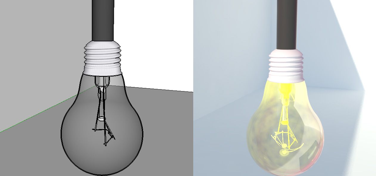
I added the materials to the light bulb and I tested the result by rendering it with V-Ray.

I rendered the full view with V-Ray to get the product.

Then I opened the image on Photoshop to adjust the brightness, contrast and tone. To finish I added the fonts, for the words "State" and "Sndbox" I used the font Quirky Robot and for the word "Of" and "The" I used the font Good Idea, I have found both here.
.png)
Hello! I find your post valuable for the art community! Thanks for the great post! ARTzone is now following you! ALWAYs follow @artzone and the artzone tag, and support our artists!